This page is only about Round 8 and above.
If you are looking for former rounds, you’ll find them here: Round 1 - 7
For those of you looking for the most up to date bundles for dev, please check out the front page of the UI Committee. The latest Me Section wires are in the pdf bundle kept up to date here: Me Section Binder Phase 1
Also useful is the list and specs of Page Feeds
- 1 Round 11a
- 2 Round 11
- 3 Round 10a
- 4 Round 10
- 5 Round 9a – The Inbox Story
- 6 Round 9
- 7 Round 8
Round 11a
Some refinements on the round 11 wires. The main difference here is that the action bar has been finalised.
Landing Page
My Work
Two versions of the action bar, version 2 has the action bar over two lines, version three across one line. I did both version because we thought one line might be too cramped, but I think it can work.
| Version 2 | Version 3 (all on one line) |
 |
 |
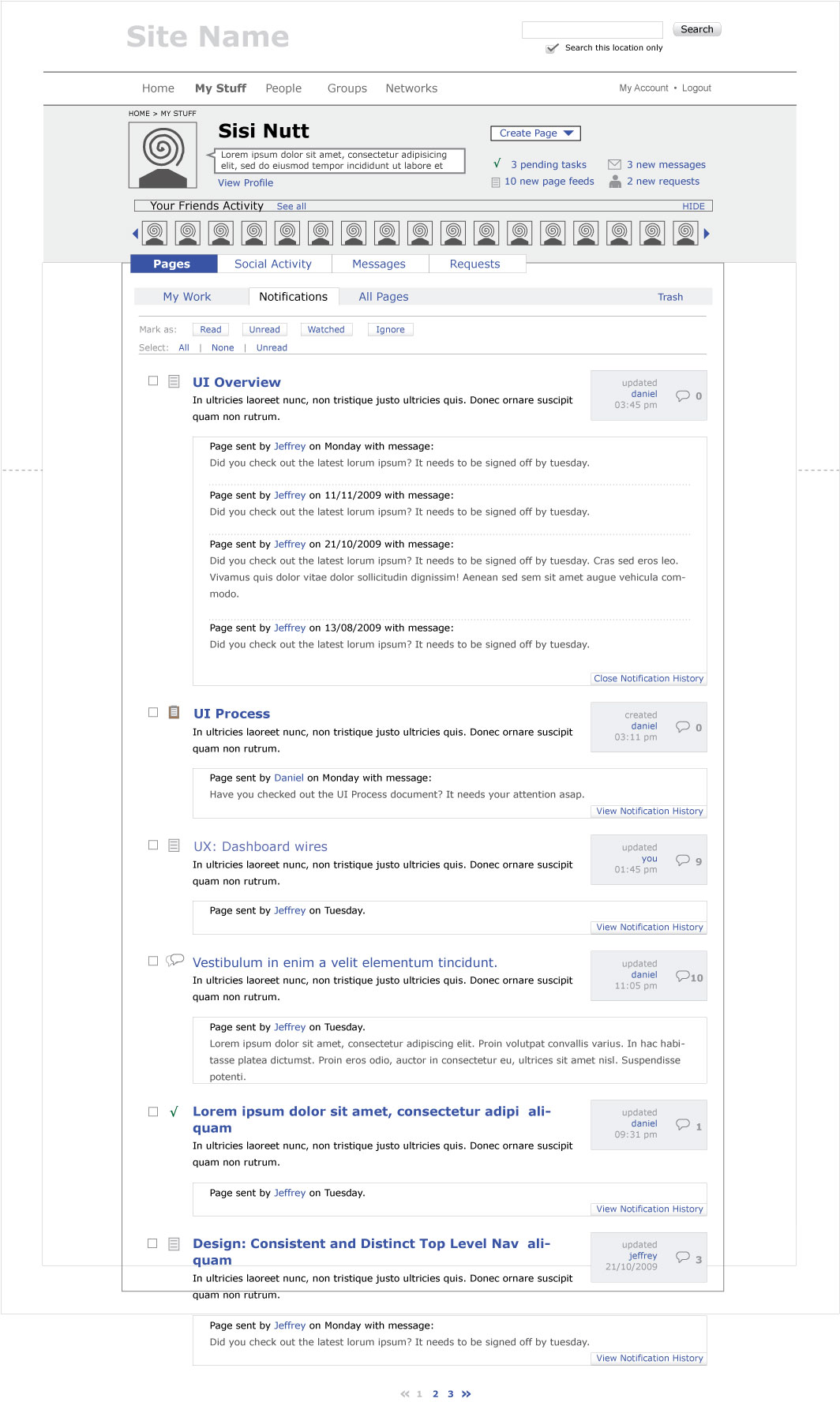
Notifications
Notification wires have the history concept explored. The idea here is that you can see the history of notifications for one page.
| Notification without history | Notification with history revealed |
 |
 |
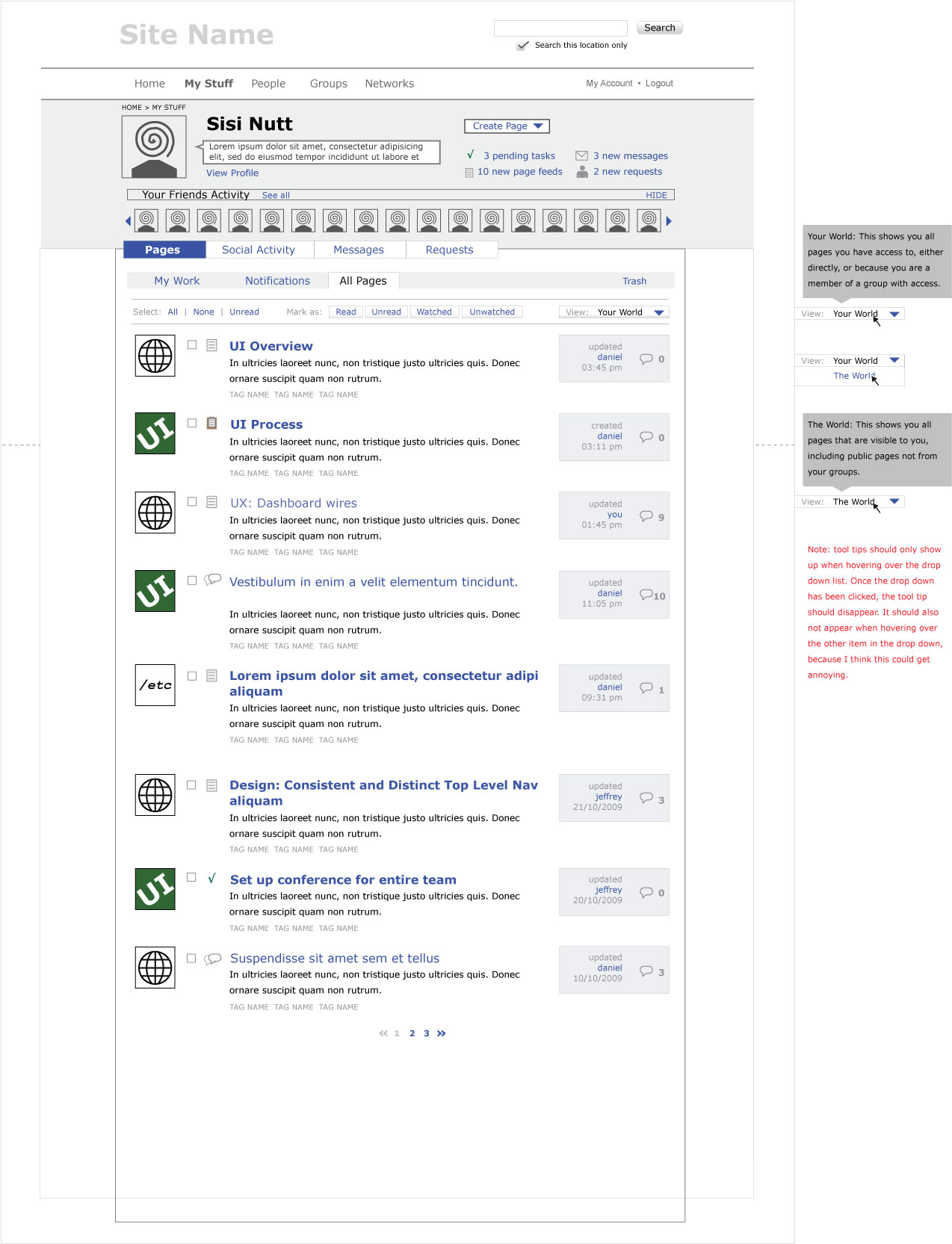
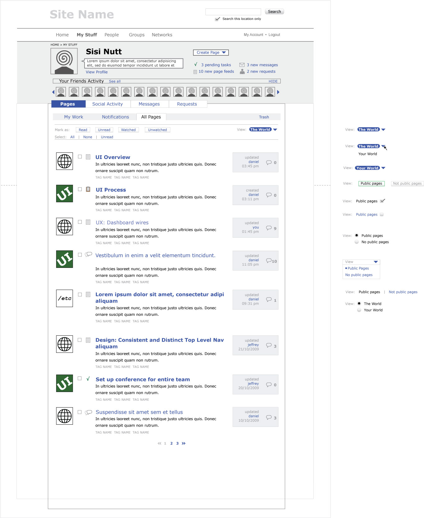
All Pages
In “All Pages” we want to be able to filter between all pages that are visible to you and all pages that you have access to.
We would like to use the terms “your world” and “the world” to distinguish between the two filters. The problem with “public pages” vs “non public pages” is that public pages have a different meaning in crabgrass (and in general), and can give the user a false sense of what they are viewing.
| All Pages |
 |
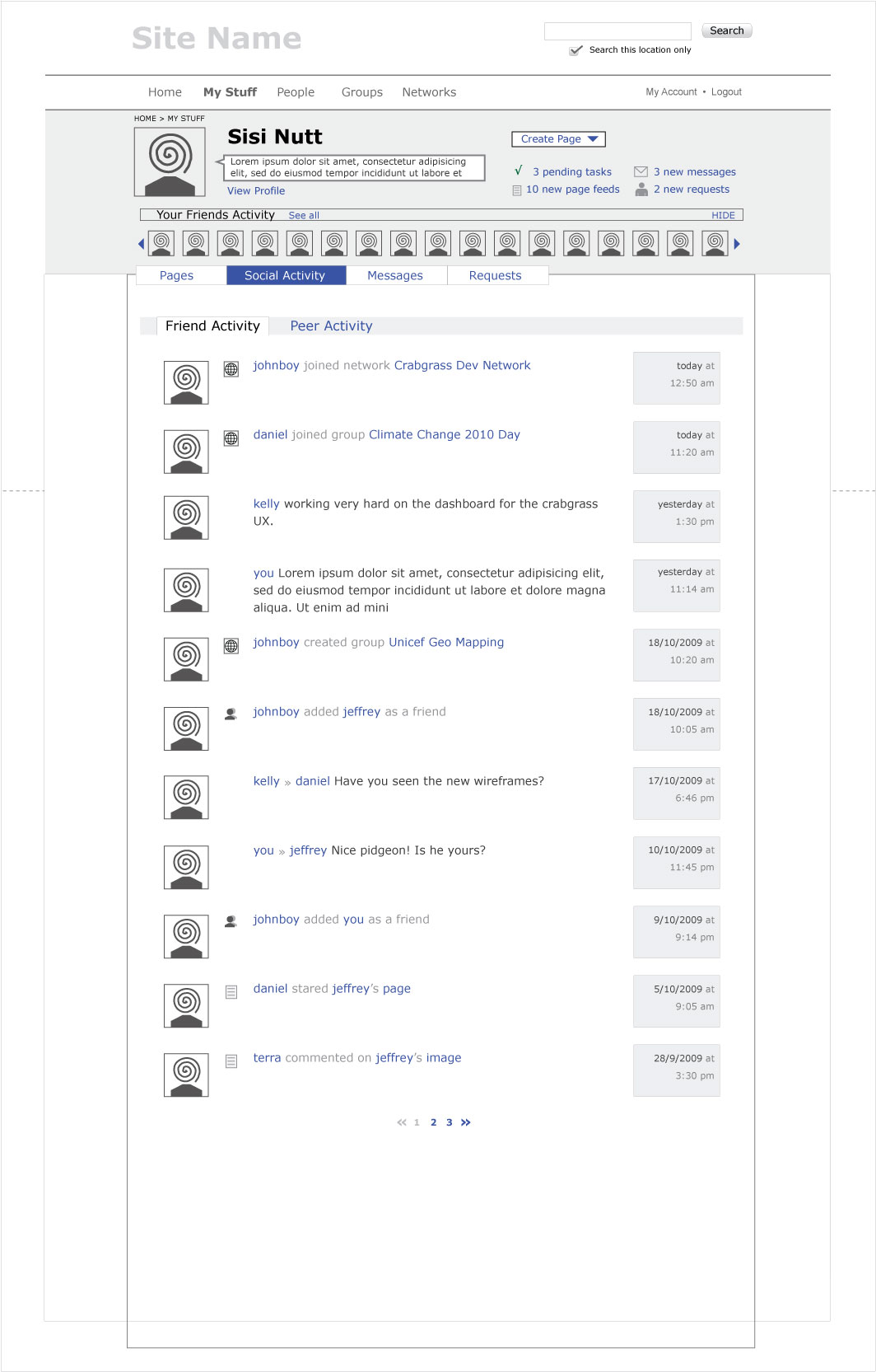
Social Activity
Please See Below Round 11
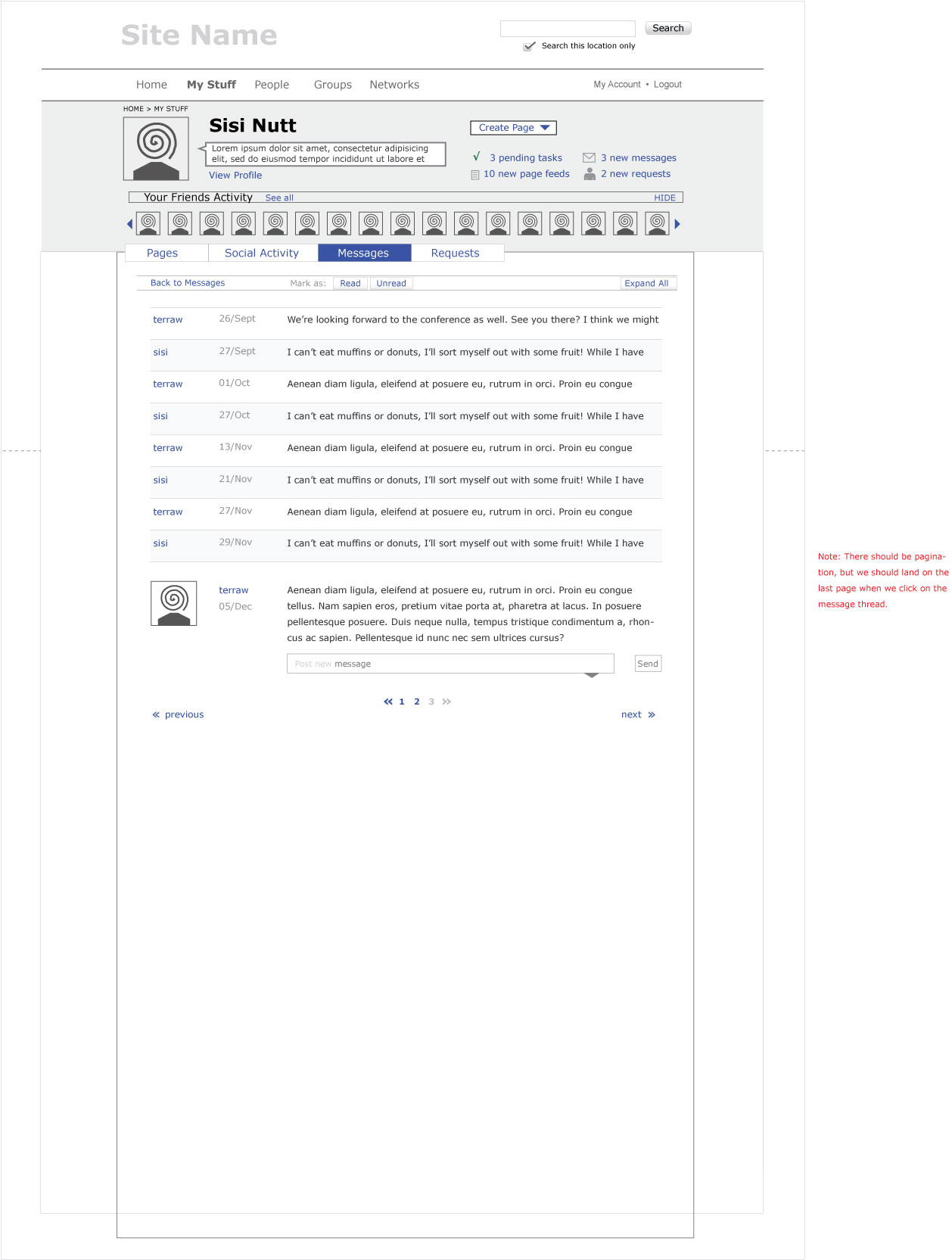
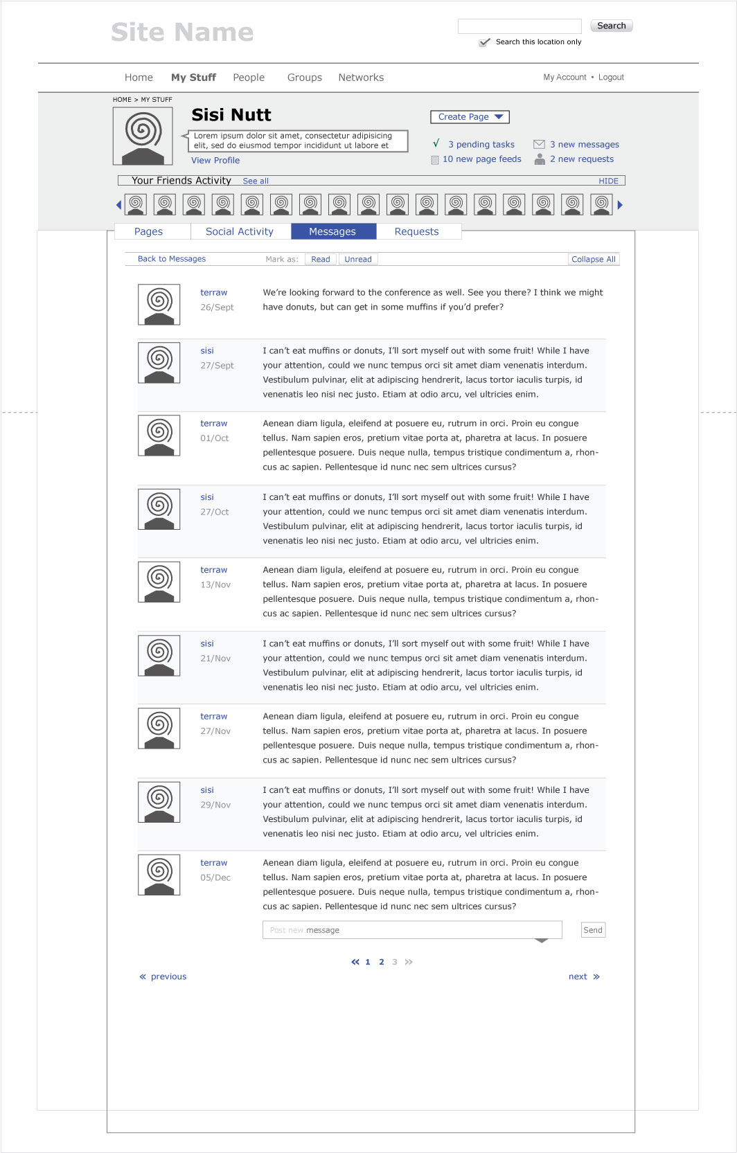
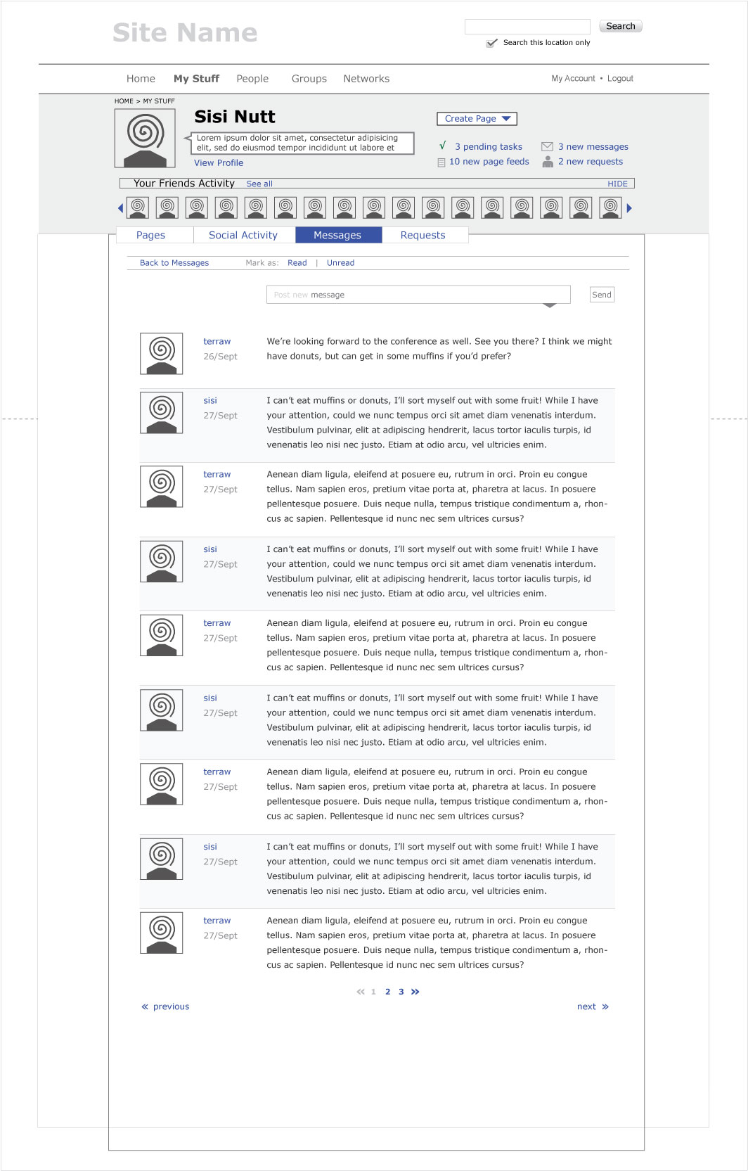
Messages
| Messages | Message Thread Collapsed | Message Thread Expanded |
 |
 |
 |
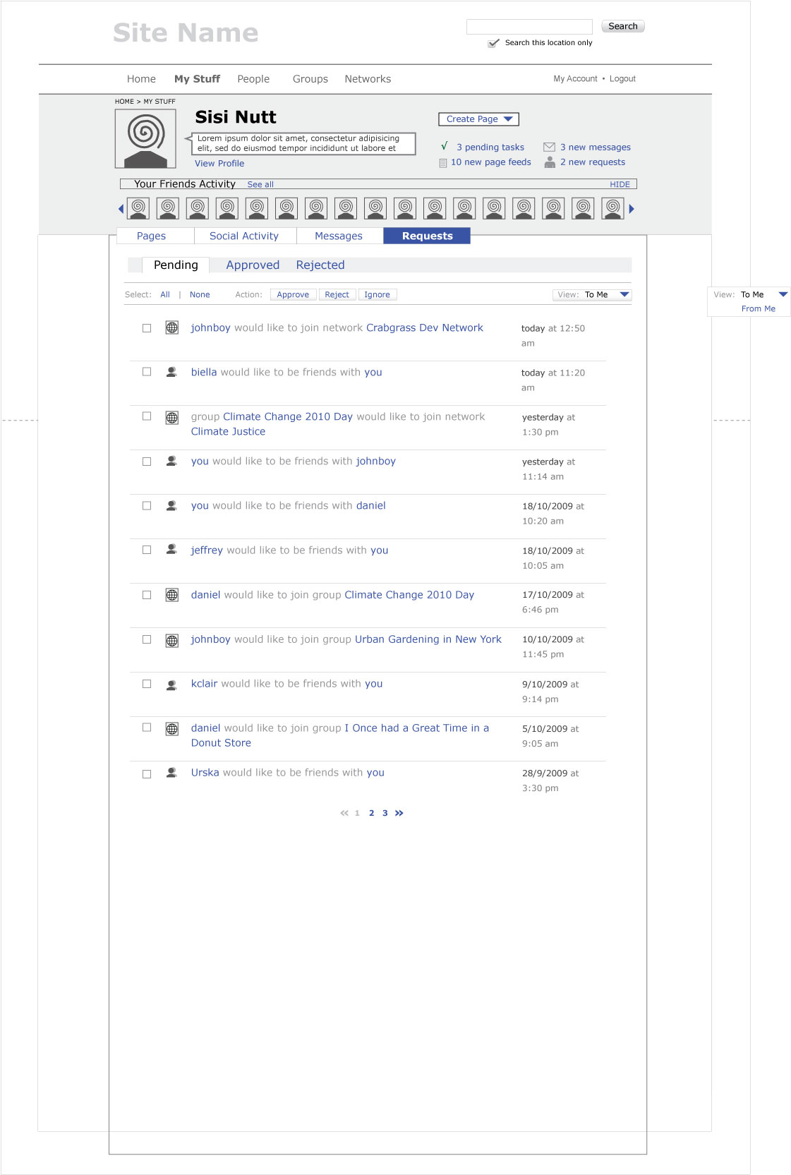
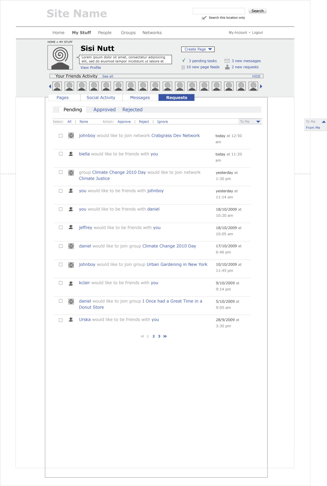
Requests
| Requests |
 |
Round 11
Landing Page
A good UI meeting on the 2nd december between Daniel, Merrick, Meghana and Sisi generated fresh ideas for organisation and layout of UI elements. Some elements coming out of the meeting are reflected here. There was alot of discussion about notifications, and generally simplifying the third level nav of “my work”. Some ideas would need to be implemented at a later date, such as possibly merging notifications with the messages system.
My Work
Notifications
| notifications | notifications with history |
 |
 |
All Pages
Social Activity
Messages
| Main Message View | Message thread |
 |
 |
Requests

Round 10a
After a good meeting with Daniel, we’re exploring version 5 (sorry to disappoint Raphael!)
The main reason for this is the idea that these sort methods can be seen as “advanced” and can therefore be moved to a more subtle menu for advanced users.
The reasons for using icons mainly come from a desire to use icons where possible, rather than text, for users of crabgrass that are semi literate. There will still be hover-over textual help, explaining the icons.
Some changes to version 5, namely removing drop downs, and creating a link/tab to trash; moving select and mark as to action menu together with drop down menu of icons for sorting; title of owner no longer a bar, but still with hide/reveal capabilities; flags removed for this round of dev work.
My Work
| version6 | version6a |
 |
 |
Notifications
Social Activity
Messages
| Main Message View | Message thread |
|
|
Requests
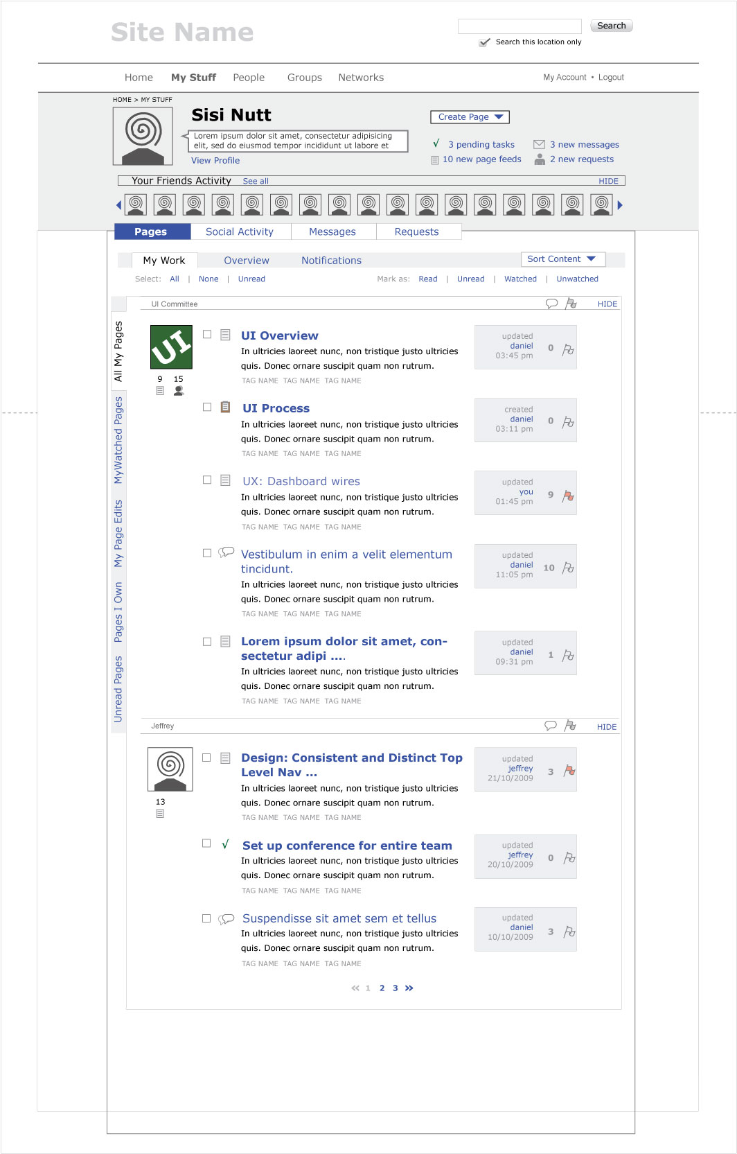
Round 10
Big changes to page sections!
Dashboard is now just work/pages. Renamed (for now) to Pages. Then we will have Social Activity, and an inbox, with Messages and Requests in one tab.
Within Pages we have three breakouts:
- My Work
- Overview
- Notifications
Overview
This is all pages you have access to, across all my groups (so not all public pages)
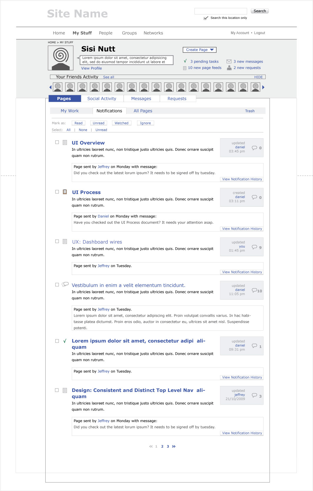
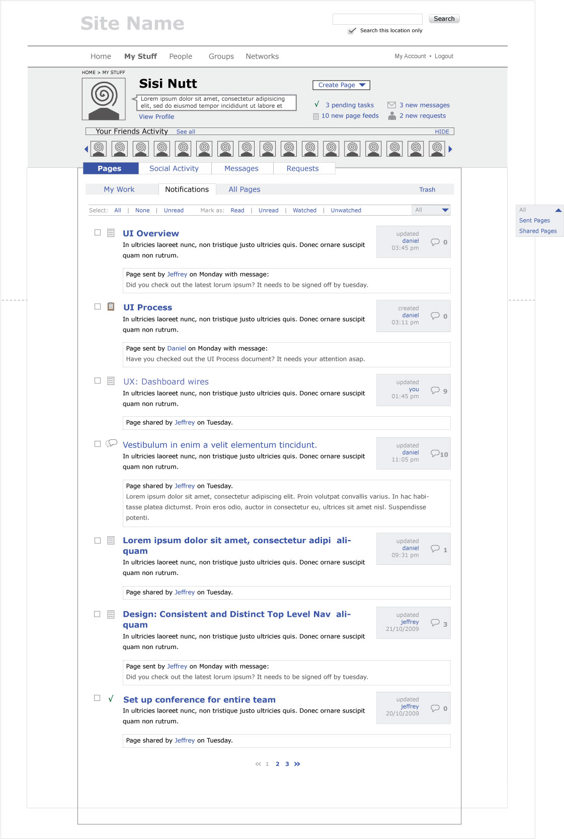
Notifications
This is pages sent to me and pages shared with me.
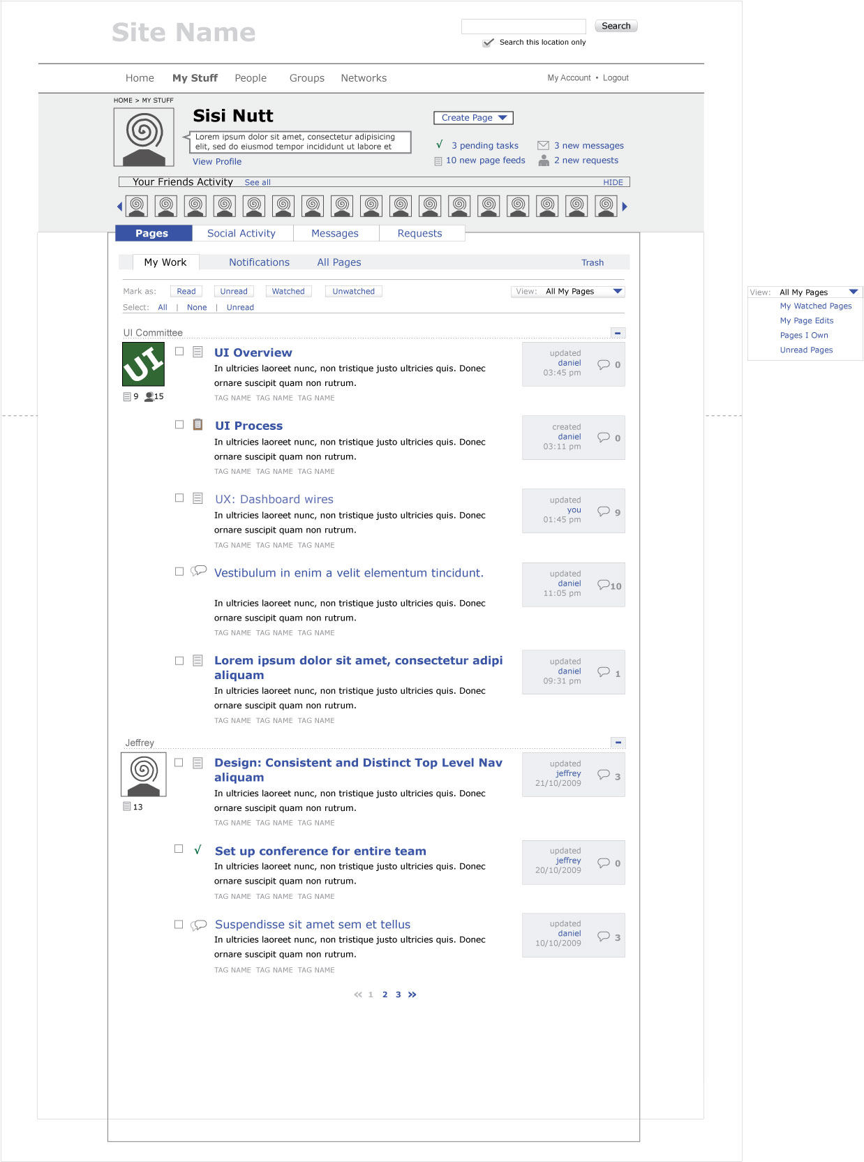
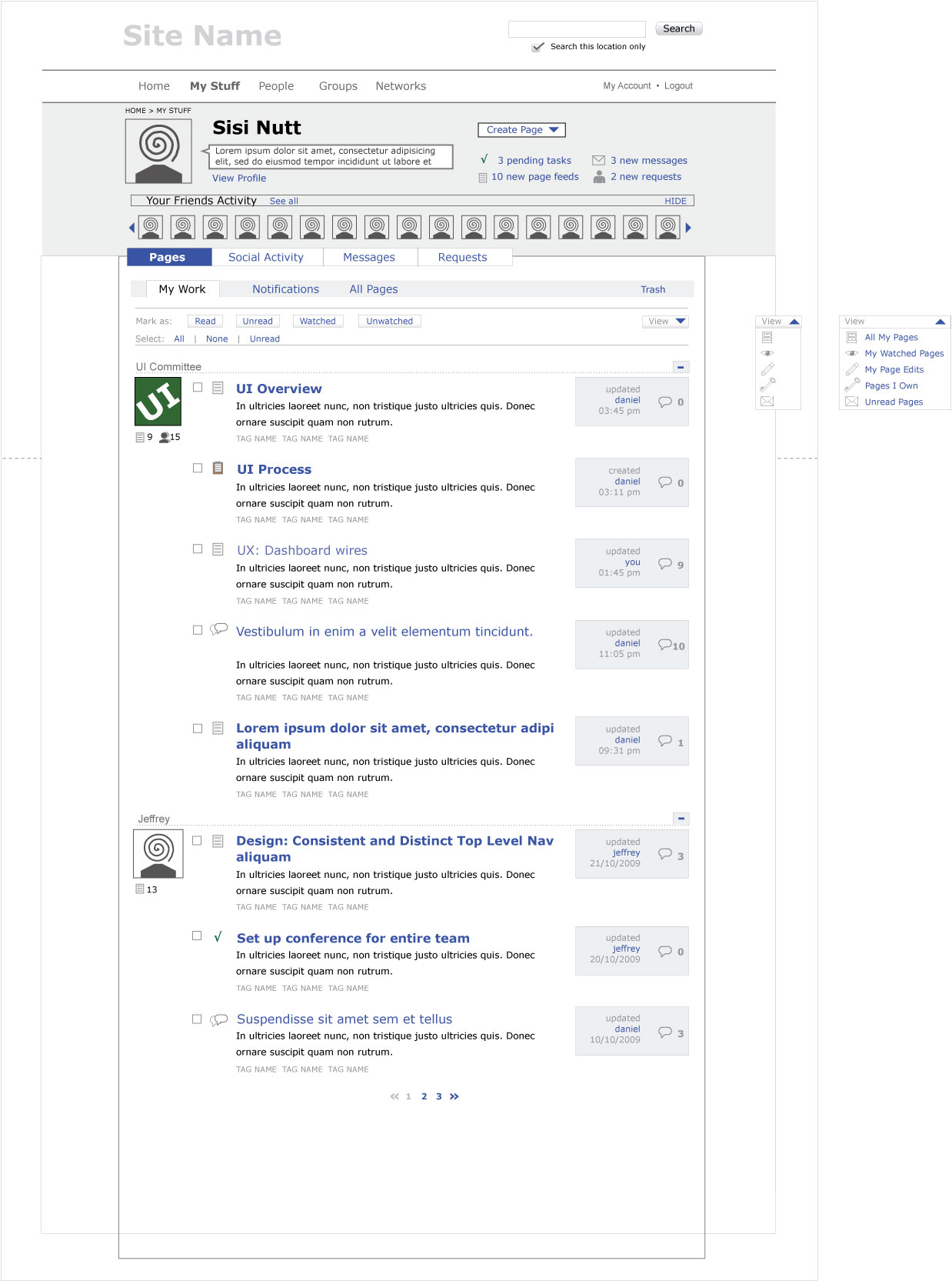
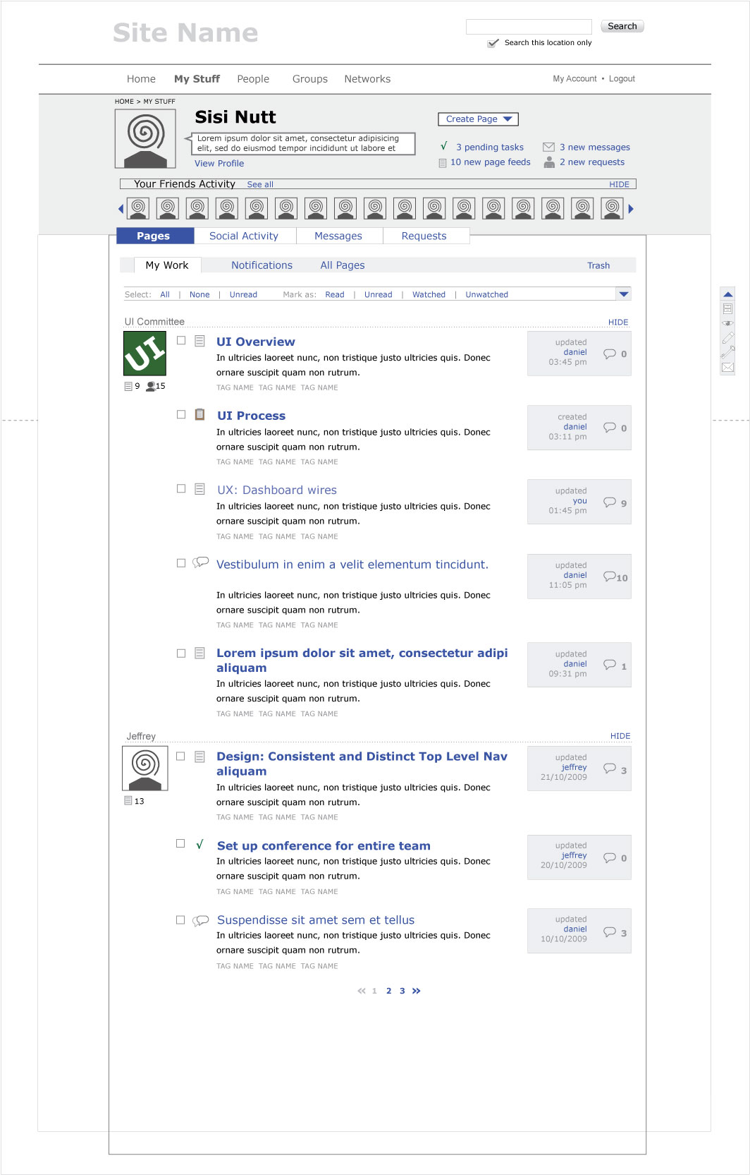
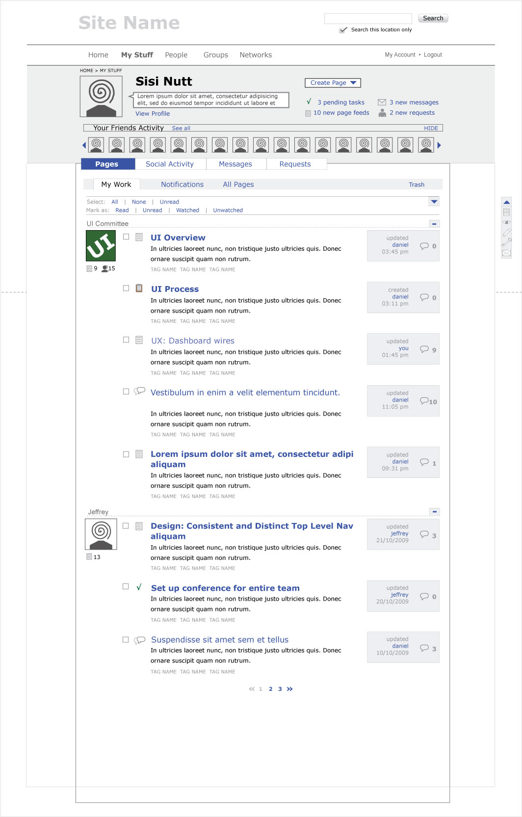
My Work
This is my edits and my watched pages and pages I own all together.
My Work is the most complex of these sections, because we want to be able to view in different ways. We need to be able to sort content by content type, we want to be able to perform actions like watch and unwatch, mark as read or unread. We also want to be able to filter so that we can view:
- All My Pages
- My Watched Pages
- My Pages Edits
- Pages I Own
- Unread Pages
We might also want to see this feed by owner too, and the wires reflect this, but probably that is too much, and should just be revealed in the Overview section.
The problem with the above breakouts is that we’re not sure we want a fourth navigation. Below some wires exploring ways of accessing the filters without yet another navigation.
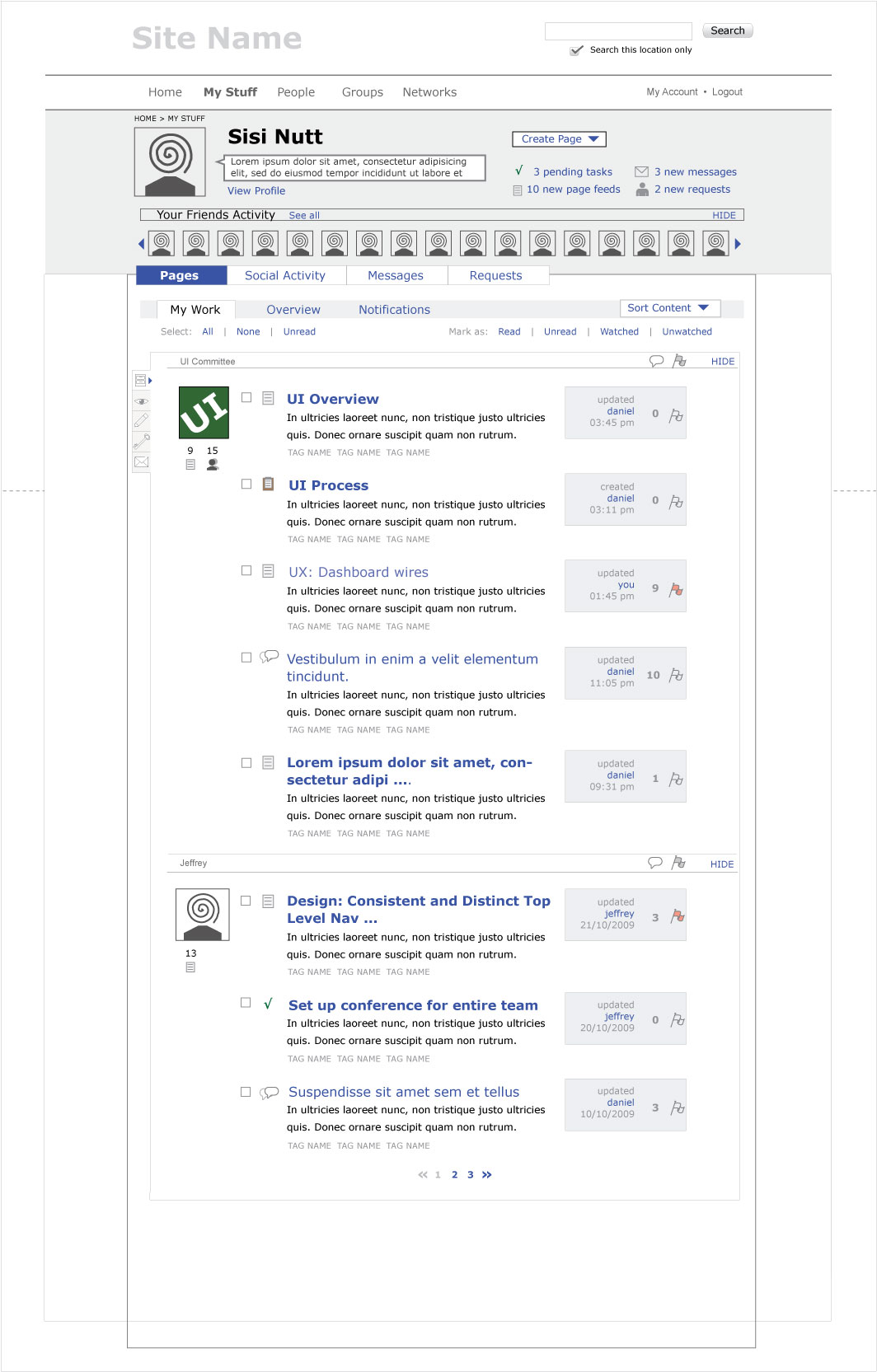
Version 1
Basic vertical tabs down the left hand side. They don’t look nice, but they could do with some styling. Not very userfriendly though.
Version 2
Vertical tabs again, also on the left, but then as icons. The arrow to the right of the active tab can be clicked to expand, so that the icons are clear, and there is a left hand vertical nav (See version 2a).
| v.2 | v.2a |
 |
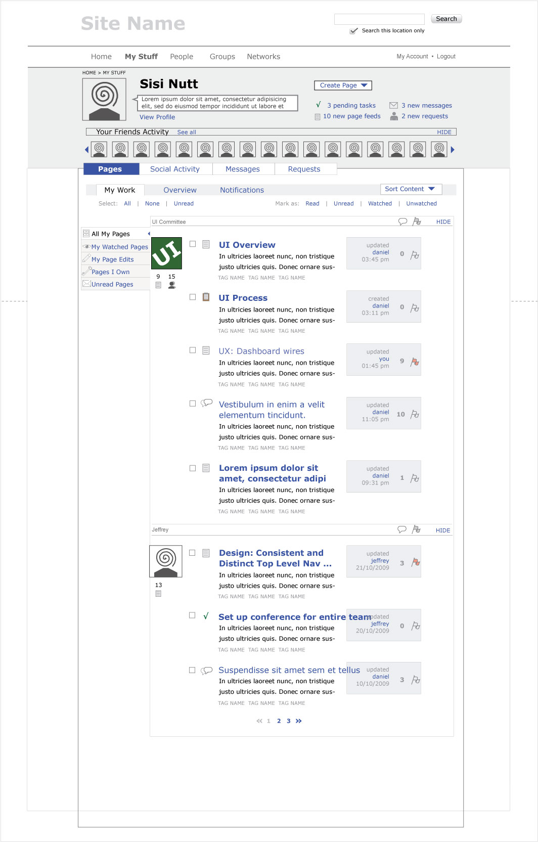 |
Version 3
Basic drop downs from the third level nav bar. These would be sortable by page type, and viewable by: All My Pages, My Watched Pages, My Pages Edits, Pages I Own, Unread Pages, as well as Flagged, and quick links to Search, Tags and Archive.

Version 4
Your basic column sorting, similar to the way email programs like thunderbird allow you to sort by size, unread, thread etc
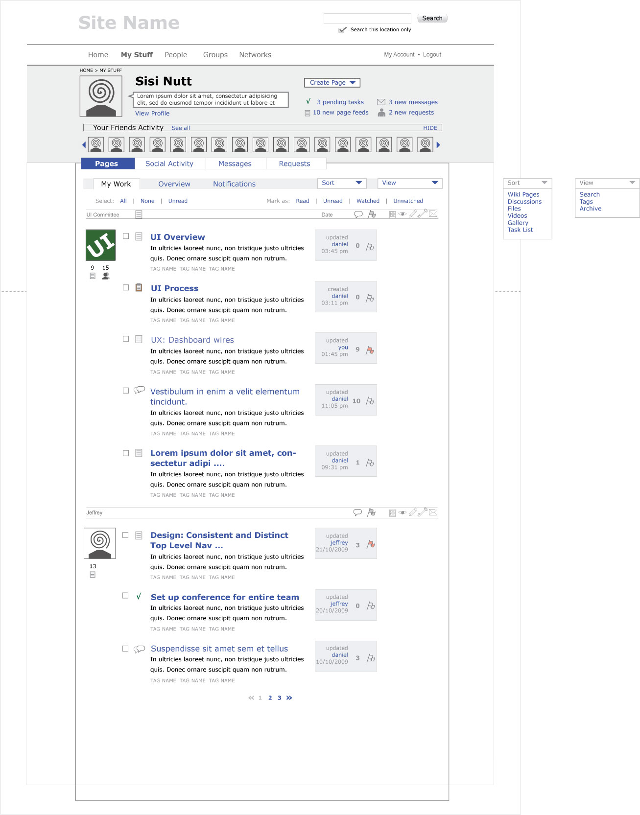
Version 5
Back to the icons, but now as a drop down list from the “sort bar”, far right. The arrow expands in to a vertical list with icons. The arrow could also be a series of three dots: … as this is used by other applications, including browsers, to show that there are more menu items/ filter types on a horizontal menu bar.
Round 9a – The Inbox Story
Background
The inbox is the display of the innermost circle, which is everything that demands our attention, our watched pages, what other people want us to look at, updates of pages what we’re working on etc.
Or to be more precise:
innermost circle: pages that you’re being requested to look at either because you are watching them (pull) or because someone is asking you to look at them (pull) (should this be push?).
See: ia me section reorganization
We land on this when we go to the me section.
We wanted to have this information grouped by “owner” (ie, groups or people). These groupings give clear visual scanability to the page, and we will be able to accordian the groupings (snap them shut so that we can get to the other groupings in the inbox, kind of like how gmail let’s you open and close threads in an email conversation)
Another note is that we will not be moving towards an inbox zero concept for version 0.4.9. That does not mean the idea is lost, but that we need to think about the inbox in terms of items staying in there, for this round.
The Stories
1) The groupings only have the most recent pages in there before the next grouping in the inbox starts. So that could be one item or it could be five (but we should limit it to five perhaps).
If a,b,a,a,b,c is the order of the new pages to be displayed in the inbox then:
a,b,a,a,b,c → (a) (b) (a,a) (b) ( c)
2) The groupings have the top five most recent pages in that group, regardless of whether or not there are other more recent pages in other groupings. So for instance, the most recent page in your inbox could be from the UI committee, so you see that at the top of the inbox, and you see the four other recent pages from the UI committee
there. Under that you have jeffrey, because he has the second most recent page that needs your attention. etc.
a,b,a,a,b,c → (a,a,a) (b,b) ( c)
3) A combination of the two, suggested by Azul:
At first you have a list of all the most recent pages in a group (one per group) like so:
a,b,a,a,b,c → (a) (b) ( c)
If you click on them the other recent posts from that group are listed → (aaa) (b) ( c) after i click on a or (a) (bb) ( c) after clicking on b.
This would be like the hide / unhide toggle, except that one page (the most recent) would always be displayed.
This would allow us to only fetch the top page in a first query and load the others later on.
For UI work this means we would need another toggle. We would have the hide/reveal toggle to hide the whole group, and we would have a “get all recent pages from group” toggle, that would have a better name :-)
The wires below (in a pdf, in round 9) run with story 1, but it is likely we will go with story 2 or 3.
Round 9
Attached is a PDF with the final wires of the me section, ready to be handed off for design.
Touchstone
The touchstone has been narrowed down to accomodate more content from the dashboard above the fold. It has also be reordered and cleaned up to give this busy area more clarity and easier scannability. Even more clarity will come in the design phase.
Inbox
The first page shows the inbox. We decided to go back to inbox, rather than attention, as a name for the innermost circle. It makes the most sense, and hopefully will not be confused with messages now that they are in different levels in the hierarchy.
The inbox feed will be grouped by owner (either person or group), with the most recent owner’s feed showing at the top. If there is only one most updated item in that owners area, only one item will be shown in the feed. If more, then there will be more items. But there will not be more than five items in the owners feed.
These groupings will be collapsable in a accordian style ajaxy way, so people can browse through their content easily. Pages 2 and 3 of the PDF show how this will work.
Page 4 shows the Sort Content drop down list, and page 5 shows how a selected type of content (galleries) will look.
The “all” feed
Page 6 shows the “all” feed, which shows all content over the whole site.
Social activity
Page 7 shows the social activity feed, with friend activity and peer activity seperated out.
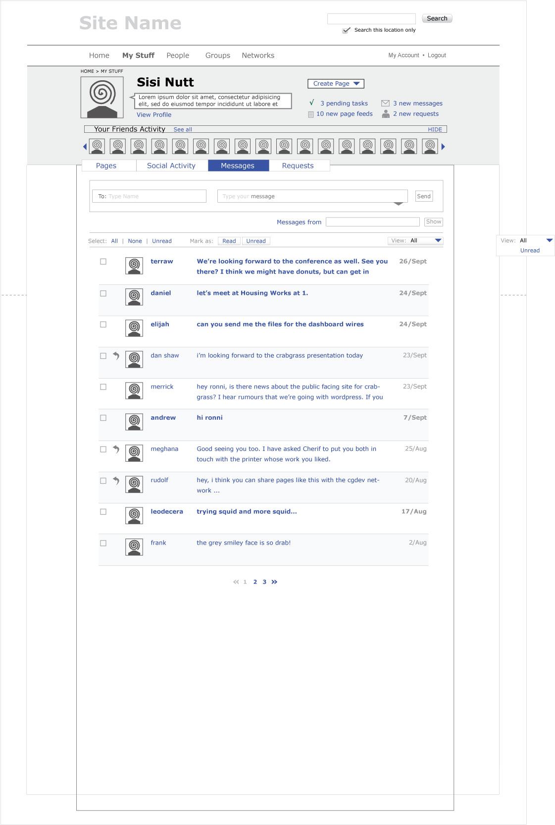
Messages
Page 8 shows messages, with page 9 showing how a message thread will look.
Requests
Page 10 shows requests.
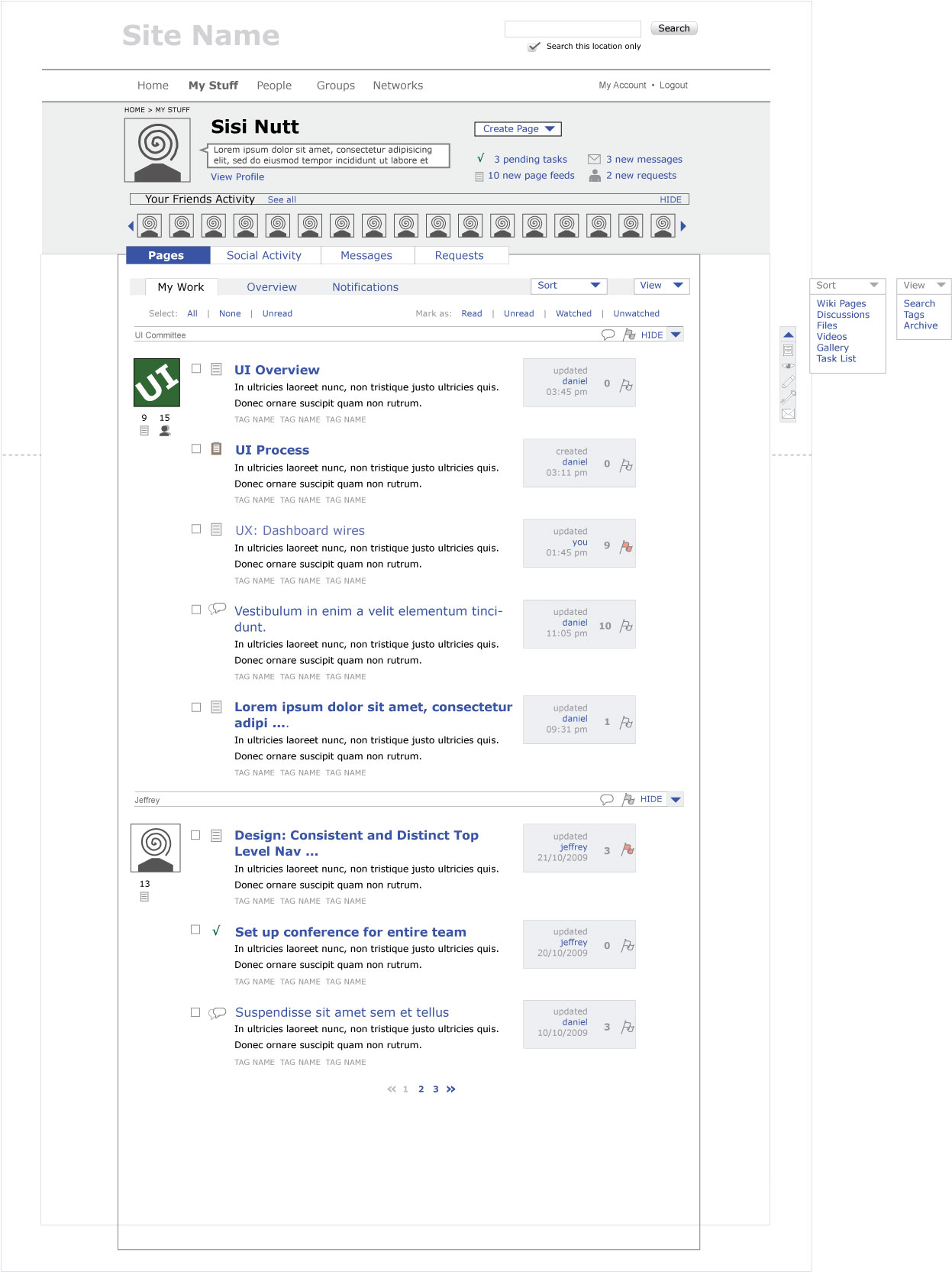
Round 8
These are still wires, but they are moving slowly towards implementing the design direction, especially in the header/touchstone region.
Touchstone reworked to reflect current design direction (facebiz), with “create page” added, plus notifications called “right now” and given more prominance but made hopefully less busy. Also cut back down to four most important notification types.
Second Level Nav bolder, more blocky, holding the content below together more (I hope). Titles of pages bolder and bigger (for Daniel)
Dashboard landing page
Your Friend Activity explicitly named, ability to hide the feed and jump to all.
View in “attention” is split up by group or individual, these can be hidden or revealed, to drill down to older content easily. We might need a “view all” link for each group or individual? Because…
There is no way to get to an over view of one or the other groups from here. At least I wouldn’t say it’s obvious. The only thing you can do is click on an icon in the feed. In other words, what has happened to “my world”?


Dashboard Sort Content by “galleries”
Works pretty much like Attention of all pages, only with a filter by content type: gallery. I don’t like the scrunched up descriptions under the titles, but I do like the larger thumbnail size. Also problematic, how to define that we are now filtering by galleries. I find the title “galleries” that I’ve done now a little clumsy!

Dashboard All Pages
I think we can get rid of the top column definitions “owner” “item” “name” and “updated” because I think these should be obvious. Unless we are planning on letting people sort by these definitions. This was my original idea but I think we scrapped that?