Round 7
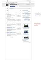
Landing Page
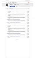
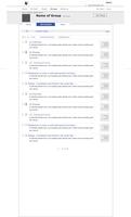
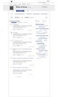
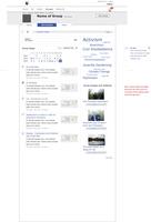
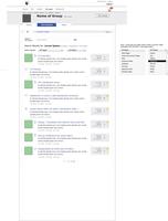
| Landing Page | Landing P Calendar View | Landing Page Search Results |
 |
 |
 |
Trash
Content Views
| All Content Views | All Wiki Pages |
 |
 |
Round 6
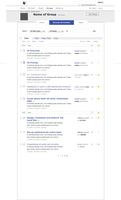
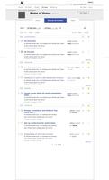
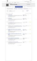
Some more refinements – we’ve taken archive out for now because it is not yet actionable (ie you can’t move something to an archive). Currently the archive view is just a calendar view of the pages in a group. This is not strictly an archive, so we’ve renamed this to calendar view, and made it available via the view filters. We can then use the archive nomanclature when (if) we have the capability in the future. It’s possible that we don’t want to use calendar view. We will want calendars and events soon n crabgrass, so that could get confusing.
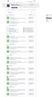
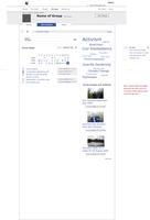
The view for the calendar view is below.
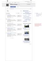
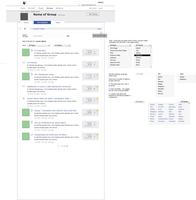
We’ve also folded “most popular this week” into “all pages”, renaming it group pages, with five view filters: the aforementioned calendar view, most viewed this week, most contributed this week, most starred this week and the default view: by date (with both created and updated by). This feed should be 10 items long, before pagination starts.
Note: the feed on the group home page should link to this page, with a “see all” link, and not have pagination. It should just show the top five items.
Landing Page
| Landing Page | Landing P Calendar View | Landing Page Search Results |
 |
 |
 |
Trash
Content Views
We’ve taken out the page view groupings (Text and Discussions, Multimedia and Polls and Votes), and have horizontal feeds to each page type. Other than the discussion forums, all the page types have straight forward feeds with largish icons at the top to give them some visual distinction. The idea is to move towards content specific views, but this will not happen in this development round. Aeach view links to a larger feed of that content type.
Whether we can sort by people in these mini feeds or not is still not decided, though I am leaning towards having that possibility in the longer content type feeds instead.
Also for the next round of development, we probably want to have the views accordianize in an ajaxy way! And we could put quick links to the different content views at the top, under the third level nav as a forth level nav.
Round 5
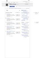
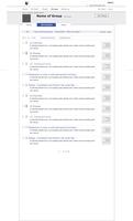
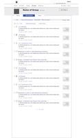
After a conversation with Meghana, I’ve moved the archive and trash up to the third level nav bar (this is also now in line with the me section, which has the trash up in the third level nav tabs too), and made some wires for how archive and trash should look. I’ve also moved the “all pages” feed to be in a narrow column under the tag cloud. Design is needed to make this column look more elegant and simple. It should be a very simple feed.
Landing Page
The two feeds on the landing page (“most popular” and “all pages”) should have about ten items per page, in the wires they have five, but that is probably not enough.
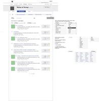
The search results page needs a decision made on how the people filter is implemented.
| Landing Page | Landing Page search results |
 |
 |
Archive and Trash
| Trash | Archive |
 |
 |
All Text and Discussion Pages
See below (round 4)
Round 4
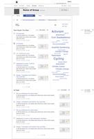
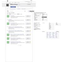
Landing Page
| Landing Page | Landing Page search results |
 |
 |
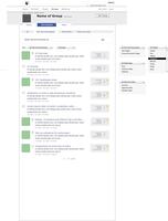
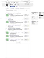
All Text and Discussion Pages
| All Text Pages | All Text Search Results |
 |
 |
Round 3
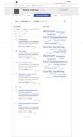
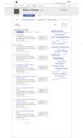
Landing page, still two column, with tag cloud on the right.
All content views will be the same, ie a normal feed, ordered by most recently updated or created.
No admin view in this development round, because no actions possible this round of development.
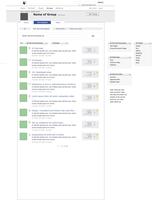
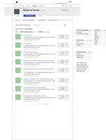
Search more developed. People did not want drop downs for what should be a discoverable/ browseable area, and the standard is to have a search box on it’s own, and if needed ways to winnow the search results, so this is my suggestion:
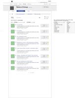
Main landing page search is just one search box. Search results page shows ways to filter the results with drop downs, one for all pages, one for all people. By default these are on all pages and all people.
On the content pages, the search is again one search box. The filters “view by page type” and “view by person” are always available, when looking at all content or when looking at search results.
Landing Page
| Landing Page | Landing Page search results |
 |
 |
Text and Discussions Page
| Text/Discussions Page | Text/Discuss. Page search results |
 |
 |
Round 2
We decided to go with the 3rd direction, filtering by content/page types. Not every page type, but the four groups: Text and Discussions, Multimedia, Polls and Votes and Planning Tools. Ideas from the other directions will probably find their way into this direction.
We also wanted to add a landing page to the mix, that could have a most popular feed, and a tag cloud in the mix, as well as the links to the Trash and Archive.
I don’t know yet what second level nav element, “tasks”, is going to look like, and it might be that “Planning Tools” is redundant in the “all content” area, but I stuck it in for now, because the “all content” area can play an important role for admins (batch actions such as archiving and trashing several pages at once etc).
Landing Page
A “most popular” feed with most starred, most viewed and most contributed, in the left hand column, and a tag cloud on the right, with links to archive and trash. Not sure about this placement, the tag cloud is not so nice narrow like this…
Text and Discussions
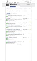
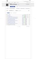
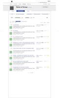
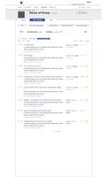
Four views, two different views of the contents tab, either as admin or not. Admins get a very worky view, so they can do batch actions. Non admins get a feed of most recent.
The other two views are either all wiki pages or all group discussion pages.
The same structure will work for all the other content types: Multimedia, Polls and Votes, and Planning Tools.
| all contents no admin rights | all contents admin rights |
 |
 |
| all wiki pages | all group discussion pages |
 |
 |
Round 1
Posted by Sisi on the 19th Nov 2009
Intro
There has been minimal work done on the UI for Group Browse All Content, but not much thought has gone in to it. We’ll work on getting this story right here.
Below are four directions we could go in.
Each is very rough, they are sketches for how we could organise the browsing experience, so please keep that in mind. Stuff is bound to be missing, elements from all four could be combined and none of them are fully realised.
So have a look and add your comments!
Most of the search options I kept to the same as we have now. ie, by all page types and all people and search field.
Direction One – Tabaliscious
Search all at the top, Tabs below for ordering by Date, User, Page Type and Tags. Ability to snap open and shut groups based on ie date (today, yesterday, two weeks ago, earlier) or user. (I guess by user I mean owner!).
Missing, links to Trash and Archive.
Direction Two – Content Seperated
Again search all at top, below lists organised by page types: Texts and Discussions, Multimedia, Polls and Votes, Planning Tools. We could limit this to five or ten pages per list, depending on whether we have descriptions exposed in the lists or just titles.
Missing, links to Trash and Archive.
Direction Three – Content filter using tabs
Tabs for page types at the top: Texts and Discussions, Multimedia, Polls and Votes, Planning Tools. Search is below (so within each page type), and just by people and search term. List is then ordered by date.
On right of search, links to Trash and Archive.
Direction Four – Two Columns with Tab Cloud
Back to having search all at top.
Just to mix it up a little and give the tag a more prominent place, a two column layout, with main feed on left, sortable by date or user, with drop down list for sorting by page type, and big old tag cloud to right. Lots wrong with this, but interesting to explore I think!
