- 1 Round 6 and 7
- 2 Round 5
- 2.1 Landing page
- 2.2 My Groups general
- 2.3 My Groups (alphabetical list)
- 2.4 My Groups (alphabetical squares)
- 3 Round 4
- 4 Round 3
- 5 Round 2
- 6 Round 1
Round 6 and 7
not documented here, there were a few furious rounds via email, but not uploaded, you can see the resultes in the link above, version 8 and beyond.
Round 5
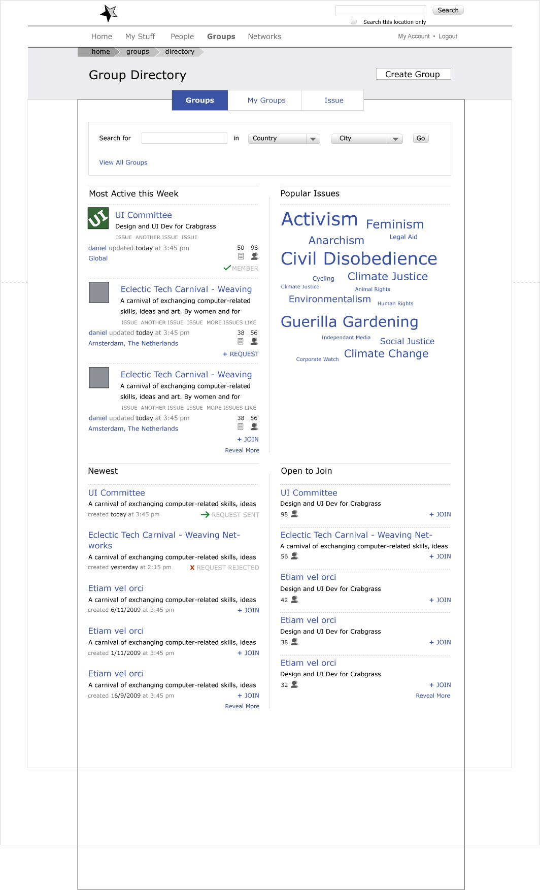
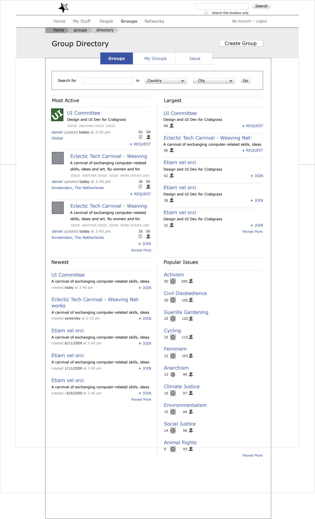
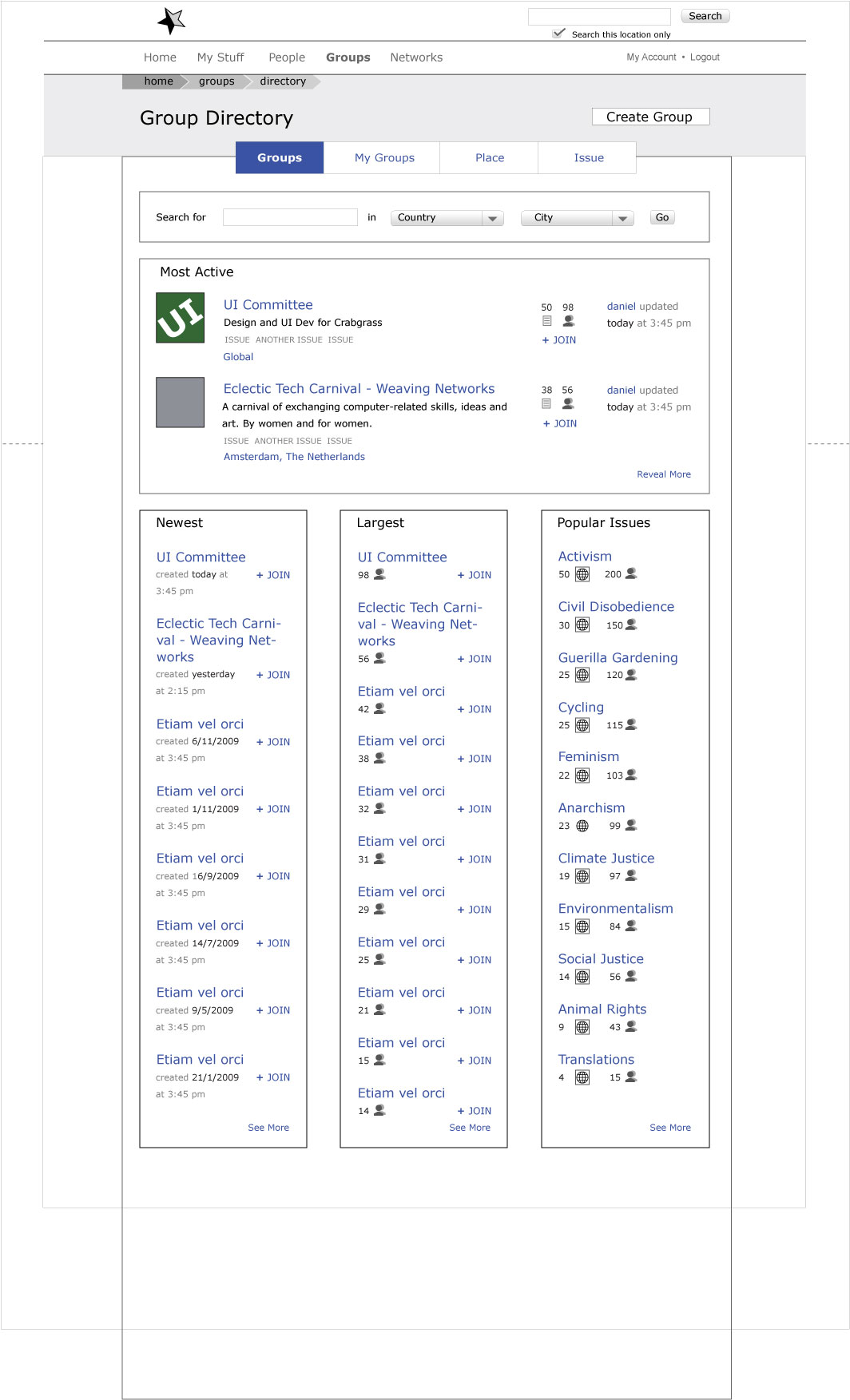
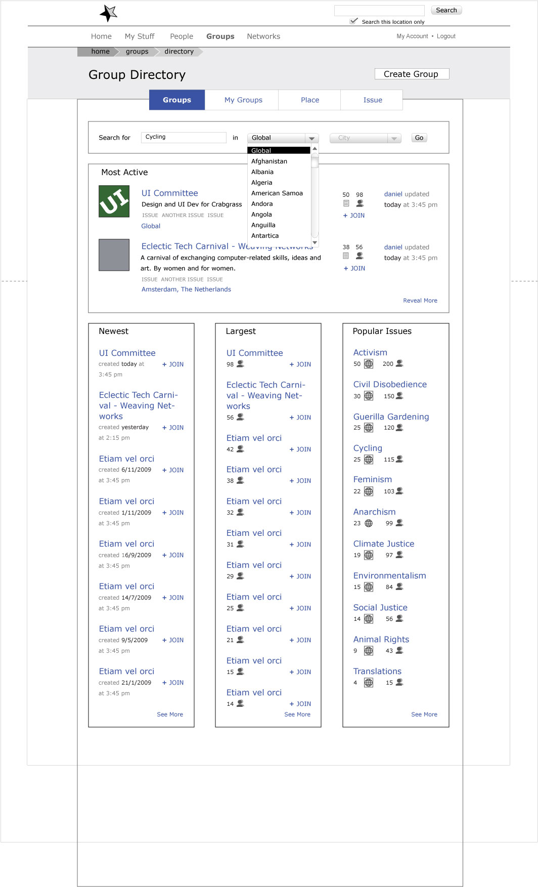
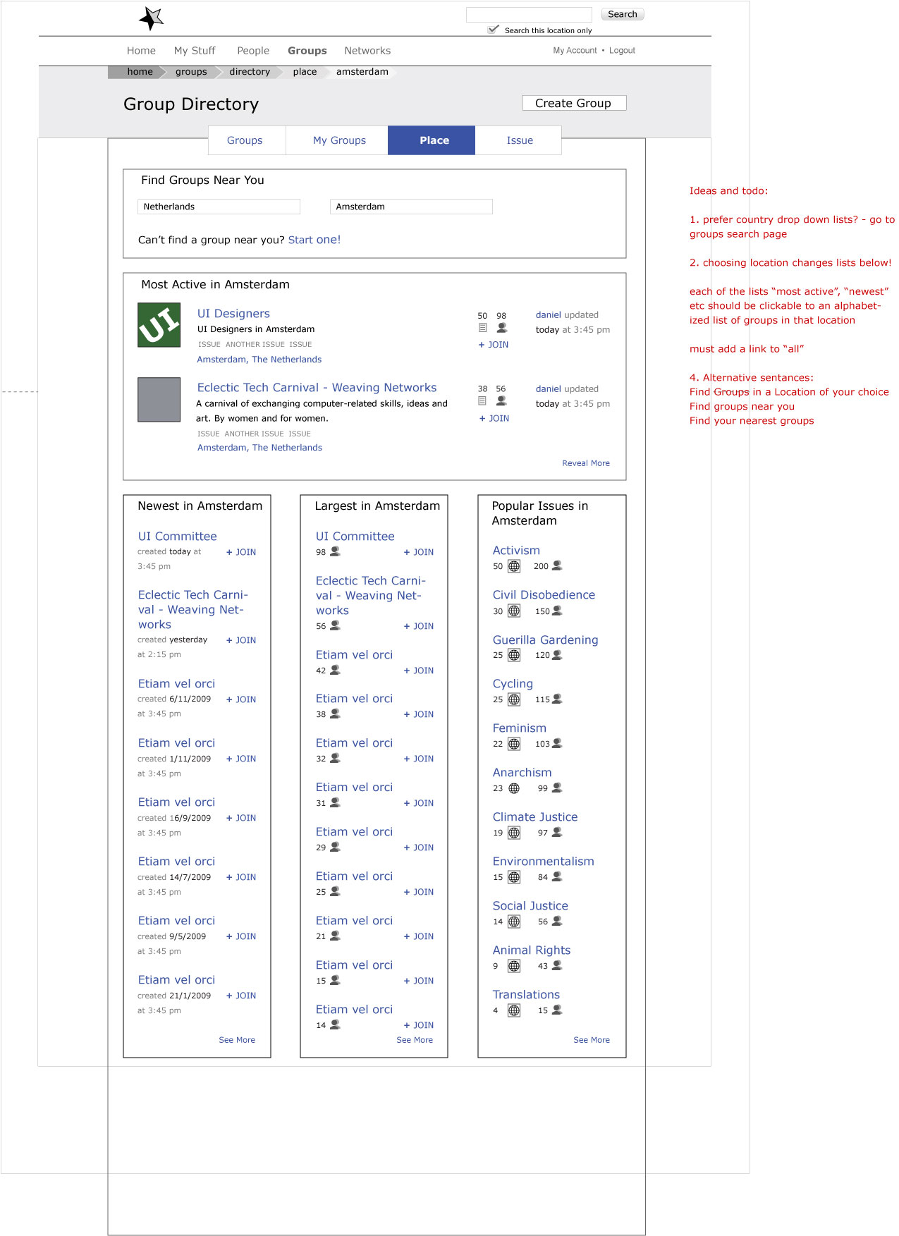
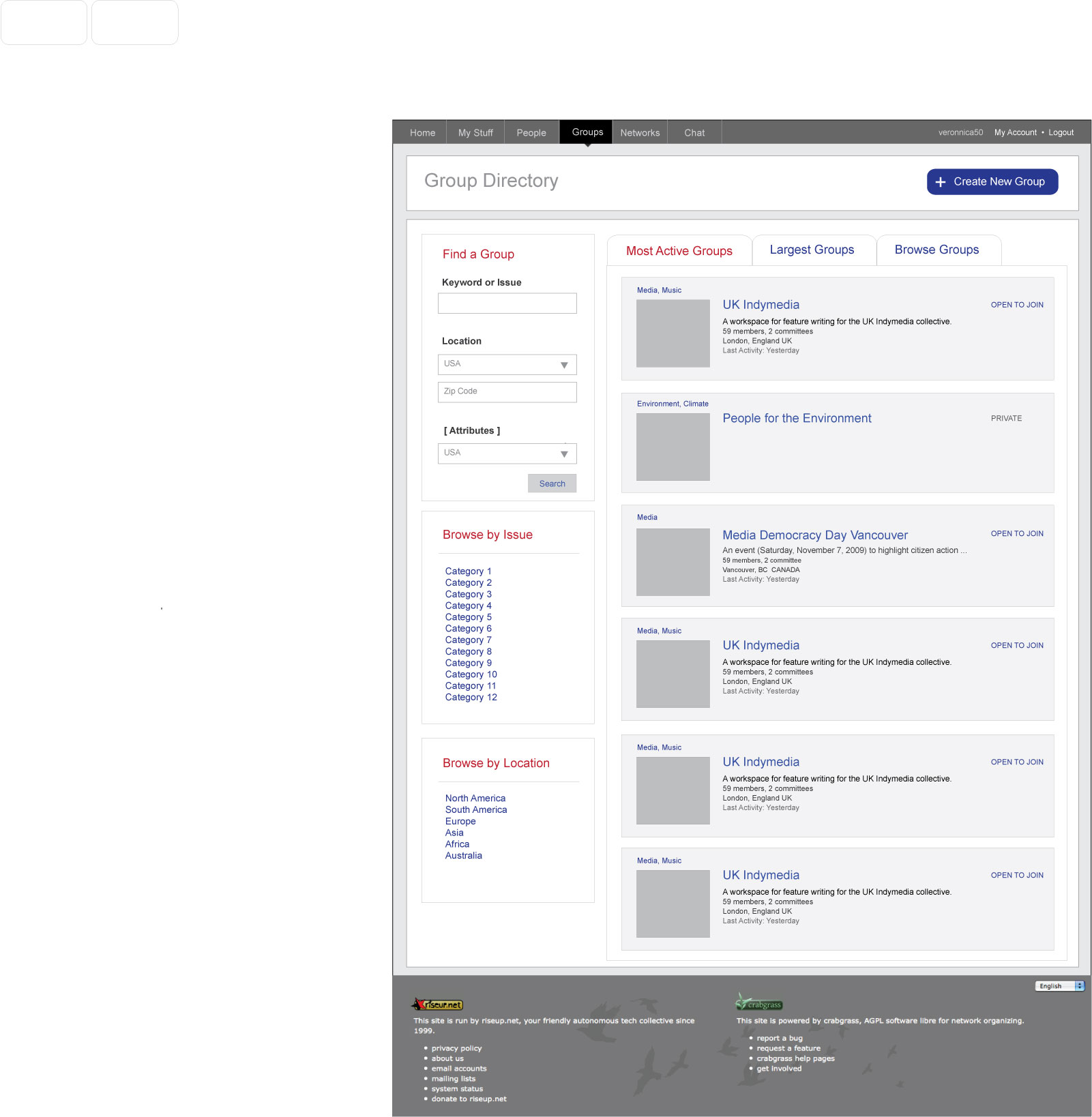
Landing page
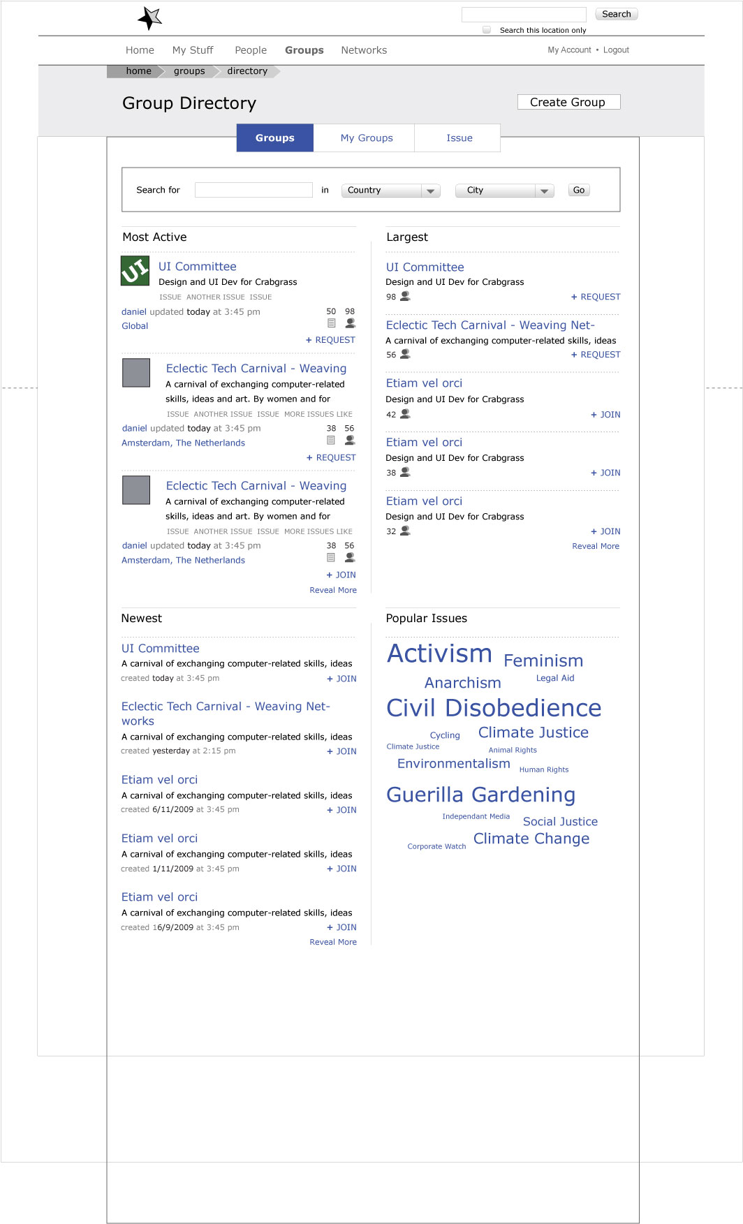
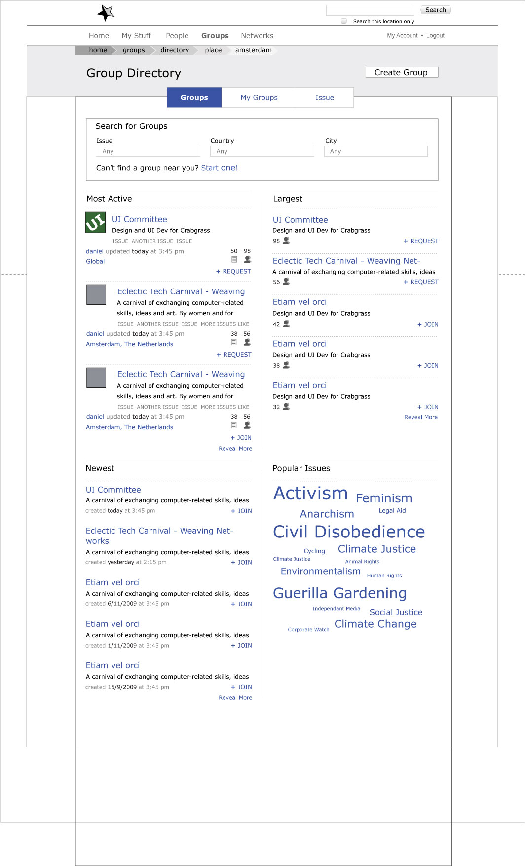
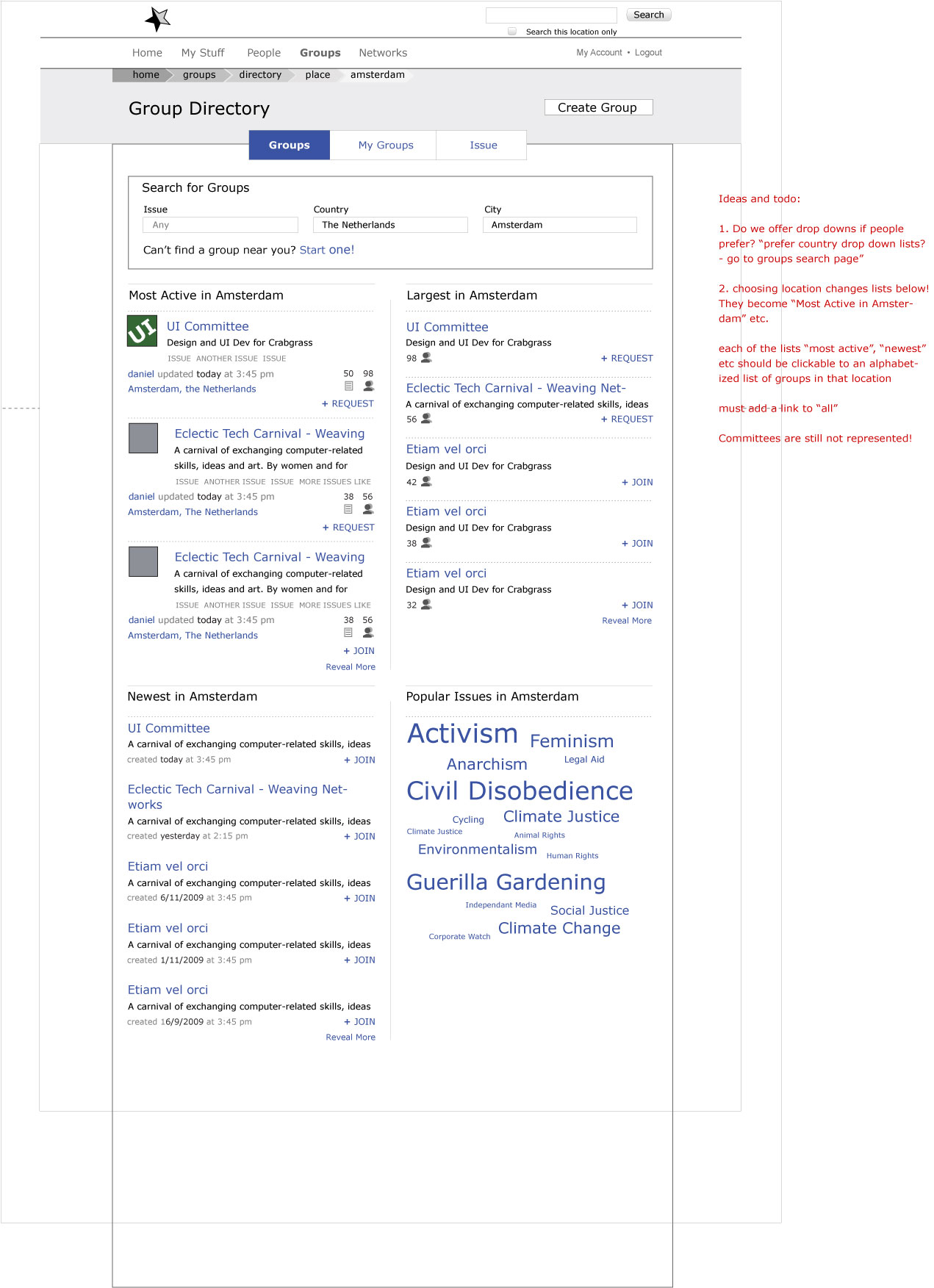
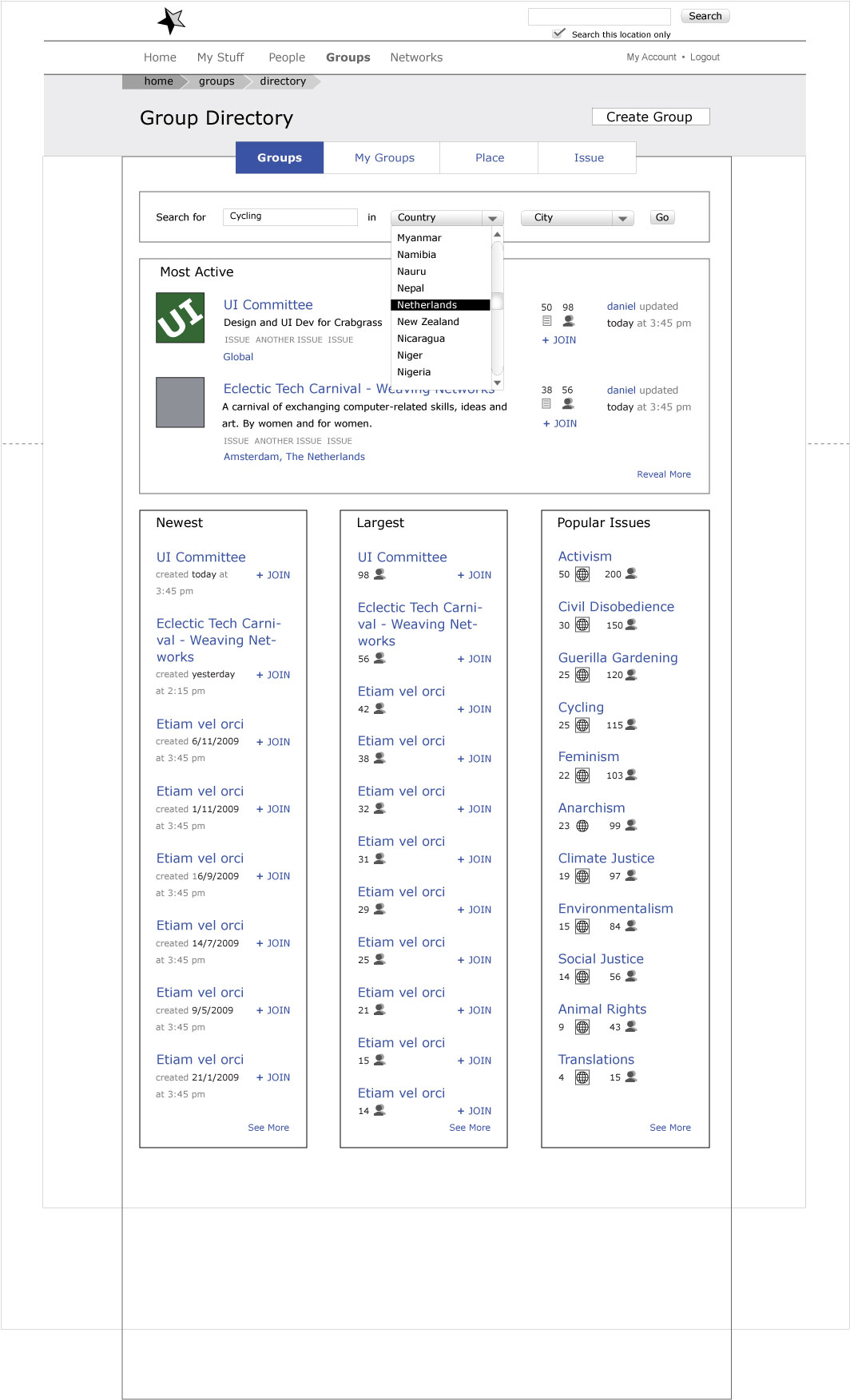
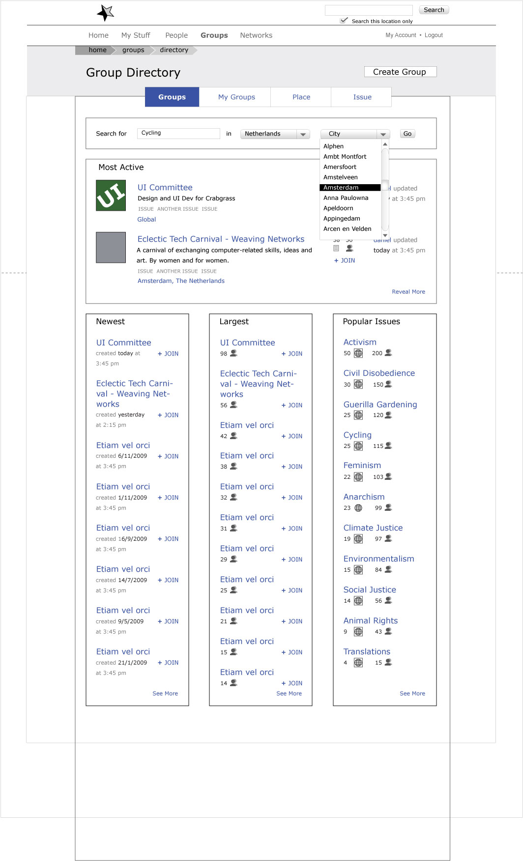
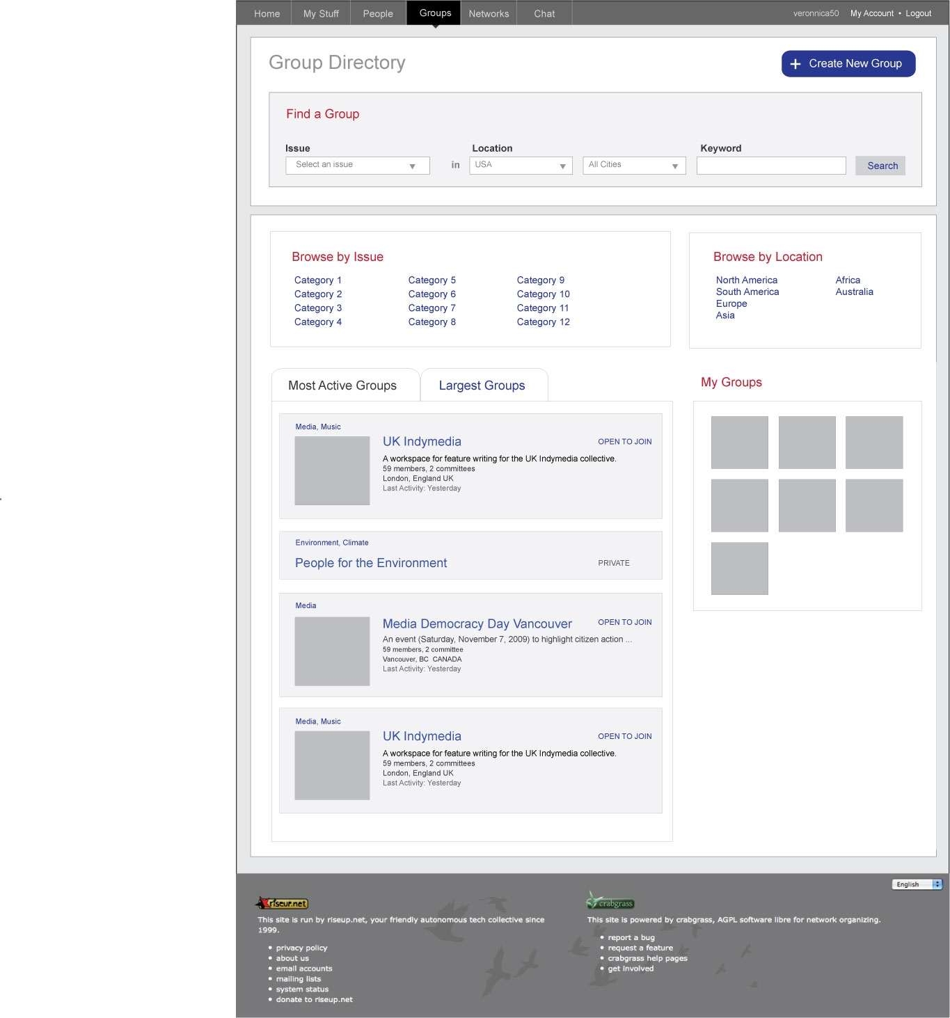
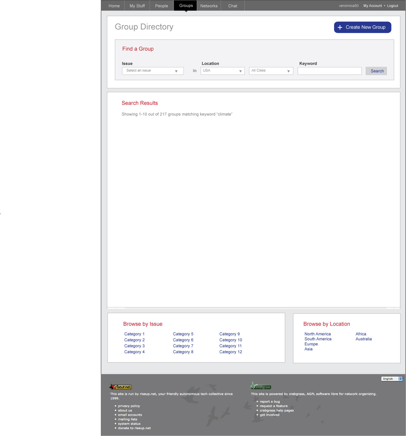
Four columns on the landing page, plus a way to filter. Ideally we could search for an issue and within a geographical region. Under the search area there is a link to All Groups, which will be an alphabetical list with committees revealed. The four columns in this round are, Most Active this Week, Popular Issues, Newest and Open to Join. Popular Issues is a tag cloud! Open to Join are all groups you are not a member of that are open for membership. The join and request links should open popup that allows instant joining or request sending!
Also in this wire is the joining a group story more elaborated. We should have four states: join group (for open groups), request membership (for groups that want more control over membership), request sent, already a member,
Dropdown lists vs auto complete is not yet decided upon, but we will probably go with drop downs, so I’ve made this wire with them.
| landing page |
 |
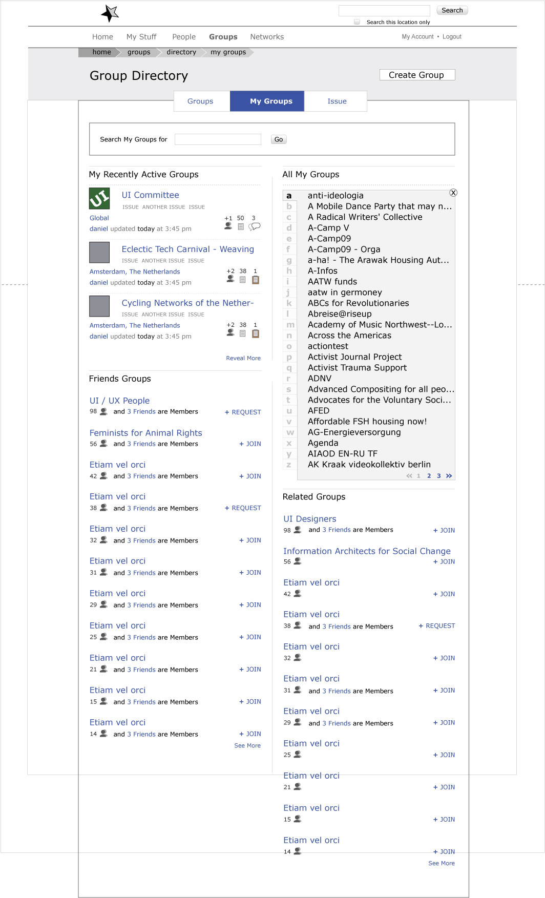
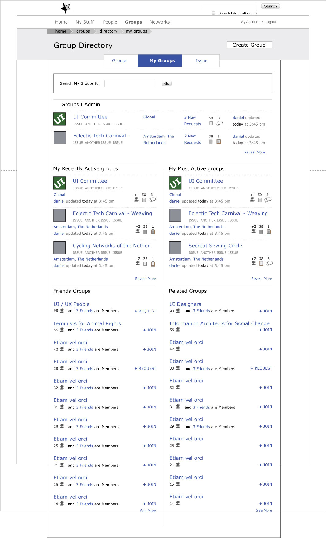
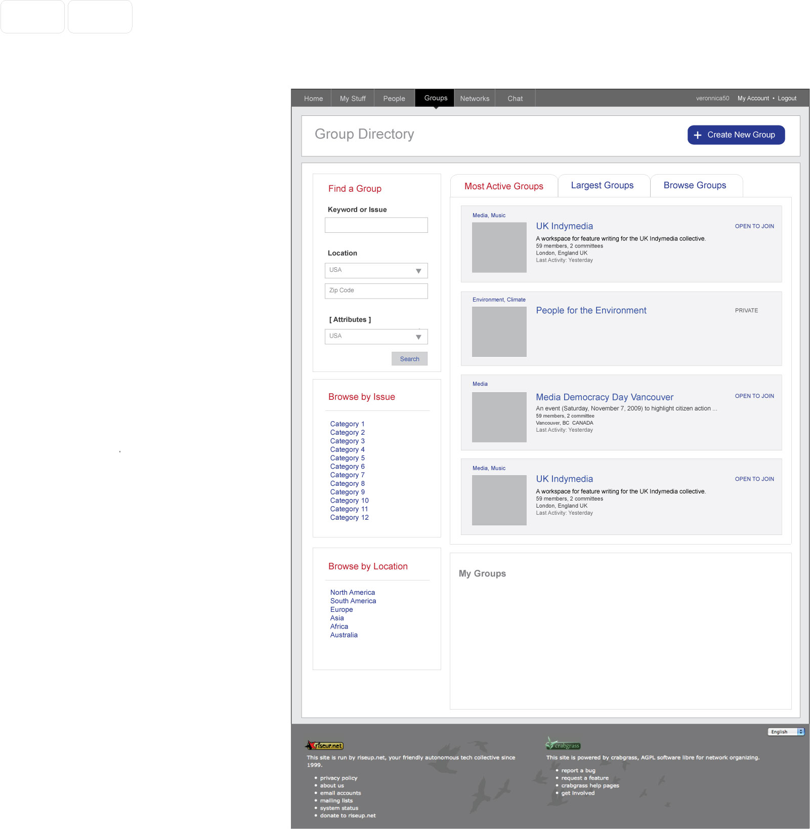
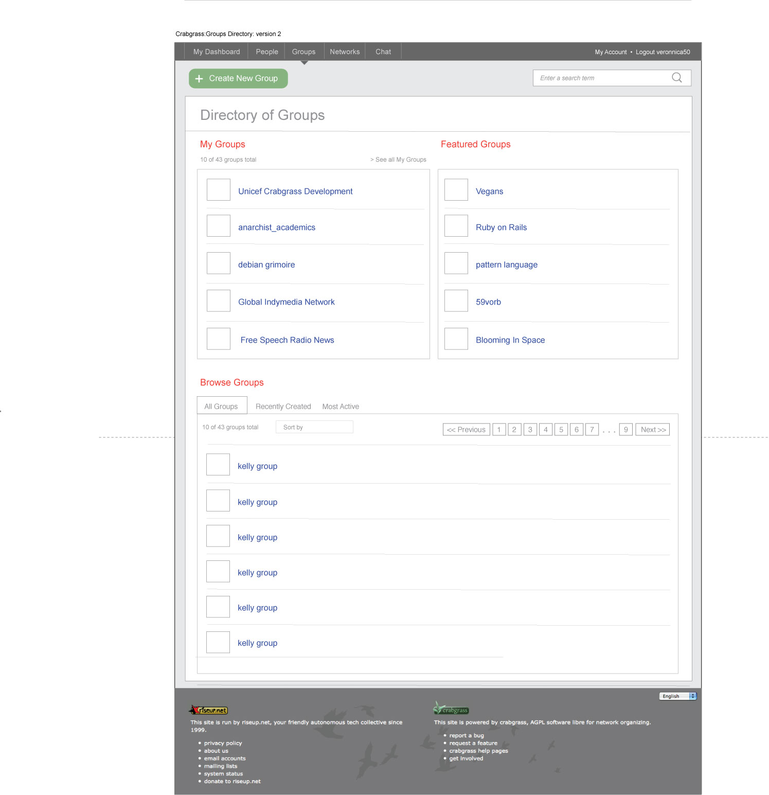
My Groups general
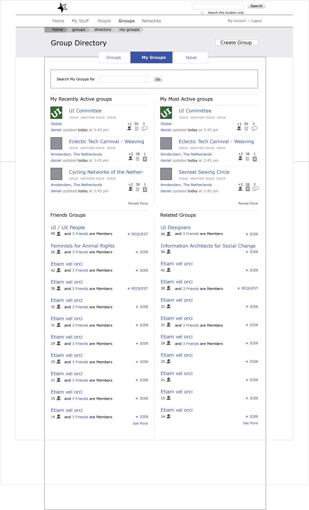
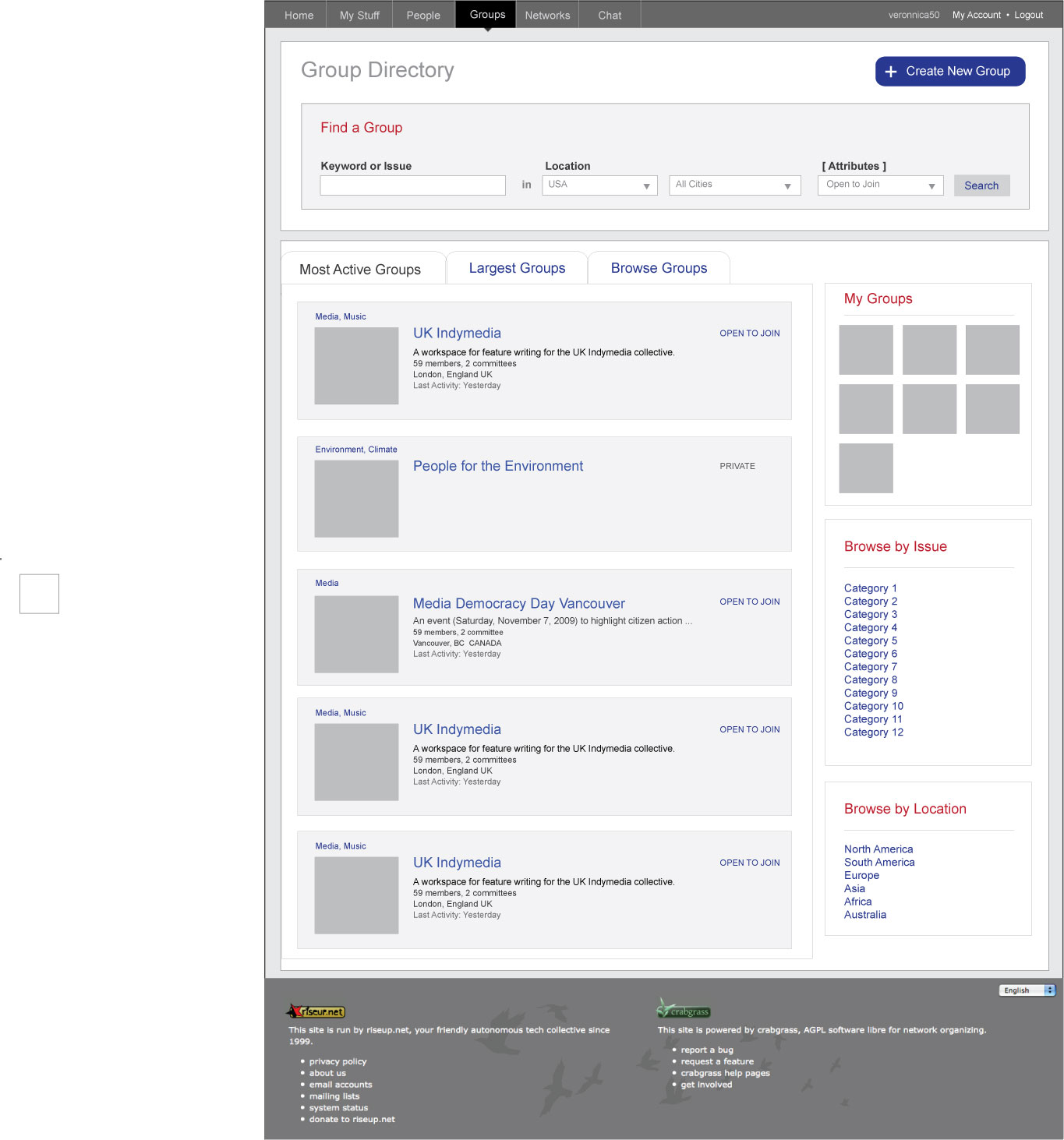
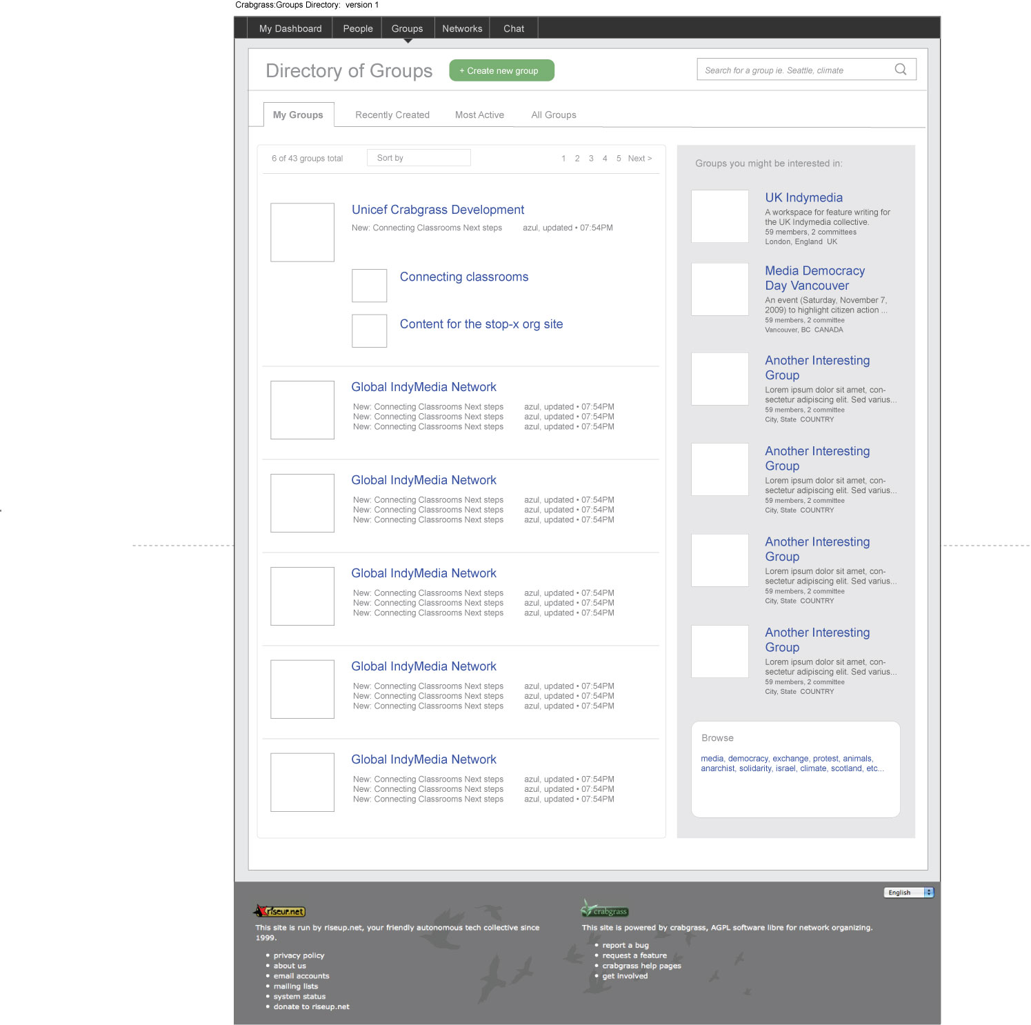
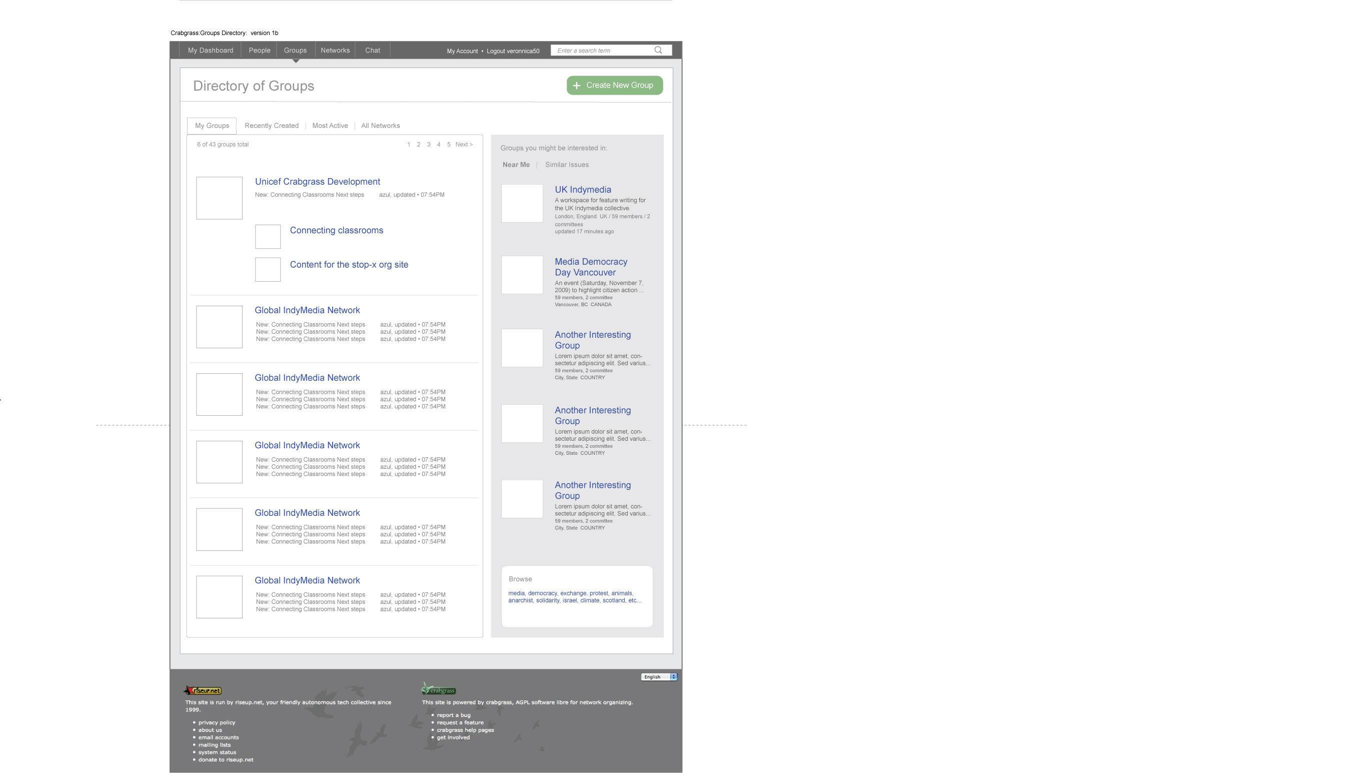
In My Groups we have decided to have a search function if technically possible, and four panels like the landing page. The four panels will be My Recently Active Groups, All My Groups, Friends Groups, Related Groups. Like the wires of rounds 3 and 4, My Recently Active Groups has the most meta data revealed.
There are two ways to have the “All My Groups” alphabetical list in one of the four panels. A vertical list or a rectangle of squares. Both are explored below.
My Groups (alphabetical list)
This one is the vertical list. The clickable area is staggered to both use the white space up, and give the uer an increased area to click in, making hitting the “target” link easier. The “arrows” or whatever other graphical button style we use, should change with roll over, but probably shouldn’t change size.
There is a link at the bottom of the list to view the whole list.
Once a letter has been clicked, a tabbed window opens, with the other letters below, greyed out, but still selectable. To get back to the whole list, you can also close the window, ajaxy style! There should also be next previous type links when the list is too long for the window.
| alphabet grouping as list | clicked on A |
 |
 |
My Groups (alphabetical squares)
Pretty much the same as the previous, only with letters displayed in a square. They are probably too big, but if we have them smaller, they should expand with rollover, like the iPhone keyboard. We need the hash in there for every group not starting with a letter. That should be in the above wire too…
| alphabet grouping as square | clicked on A |
 |
 |
Round 4
Rocking a two column layout:
Landing page with drop down search
| landing page – drop down lists | landing page – dd lists v2 with tag cloud |
 |
 |
Landing page with auto complete search
| landing page – autocomplete | landing page – autocompleted amsterdam |
 |
 |
myGroups
| myGroups | myGroups with admin |
 |
 |
Round 3
| group landing page | group landing page with drop down choose country | group landing page with drop down choose city | group landing page with drop down choose global |
 |
 |
 |
 |
| my groups | places |
 |
 |
Round 2
Round 2 version 1
| Version 1a | Version 1b | Version 1c |
 |
 |
 |
Round 2 version 2
| Version 2a | Version 2b | Version 2c |
 |
 |
 |
Round 2 version 3
| Version 3a | Version 3b | Version 3c |
 |
 |
 |
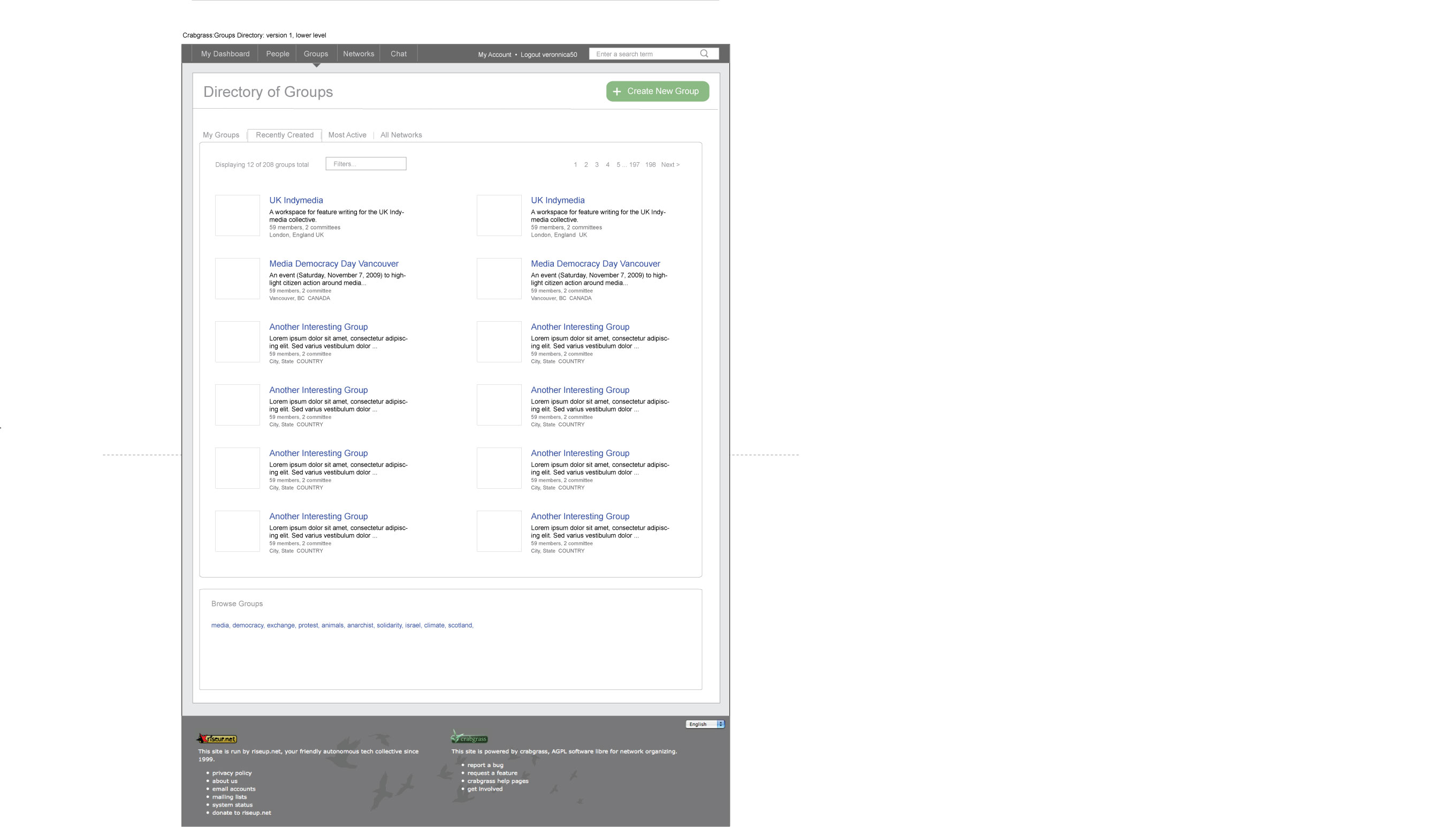
Round 1
Possible approaches to the Groups Directory screen. Takes into account conversations with Daniel and Elijah.
These wires emphasize the following user needs:
• ability to find groups more easily
• ability to scan group info quickly and broadly to determine if it’s one they might be interested
• suggested groups they might be interested in
Version 1
| Version 1 | Version 1b | Version 1 (lower level screen) |
 |
 |
 |
Version 2
| Version 2 | Version 2b |
 |
 |