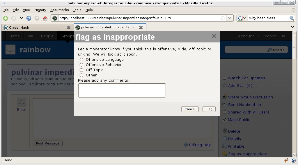
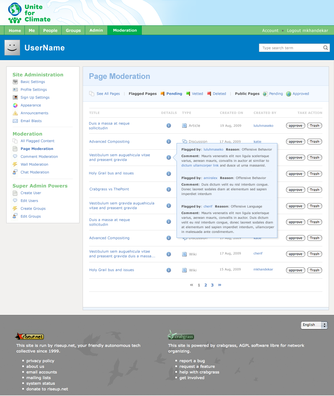
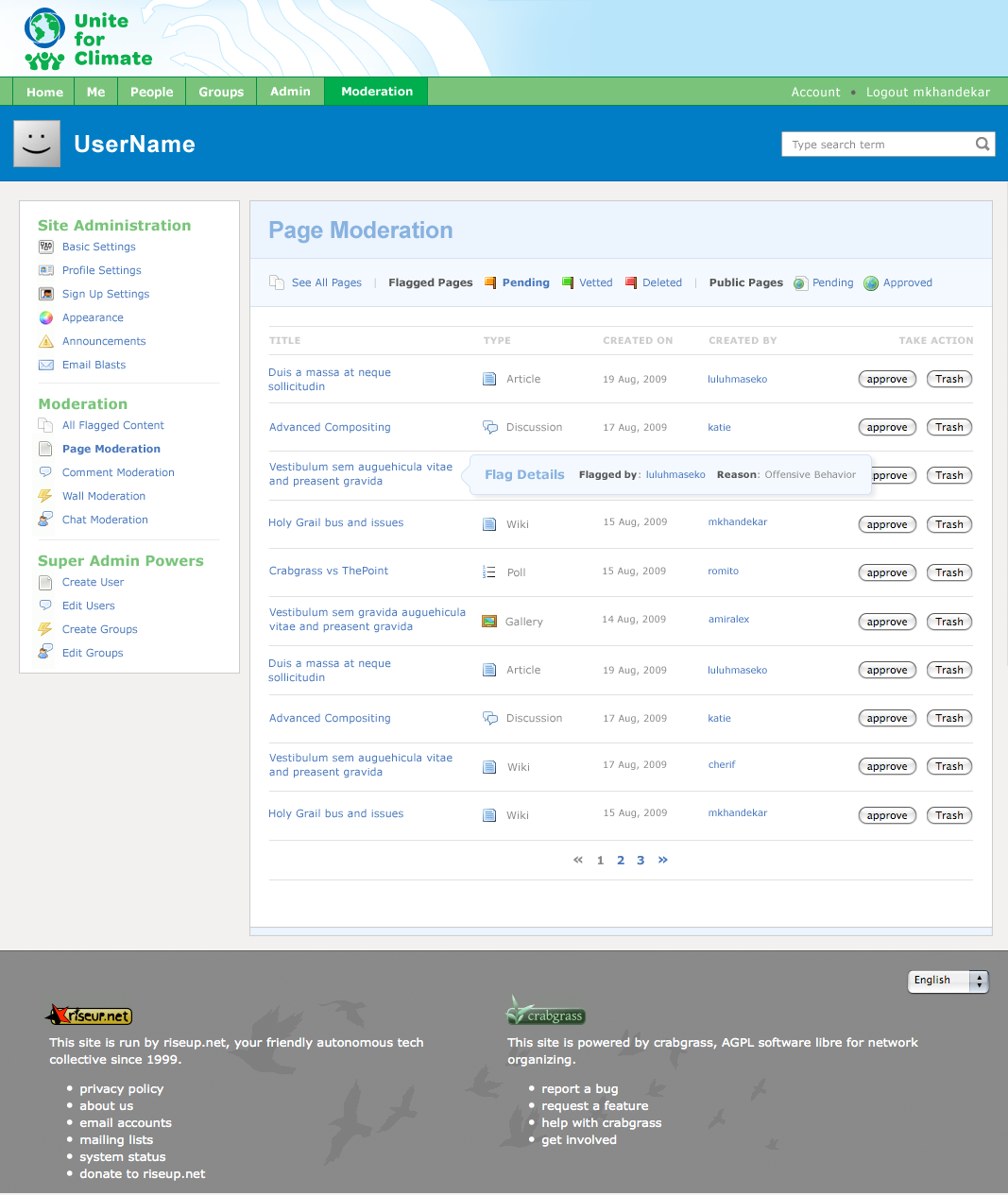
Pop Up
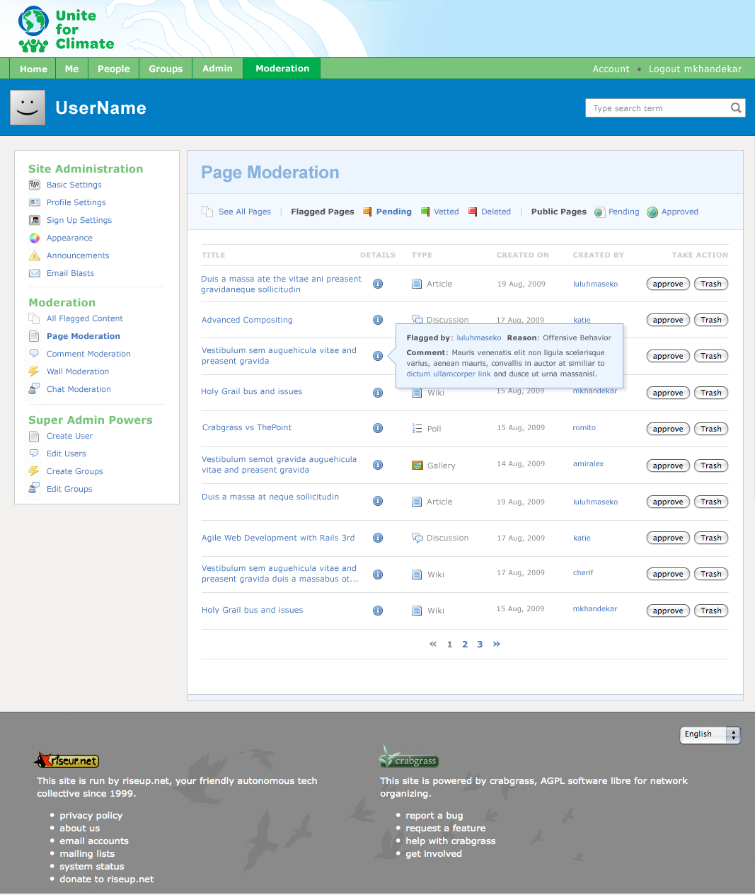
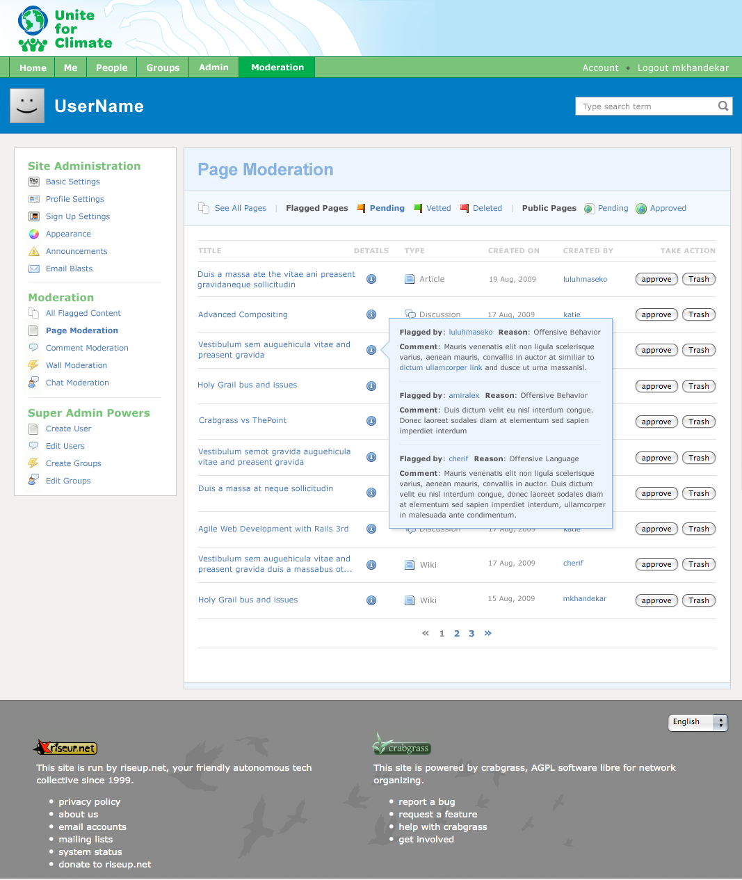
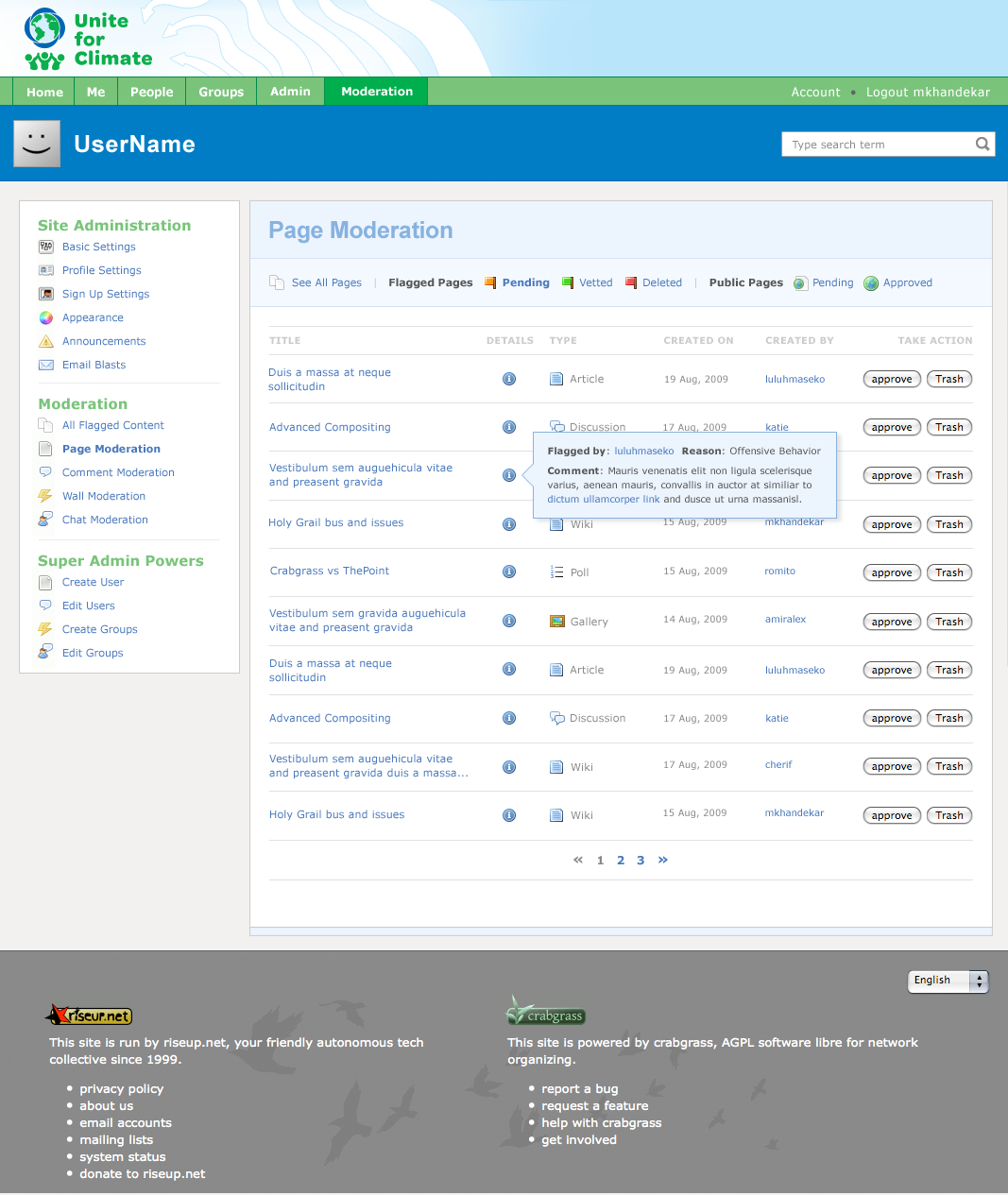
Moderation Panel Display
We are doing a hulu style rollover box
- reason for flagging
- who flagged
- comment
Round 3
only change: info icon closer to title
| 1 comment | 3 comments |
 |
 |
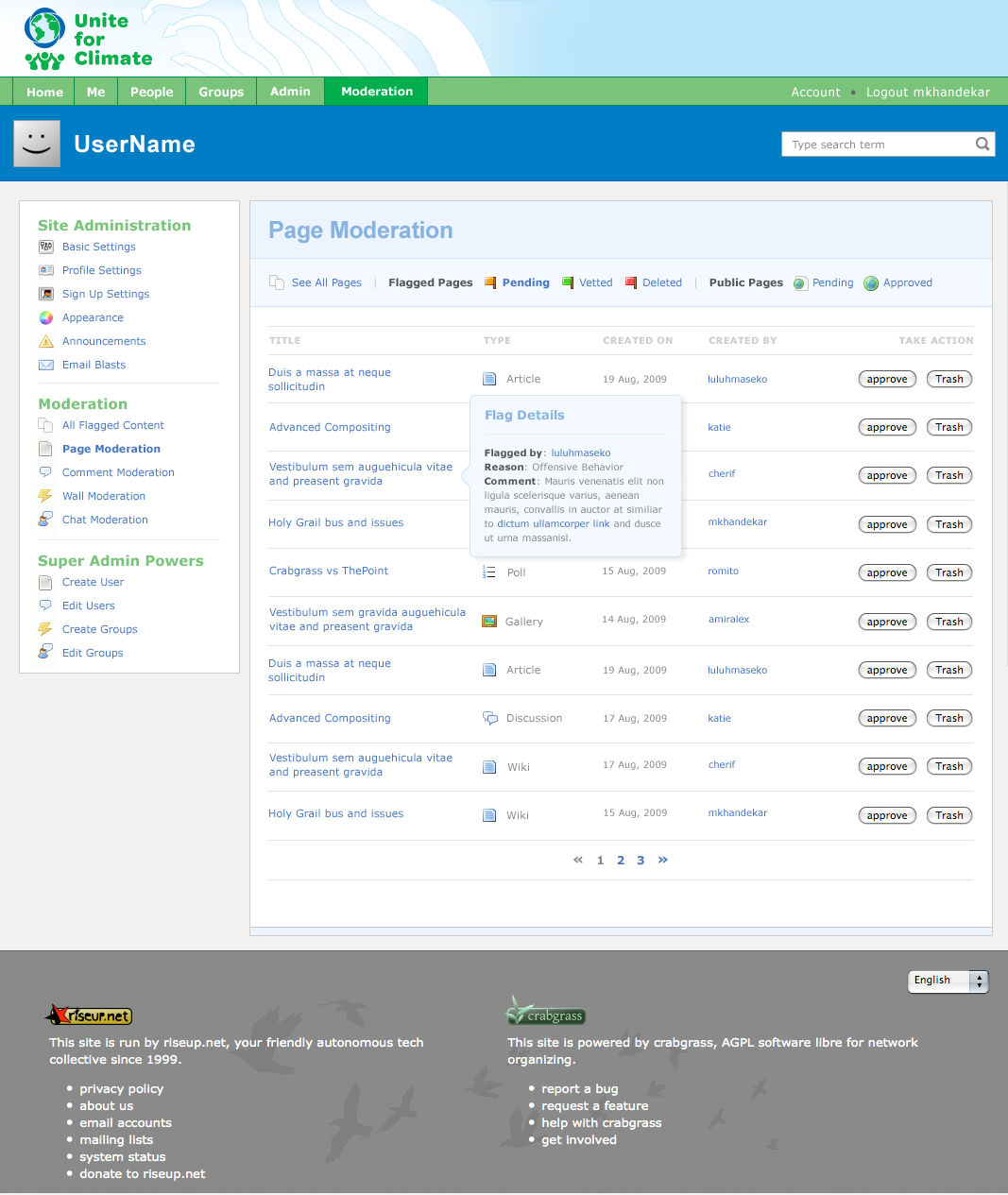
Round 2
| 1 comment | 3 comments |
 |
 |
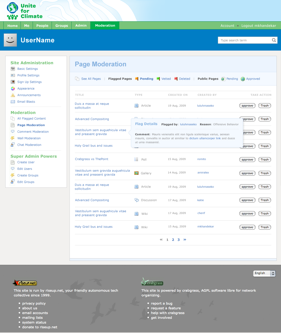
Round 1
| 1 (square) | 2 (rounded) | 3 (no comment) |
 |
 |
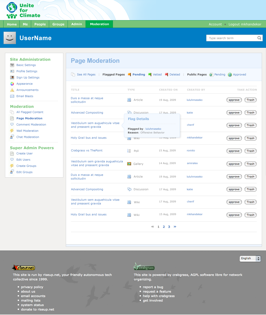 |
| 4 (bg colors mimic page header1) | 5 (bg colors mimic page header2) | 6 (long format) | 7 (long, no comment) |
 |
 |
 |
 |
|
meghana, nice, thanks for these. i talked to kclair, here are some comments.
|
|
|
agreed with daniel about moving “details” from the box to the listing. daniel: just don’t use firefox and you won’t see the rounded corners ;-) |
|
|
looking good! i like the icon in its own column. it should be closer aligned to the title. |
|
|
where can i get these icons? |
|
|
here you go: we.riseup.net/cgdev+ui/icons |
|