|
david and seth. is this something RD could work on, elijah is not able. dashboard improvements would be great, but more simply a new user landing page would make a huge difference and should be pretty easy to implement? In theory the Pizzagati review process starts today. Once a new user logs in they will go to a intro page that says these things WelcomeThe best thing to do as a new user is create a group or join a group. To join the user feedback group or another group, click on the group in the group directory. This will take you to the group page where you will see a “join group: link on the top right. Once part of a group you can create task lists, discussions, wikis, polls, and messages to communicate, collaborate, and get things done. Like any new platform you will need to familiarize yourself with the workflow. Here are some basic help pages and here are pages for user feedback. Dashboard is confusing. Some improvements that could help
|
|
|
i have been waylaid by various emergencies and i don’t know how i will get to any of this stuff. :( |
|
|
sad! well we all knew time was tight, now we need others to step up, funds to flow like the mighty rivers, and new crabgrass gurus minted. christ jesus. |
|
|
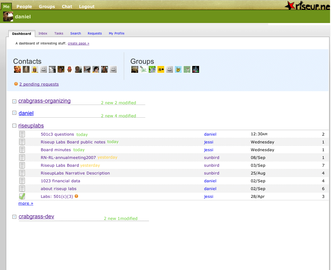
do you like how i made it so that the image above does obliterate the sidebar? it has a scrollbar for the extra width. sweet, if i do say so myself. |
|
|
o shit,thats nice…one problem is that when the window is not expanded wide enough, the image is blocking out the edit pencil. |
|
|
oh, true, i think the pencil can be given a z-index to make it stay above. shit, i just discovered that now the pencil is really hard to click. |
|
|
fixed |
|
|
the pencil is still hidden by the image and doesnt show unless i make the browser really wide. |
|
Better New User Flow (minimal)

This site is run by riseup.net, your friendly autonomous tech collective since 1999.

This site is powered by crabgrass, AGPL software libre for network organizing