the way i was thinking of it is this:
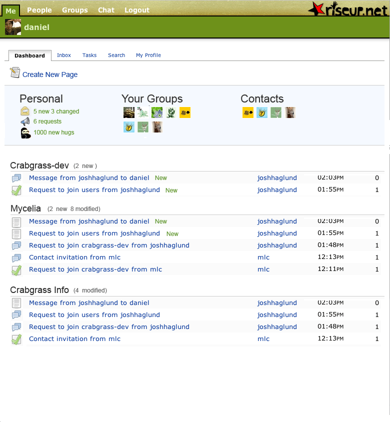
next to the group name is info on total new and total modified. this is useful because it might be a bigger amount then what is being displayed.
next to the pages that are new we have “new”. i dont think we need this for modified, it will be obvious after a day of use and will be less cluttered without. or we can have a dash of color instead of text to reduce clutter.