the problem
Susy uses percentage widths to control all the columns in the layout. This is pretty cool, because it makes the layout very elastic. The problem is that webkit and khtml based browsers (chrome, safari, konqueror), render percentage widths slightly differently than Gecko browsers.
Here is a sample susy layout in firefox (with reference grid shown in the background):
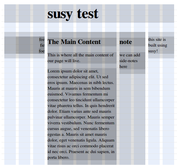
Looks nice!
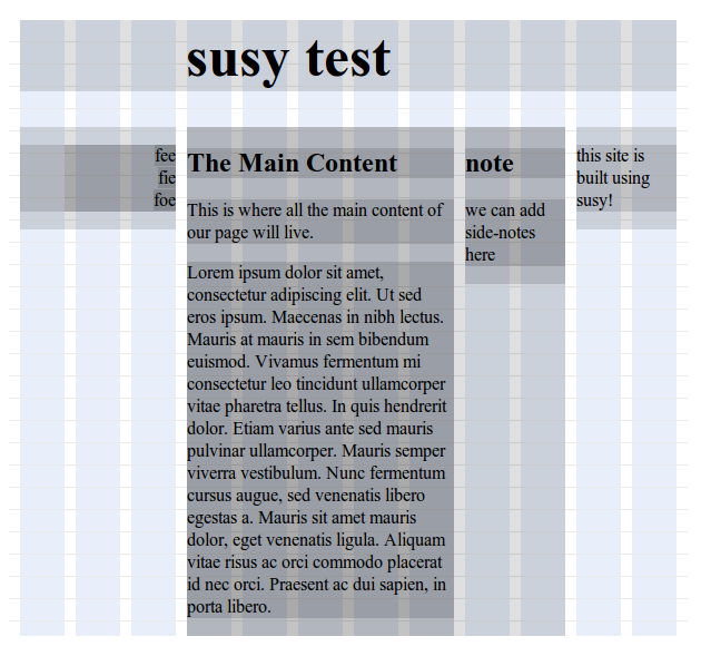
But here is the exact same css+html in chrome:

Ouch. This is more than a minor problem, because it can easily make one column 4 pixels off from what it should be.
But there is hope. If you nudge the width of the gutters and columns by a very small amount, then it renders pixel perfect in chrome/webkit:
The problem is, the minimum amount of nudge needed for this to work is more than the maximum amount of nudge that firefox will tolerate without starting to mess up the alignment of its columns.
(these screenshots were made using these haml and sass files.)
the solution
I wrote a patch to susy that will produce slightly different percentages for webkit browsers. For this to work, you need to detect webkit browsers and configure susy with a browser specific css selector of your choice.
(1) detect a webkit browser:
Here we add class webkit to body when javascript detects a webkit browser:
document.observe("dom:loaded", function() {
  if (/khtml|webkit/i.test(navigator.userAgent)) {$$('body').first().addClassName('webkit');}
  });
}
maybe this should be called before dom:loaded?
(2) in sass, define the webkit selector to match what javascript sets
$webkit-selector: "body.webkit";
@import "susy/susy";
(3) apply patch to compass-susy-plugin
apply this patch to susy or clone this repo to allow susy to nudge the widths for browsers that match $webkit-selector.
what does it do?
here is an example of the output:
h1 {
  margin-right: 1.639%;
  margin-left: 1.639%;
}
body.webkit h1 {
  margin-right: 1.68%;
  margin-left: 1.68%;
}
discussion
After I wrote this fix/hack, I discovered that the problem with webkit is known and different liquid/elastic css frameworks have different hacks to get around it. Susy does not yet have a solution for this problem.
I like the approach that I took with this patch: it is precomputed, flexible, and fairly straightforward. The one problem with the patch is that it will mess up if they ever change the way webkit renders columns to be more like gecko. When/if that happens, you can just disable the $webkit-selector.
|
The workaround sounds great. One thing I don’t quite understand yet is if column width are elastic and based on percentage we can never rely on their width, can we? So why would a few pixels of matter if the column width might vary by a factor of say 2 on different screens? |
|
|
thanks for posting this. if we go with this hack i think we need a clear place in /docs that details this and other hacks that might cause issues in the future when other systems are upgraded. do we have a place for that already? elijah, i’m also wondering if you are in touch with the susy community. if we use this i think its important that we push the hack upstream and have more eyes then our own on it for the future. also, probably unrelated, but i notice that the text in the two center columns are lower then the outside ones….by design? rah rah |
|
So why would a few pixels of matter if the column width might vary by a factor of say 2 on different screens? Because the spacing between columns can look totally messed up on webkit browsers, the vertical alignment of two elements that are supposed to be in the same column can be really off, and because I want the option of doing two columns that are flush and don’t have a gutter — which is only possible if the columns are really accurate. details this and other hacks that might cause issues in the future when other systems are upgraded I document religiously. elijah, i’m also wondering if you are in touch with the susy community. if we use this i think its important that we push the hack upstream and have more eyes then our own on it for the future. i issued a pull request to the upstream maintainers and wrote to the discussion group. so far, no response. there are a few problems with my hack: it works really well most of the time when the grid is specified in pixels, but less so for em based grids. i think this is just an adjustment issue. There is a bigger issue, in that even some pixel-based grids experience problems depending on how the grid is configured. The problem is that when you resize the screen, once in a while the rounding of all the columns will result in a total column width greater the 100%, which will cause the columns to break and show on multiple lines. With some work, I could probably figure out different nudge factors that work well with different grids. it is interesting to me that no one responded to my post to the discussion list. it is telling that i was the first person to comment on this major flaw in susy, and that no one else seems to care. The actual susy code is pretty simple. I don’t see why it needs to depend on compass. I might just fork susy and maintain a compass-free, webkit-compatible version. Which, I have sort-of started to do here. |
|