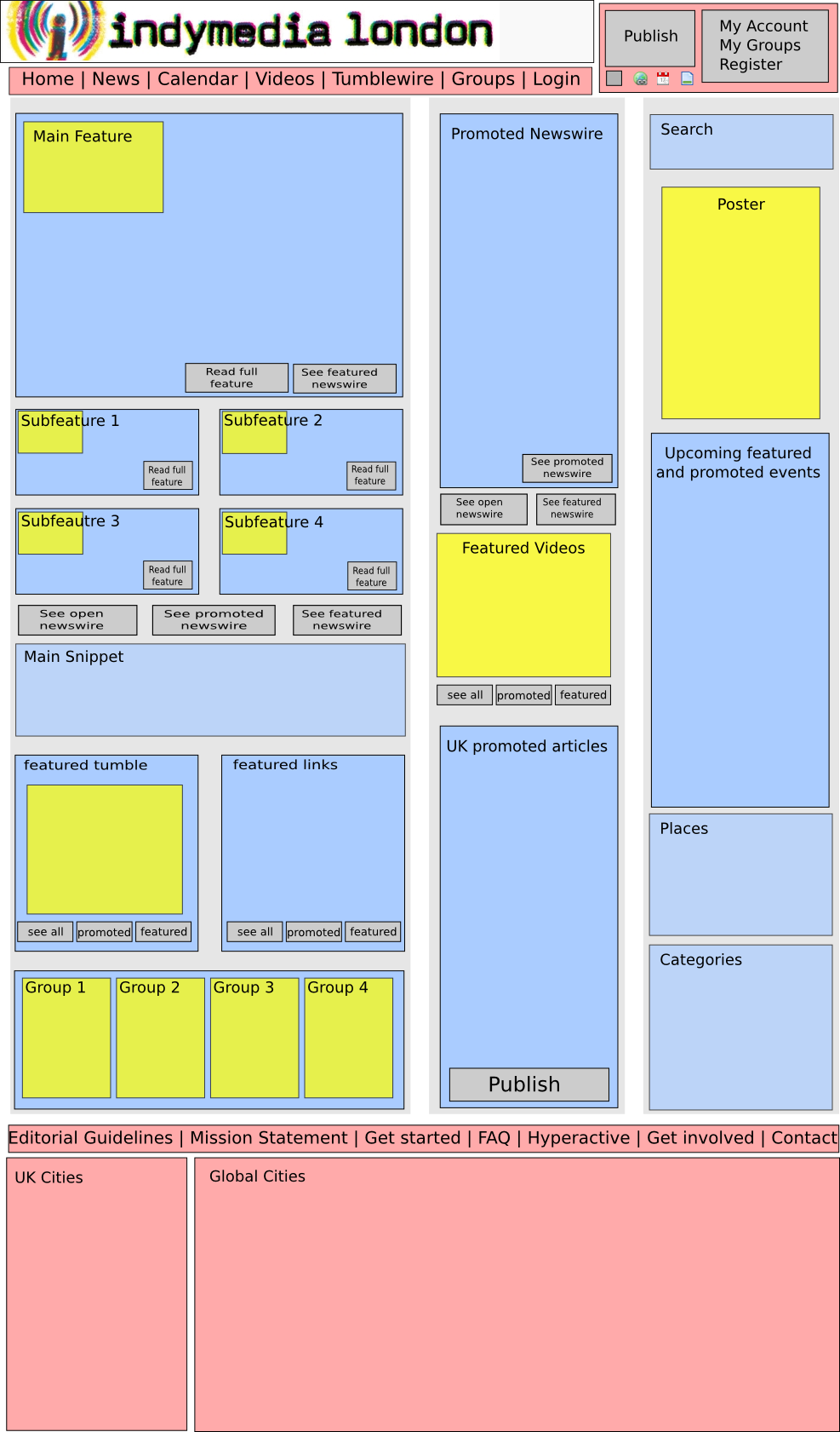
Wireframes
February 2010 – Publish Forms
The expalations with these frames got a bit extensive, so I moved it to the special place for re-thinking publish forms. Please look there if you got questions, as always I’d love some feedback.
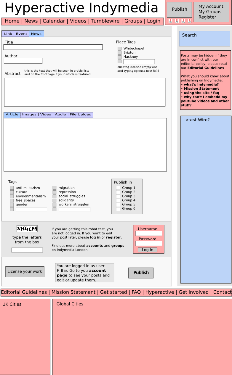
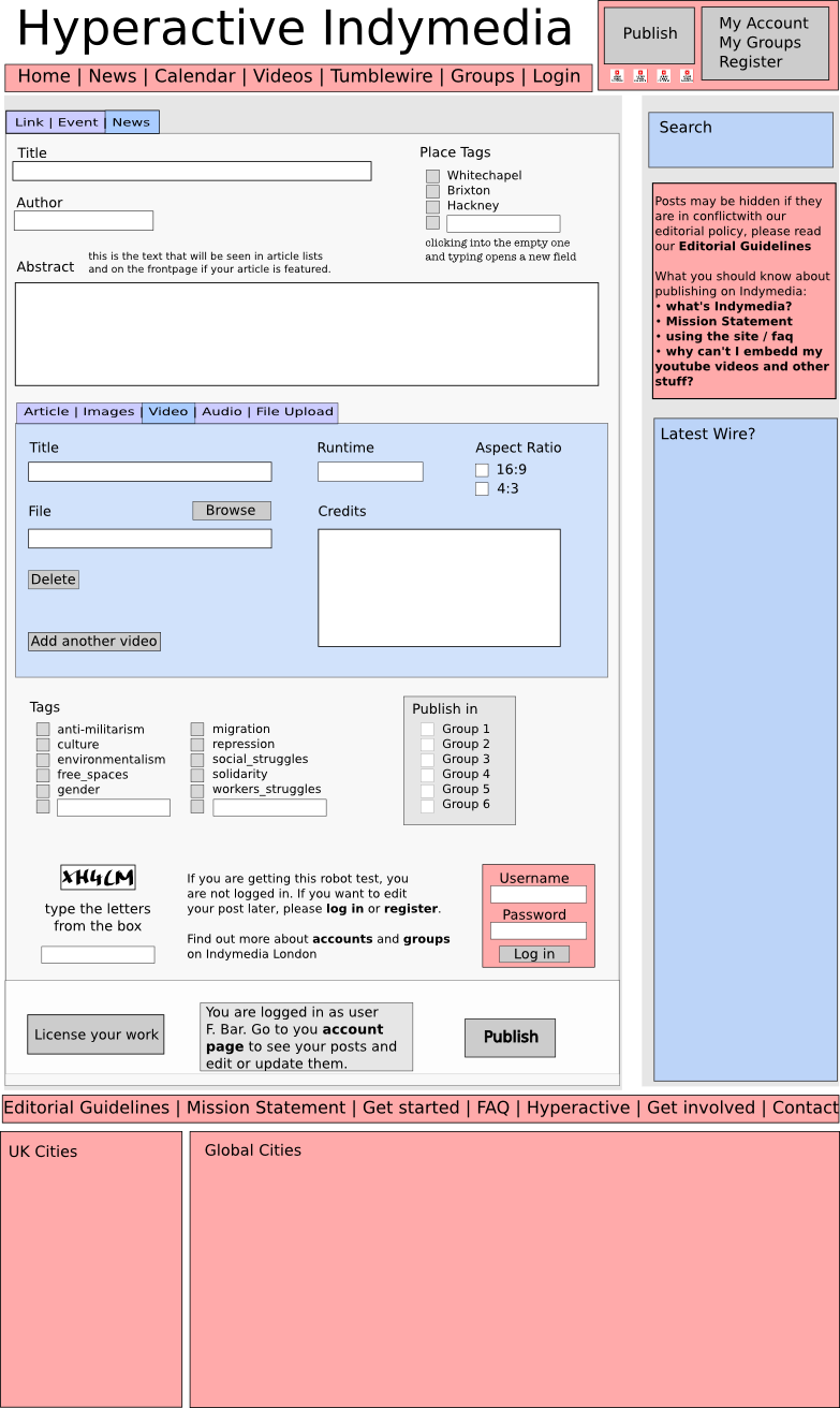
One publish form with different faces: Publish News
| Article | Images | Video | Audio | File Upload |
 |
 |
 |
maybe someone who knows more about audio should say what kinda fields they would want? |
yeah, dunno really, I guess this would be used for random stuff, so it’s hard to say |
| no specific changes, except the tab structure of main text body and media uploads. | Added a blurb about the re-ordering (cool feature that’s impossible to find) and added a description box. This comes from thinking that it might allow people to create kinda photo essays. Lots of people have been asking about the possibility of including pics at certain points in the text. Apparently we can’t do that, but we can have some slightly longer text in between pictures. I’d be using that feature for sure. |
Added a few fields that might be useful. The idea of asking people to tell us what aspect ratio the video is comes from out problems with ‘fake’ 16:9 (the ones with the wrong pixel aspect ratio) being displayed all squeezed up as 4:3. Question is if it’s technically possible to encode the video in what’s ticked? |
someone write here what fields they want |
any cool ideas? |
and the other publish forms:
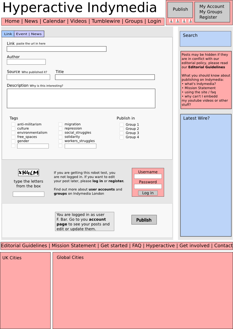
| Links/Other Media | Events |
 |
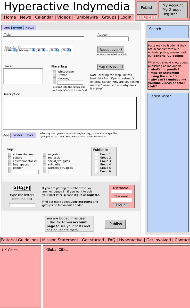 |
| major change is having a source field for giving the source and a link field fur the url. ideally this could be displayed in the title as ‘source: title’ (e.g. ‘Guardian: Chickpea is an Anarchist!’). Also included groups ticking. | There’s mostly a bit of rearranging here, and more foldup stuff. Like for the repeat event thing, I thought it could fold out the way the maps do or the moderation box. Saves space and makes the thing easier to look at and less crowded. Only two upload files, can’t really see what other files people would want, but of course this could be the same as the news publish form. |
January 2010 – Views
| Wirepages | Frontpage | Accountpage | Grouppage |
 |
 |
 |
 |
| Wire not only meaning the main newswire, but also potentially group wires, a user account’s wire or tag (category) wires | Obviously, this is the main page, but potentially, this could also the the place tag page, combined with nice url’s we could have almost local Imc’s (eg london.indymedia.org/whitechapel) | give an easier overview, obviously the pages that the buttons lead to need designing as well. | Groups can pick their primary and secondary wire, while all other type of posts are combined in the third wire. |
There was an idea to let users or groups ‘watch’ or ‘collect’ certain group’s or tags wires, as well as single posts, to put together the wire with stuff they are interested in. The how where what and why has never been discussed really.
London design meeting Oct 09 + Mockup Oct 09
| wire pages | group pages |
 |
 |
|
The account page is great – much clearer than before |
|
|
Ok, so as far as the acount page goes, I was about to embark on something similar to the prepublish page I’ve written for northern at northern-indymedia.org/publish_page What I wanted to do was rather than have all the information on display from the off, have similar buttons to the northern prepublish page(using the same background as the links to the different publish pages) and in the box below which currently has info on each item, when each button is clicked it will render the users articles/events/zines/whatever in that box. That way it would be clear and easily navigable. I would also like to move the main publish button into the banner (hovering over the top right) and make some nice login/create account buttons in the same style as either the publish or prepublish ones. Does this make sense or should I go ahead and make a mockup to show what I mean. I really like the idea of only displaying detailed info if the user actually wants to see it, and move to a more web 2.0 look. I think we really need a joint meeting of as many hyperactive users as possible (not just london) before deciding to commit code changes that are specific to the look/feel of the site into te main project, or we are going to end up with a load of messy forks and a difficult situation. I’m willing to commit to focusing on the look/feel of the code as opposed to looking at new features for the time being so let me know and lets get some kind of proper group set up dedicated to that perhaps? :-) JimDog |
|
|
coolio, what you write sounds good. It would still be interesting to see a mock up, or maybe we could just add a screenshot of thenorthern publish page? It would need a couple of additional buttons I guess, like groups. I was thinking to have the publish button to the right side of the banner too, plus an account/login button. Also I thought of having a large publish button and then just small icons for link, event, article and video as people have been saying it would be nice to be able to get to the publish forms directly. If it’s only the small buttons with no description, the risk that people mess up different kinds of postings isn’t too big either, but it would be convenient for regular users. not sure what you mean with proper group, think we should set up a design committee or something? but yeah, lets get this rocking! |
|
|
in case someone gets enthusiastic about making wireframes, but isn’t sure how to: I use inkscape (something like illustrator will be just as fine) and am happy to provide .svg’s if people want to move some boxes around and resize them. |
|
|
I like this design very much |
|
|
Jimdog: I really like the northern IMC publishing page. Draws a lot more attention than having oodles of text. Get a lot of comments from people who say that they don’t understand how the page works and I always ask them if they’re read the text (and usually they haven’t, because people are impatient). Mara/Jimdog: I like the idea of the publish button being in the banner, especially with account login, that’s a pretty standard place for it to live, no? (An aside, might be useful to have a warning/reminder to get people to log in if they want access to their information.) Mara: really like the wireframe 4 (of 8) (which is also 6 of 8, yes?) And because I’m biased, perhaps one day there can be a little box for audio (sort of like the video/poster area) that aggregates the last 2-3 clips uploaded or something. :D These are comments off the top of my head. I’m happy to be part of a design committee but perhaps it would be good to hear what kind of feedback you want specifically etc.etc. if that makes sense. Later dudes. -chickpea |
|
|
i like the audio player idea, we really need to do more nice things for that. plus an audio player fits just about anywhere! uh, no idea what you mean by 4 or 6 of 8, but thanks. try the names? … we should also think of providing something nice for photo, photos are kinda there, but not dealt with very well. jimdog was working on a slideshow display thingy (so you see photos as thumbnails and cen see large ones in a fancy slideshow), bt in a way audio and photo need a bit of love in the navigation etc as well. |
|
|
Sorry I meant the ‘wirepage’ and the ‘grouppage’ (dunno where I found the numbers) – when I say ‘I like’ it means I like the layout of the information as well as the idea to utilise the grouppages more – not only with their posts/articles but also tag-related articles. Would it be feasible and/or interesting to have tag pages – so, say, everything published under ‘whitechapel’ or ‘brixton’ would also show up on a directory london.indymedia.org/brixton – mara I think you were saying something about that in addition to group pages, right? Dunno if that’s just replicating the same information… Slideshow is a cool idea for integrating photos more. All sorts of news sites have those slideshows – a week in 60 seconds I think is the BBC news online one. Is it possible for all pics to be published on a london.indymedia.org/pictures page? (Though the problem is that hyperactive will start to get quite bulky and stuff…is that trying to be avoided?) I’ll have a think more about the audio. At the moment I’d really like to find a way to have audio be sorted by tags in the same way, but not have it be a multi click process to get what you want. So somehow enter a search query and it populates audio into a playlist. That would be super ideal. I haven’t really looked very widely for this on other news sites yet. I’m not sure this is going to make any sense though and I also don’t know if it is actually possible to do in the geek sense. I guess I will find out soon! Enough rambling questions and suggestions from me! Later dudes. |
|
|
nice one, i like to see this kicking off a bit of discussion. as for the tag thing: yeah, especially for the place tags, it would be nice to show them not in a huge unsorted wire, but maybe something like the front page. for topical tags, the frontpage design could work, or just the improved wire page (easier overview and nicer with less content) for pictures: maqui was saying very early on that it would be nice to have something like a full gallery, the way imc barcelona has it (http://barcelona.indymedia.org/media/index.php) even better if the gallery can be seen by tag or by date. in a way i guess all the media should have the same tags as the articles they are published under, and be made accessible in some media type form. i think we should be thinking about organising the whole site more in a tab kinda way. like different tabs for different type of posting as well as for different type of media. not sure how that would look exaclty. |
|
|
I just wrote a really long response and then closed the browser window. Super duper lame. But I will encapsulate my response in one line: “Mara you are awesome.” I will work on recreating my epic comment later. |
|
|
Yo! All this work is awesome! Just to say thanks to everyone, and although i’ve got to give a much closer look to it all to be a bit more constructive in terms of ideas and comments, so far what i’ve seen here is impressive. Just wanted to say that :-) |
|