Table Layout 1 is the clearest, but takes up room. Table layout 2 could be nice if the bottom text could be formatted better. Table layout 3 is just lame! But might have uses for some other scenario as yet unthought of :-)
Table layout 1
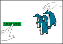 |
Create a Group – Create a Group space for your activities |
 |
Find a Group – Browse Groups |
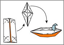 |
Create Content – Create Content to Share with Others |
Table layout 2
| Create a Group | Find a Group | Create Content |
|---|---|---|
 |
 |
 |
| Create a Group space for your activities |
Browse Groups | Create Content to Share with Others |
Table layout 3
 |
Create a Group |
| Create a Group space for your activities | |
 |
Find a Group |
| Browse Groups | |
 |
Create Content |
| Create Content to Share with Others |
|
Website usability is improved by TryMyUI Usability Testing Services. Watch user-generated user testing videos lewdle and have real users test my website. your product is so great |
|
|
With curiosity guiding me, I ventured into unexplored territories, eager to uncover new perspectives and ideas. slope game |
|

