Design: Gallery

419 KB, JPEG Image (.jpg)
Preview: small, medium, large
 

Initial Comments

  • i like the wingless sidebar
  • sidebar should be distinct color from the title bar. The sidebar should be more in the background, the main column more the focus.
  • is this a view while browsing through the gallery? if so it needs arrow to nav through
  • what should the initial gallery page look like? currently (on we.riseup) we have a big photo of the album color and then smaller images for the rest.
  • i dont think pages need to display the leave group or edit group links.
  • i like combining groups and people into “This Gallery Belongs To”
  • what is update?
  • i think we can get rid of past versions, and other format links – these are good on asset pages, not within galleries.
  • it would be good if we can see our way to one row of horizontal links under the nav bar. currently there are three.


looks great. some comments:

  • what do some menus look like when selected?
  • what do side navigation links look like when selected?
  • it would be much easier to not do (x) for the tags (simply because it works differently now)
  • it would be much easier to keep “groups” and “users” for the page’s population, rather than ‘this xxx belongs to’.


just my personal opinion:

  • i liked alternating colors in comments.
  • i think background grey should stop at the banner, but not stop at the footer, and wrap around the footer to the other side.
  • i think the extra gap on the left side can then be eliminated.
  • i think the titlebox should stand out more, maybe be a darker color or a different shape.


Some rapid comments since I am new to this project..

First, I must say Bravo! to the designer. The interface is pretty clean, legible and seems evolutive.

- The title of the Action (Stop Xploitation) seems too much outside of the page… It seems there’s no link between the title and the page
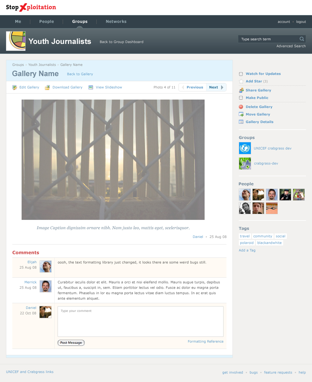
-The first element the users will see is “Youth Journalist”. I guess with a colorful icon, that emphasizes this idea. Then, the user will see the button contribute. That’s a good point… if this is what you want.
- why is there a left margin in that page and a right margin in the dashboard page?
- The darker top menu (wireframe) is probably more legible.
- Depending of what you want the user to focus… if the comments are important, they should be more contrasted, but not too much.
- I don’t see any navigation for the gallery?
- “Photo 4 to 11” is more legible than the title. Why in italic?
- vertical alignment is not accurate between “stop xploitation”, Me, youth journalist logo, Gallery name, Photos 4 to 11
- the different boxes in the right menu could be better separated


why is there a left margin in that page and a right margin in the dashboard page?

the idea is to have a different look for content pages to set them apart.


digging this version, not much to say right now.

  • the title box and the nav bar should be different colors. but, we can start cutting this up soon, a deal with color later.
  • right side bar should move down, i think currently it compete with the title of the page.


Thank you for the comments. I’ve uploaded the psd.
If you just want to view it, please open version 5 (light nav bar) or version 6 (dark nav bar).


Looking Good

  • previous next bar could be smaller
  • this is the view you have when you are flipping through the gallery. there needs to be a way to get back to the gallery view that shows all the thumbnails.
  • i think the initial page you get to when going to a gallery should simply be equal sized thumbnails, with the gallery cover highlighted, but not enlarged. we’ll need to get to a mockup of that.


Looking good.

Other things gallery

  • this is what it looks like when you are flipping through the gallery.
  • there should be a way to return to the view when you first get to the gallery. (currently that is between previous, and next)
  • we will also need to see what it looks like when you go to the gallery, we talked about having it similar in concept to we.riseup, with a big image that is the album color (the first photo by default) and then to the right a bunch of smaller images.
 
 
  1. what happens when the page title gets longer? (ie “Gallery Name”)
  2. i don’t know if unicef wants this feature, but currently we indicate what type of access a user has by putting an icon by their name. if instead there are only icons for people, how do we indicate their access level?


meghana addressed (1) in version 12.

for (2) we can easily revert back to how it is now, but i like the layout on the mockup. If we have time it would be cool to make it so the icons appears on the image, kinda the way they do when you are editing a photo in the gallery. you would roll over the image to have the name show up. what would this take?