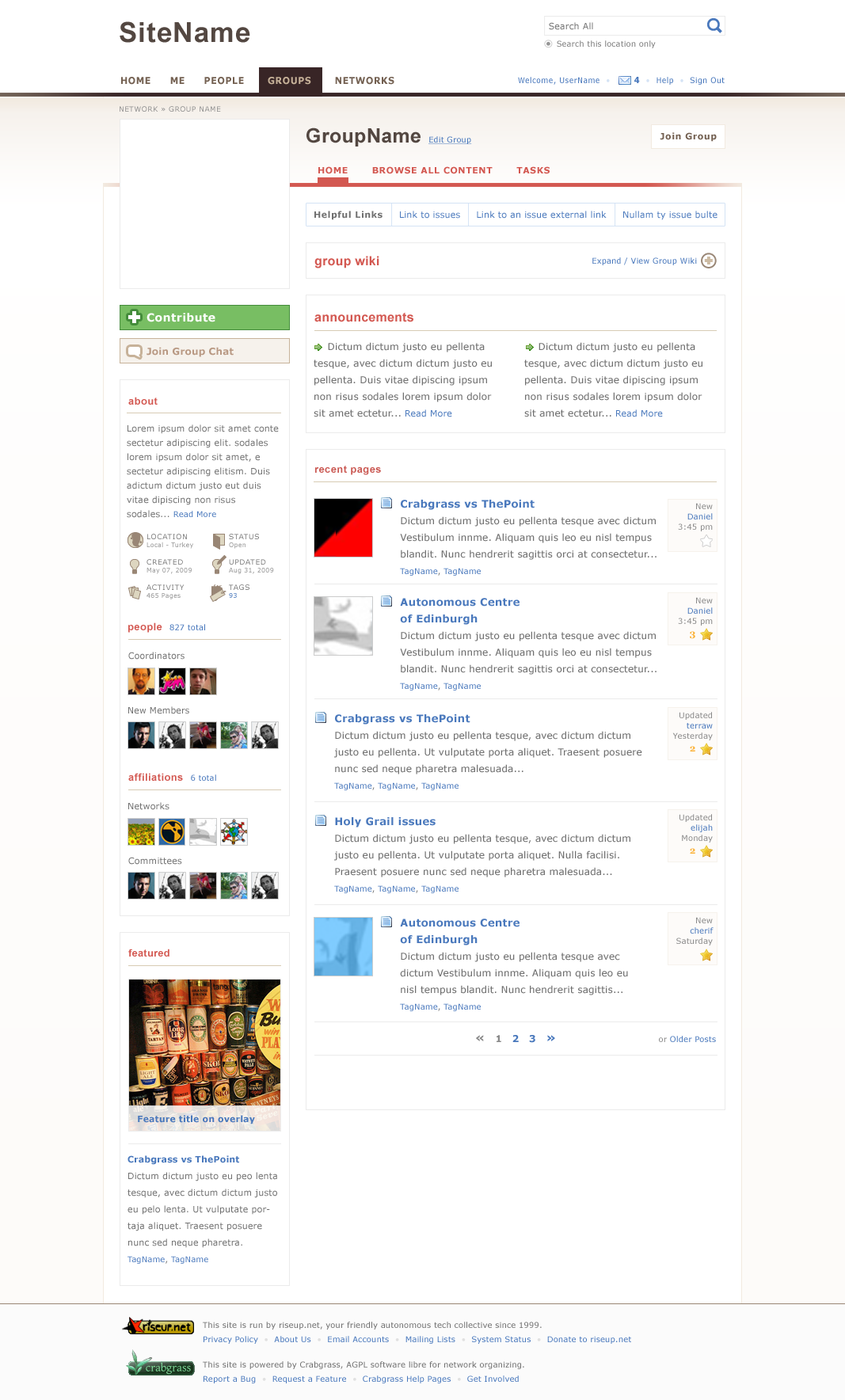
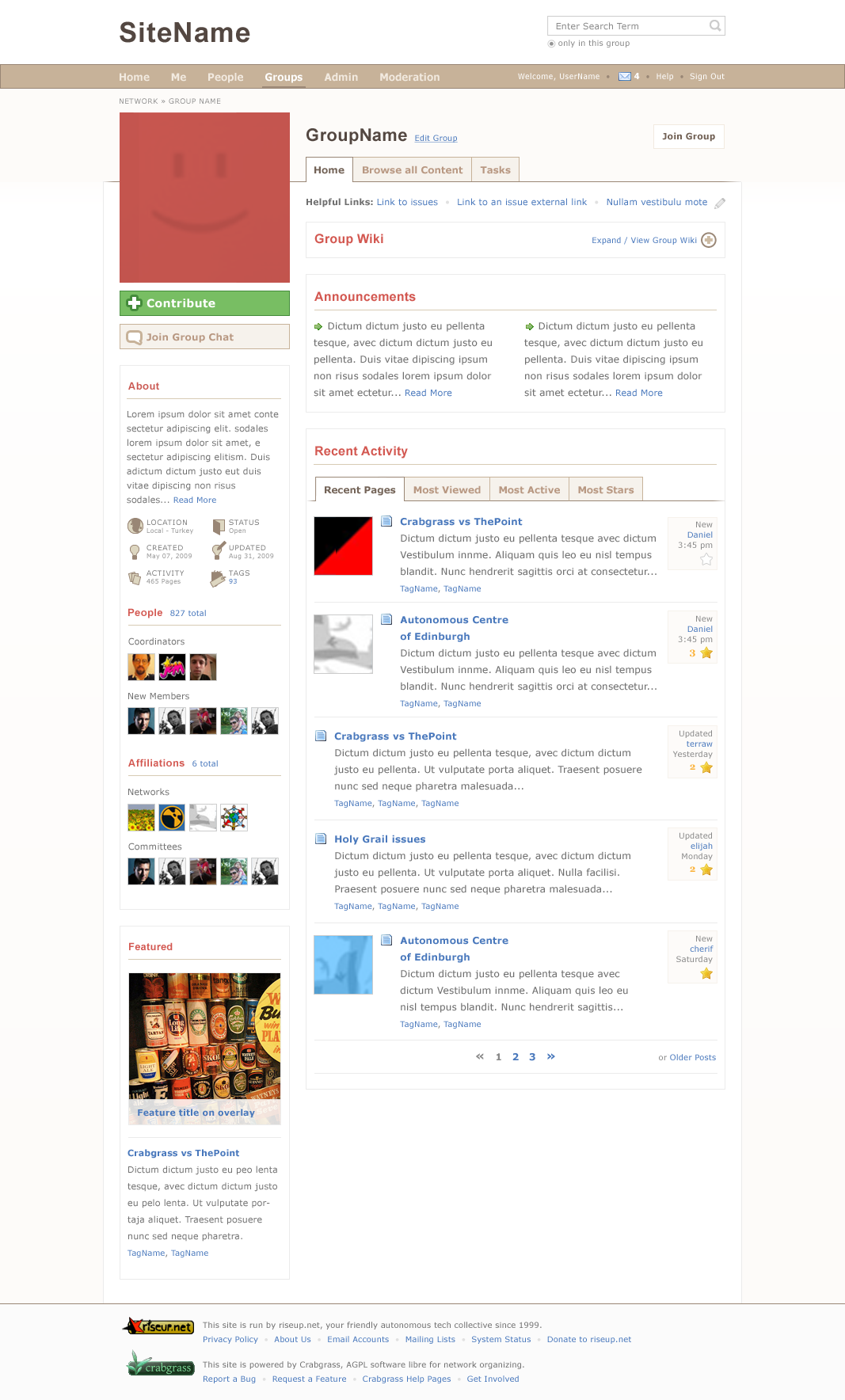
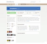
Round 6
we.riseup.net/assets/17742/GroupHome.ps...
Download PSD —> we.riseup.net/assets/17735/GroupHome.ps...
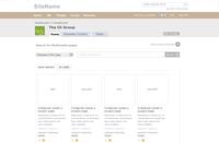
h1. Round 5
| new feeds |
 |
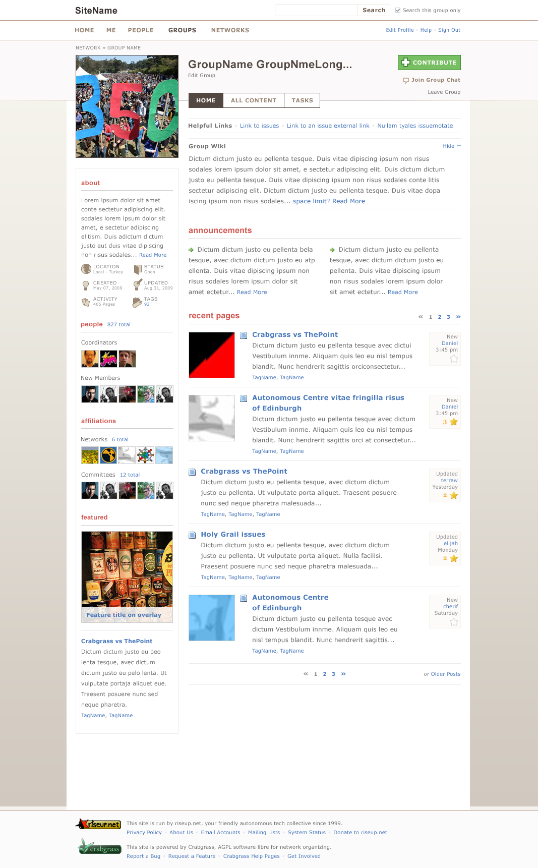
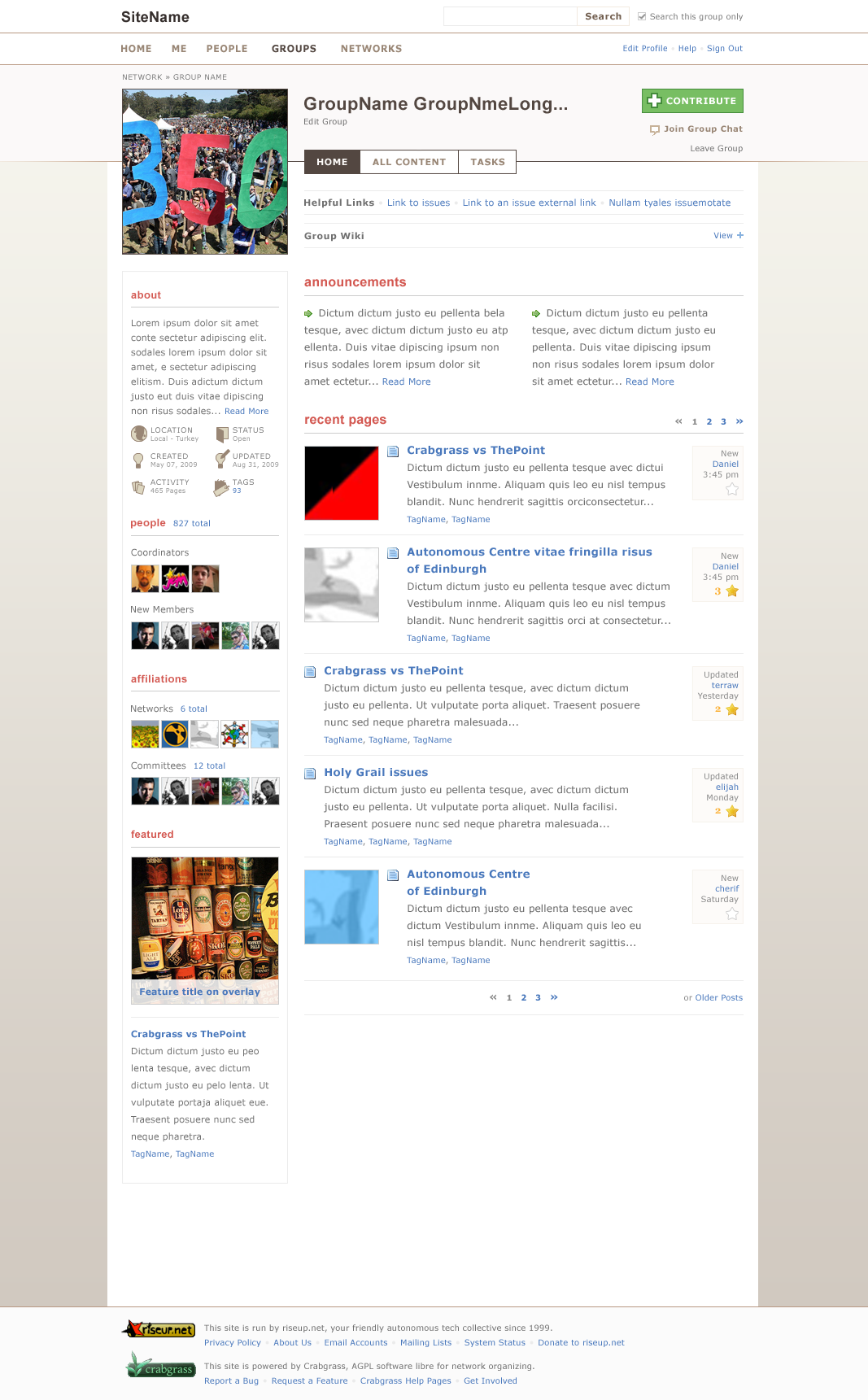
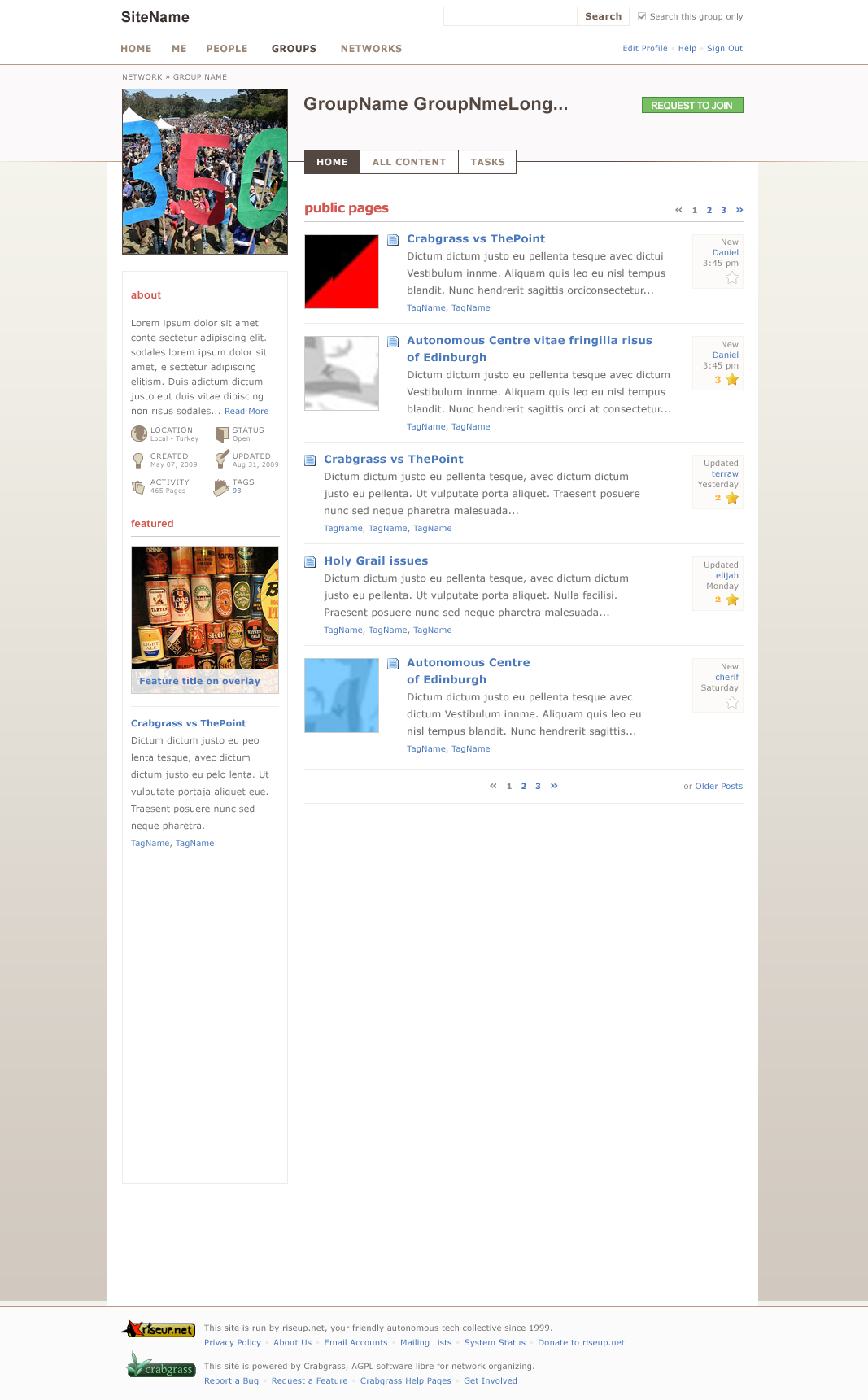
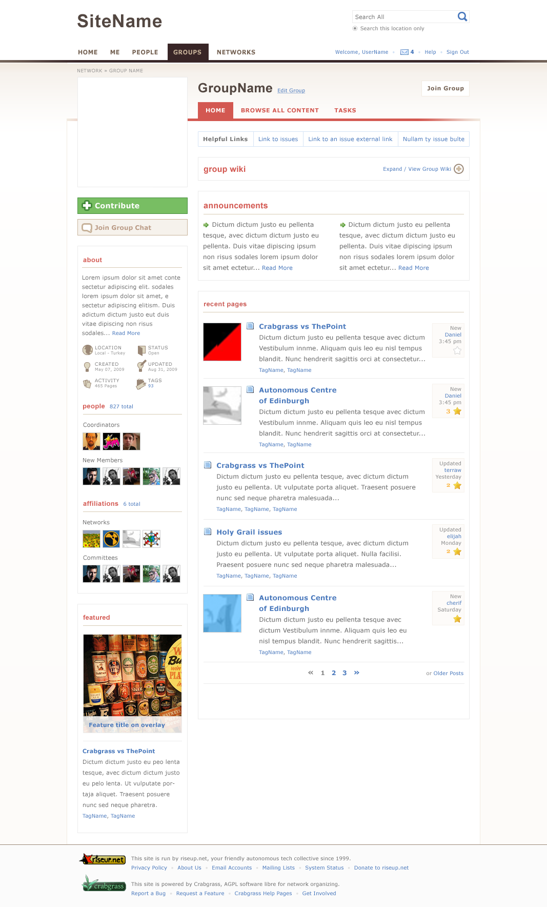
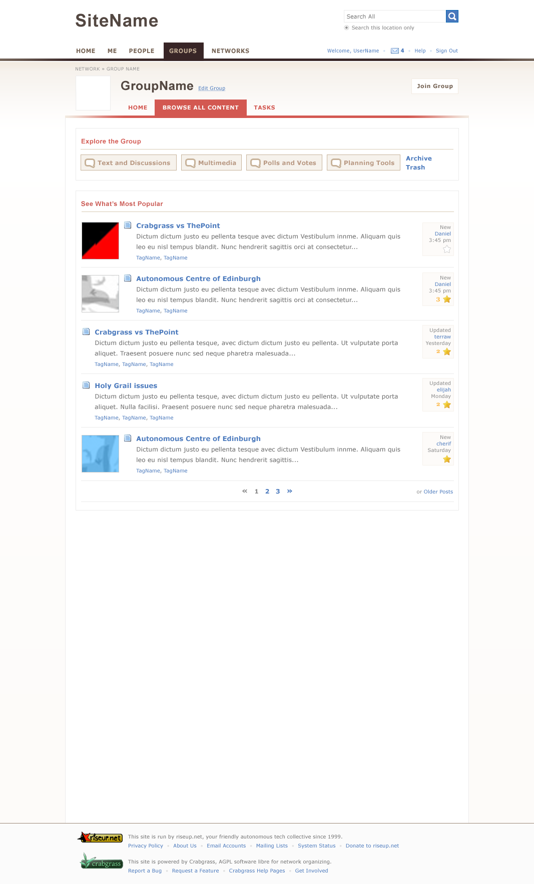
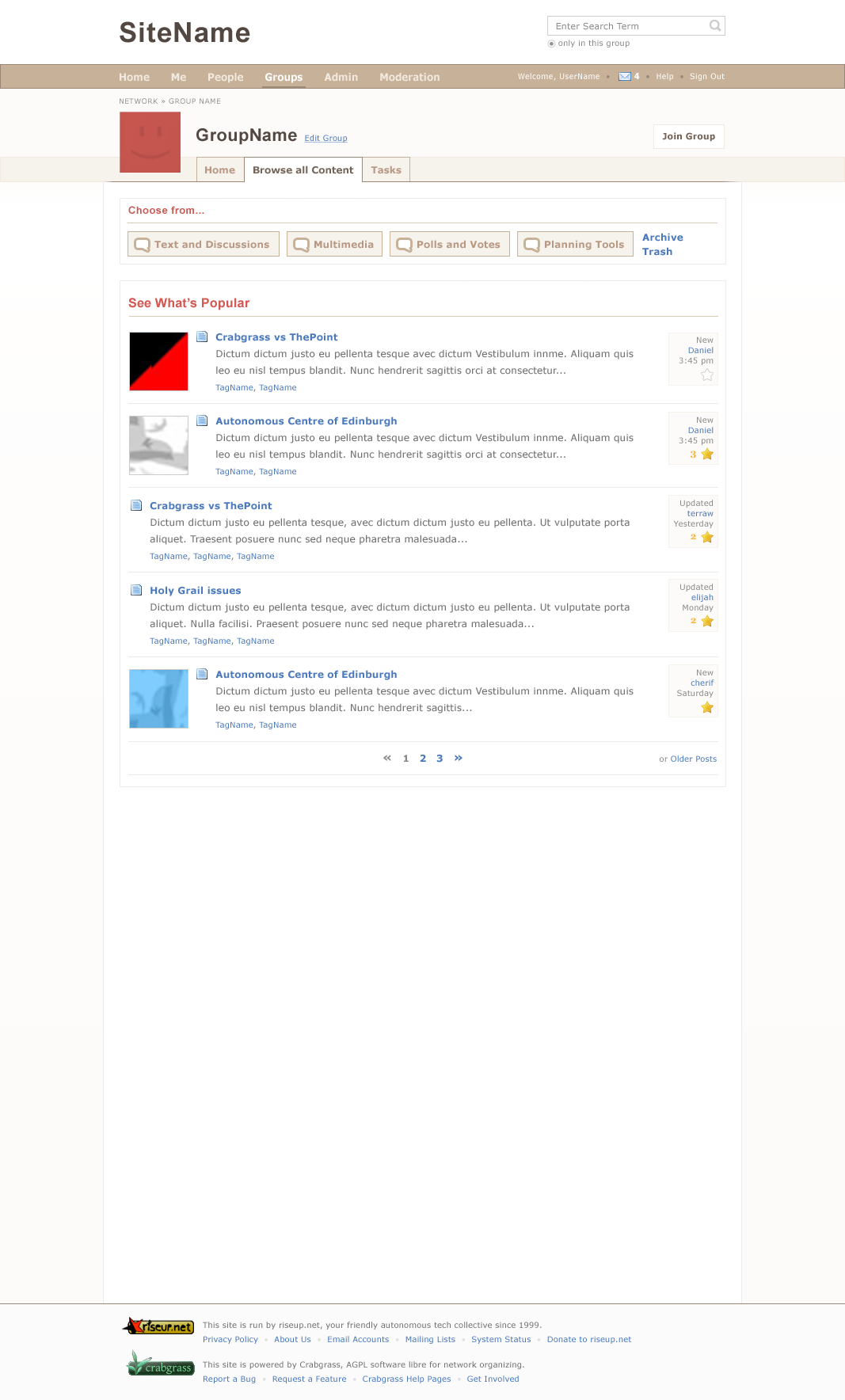
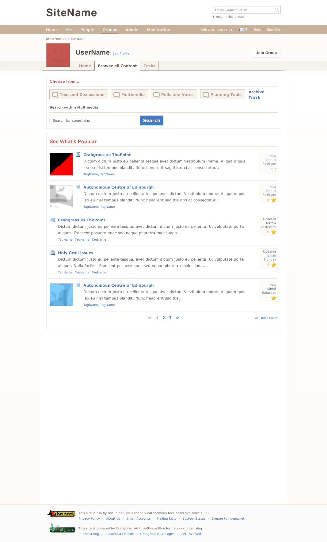
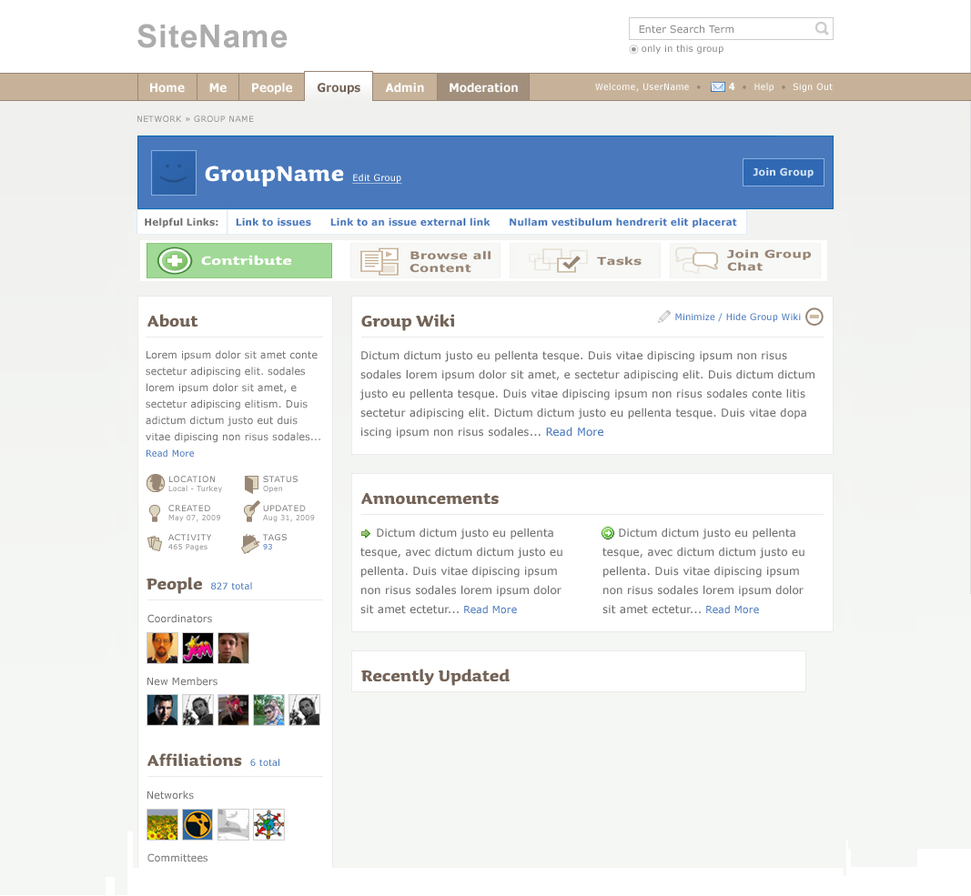
| show wiki | hide wiki | public view 1 | public view 2 |
 |
 |
 |
 |
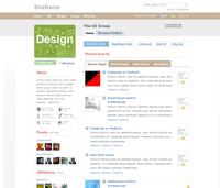
Round 4
| tab-like | line | plone-like | |||
 |
 |
 |
|
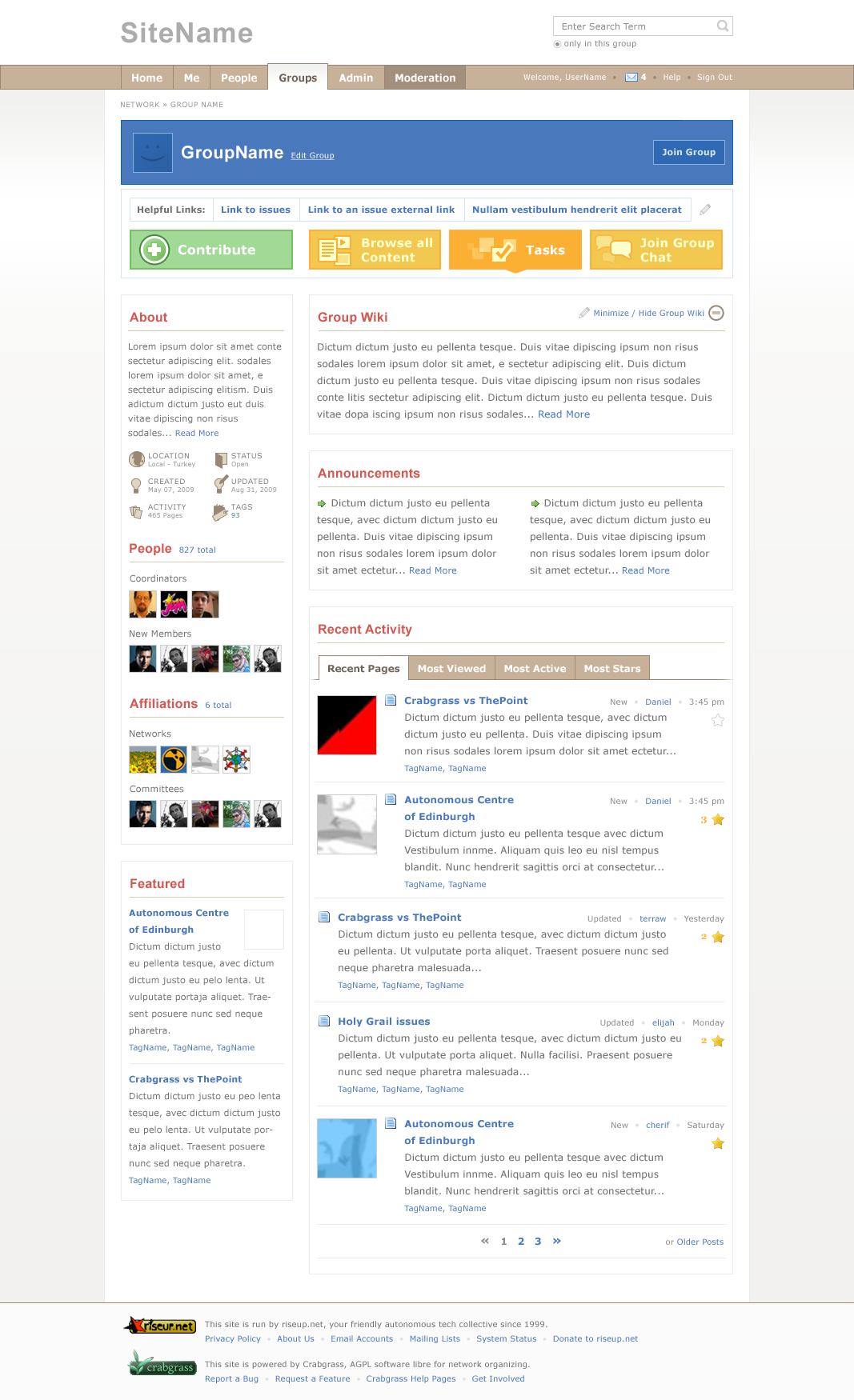
browse 1 | browse 2 |
 |
 |
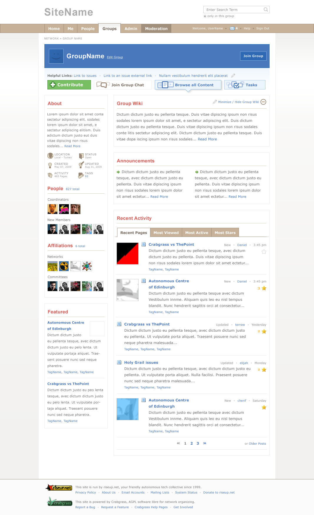
Round 3
| GrouHome bg 1 | GroupHome bg 2 | GroupHome Browse 1 | GroupHome Browse 2 | Me Dashboard |
 |
 |
 |
 |
 |
Round 2
various touchstone design/placement ideas:
| moving away from colorful/blocky | little color, no bgs | smaller text | chat btn on left, simplified more |
 |
 |
 |
 |
| contribute & chat btn on left smaller | streamlined, edited icons |
 |
 |
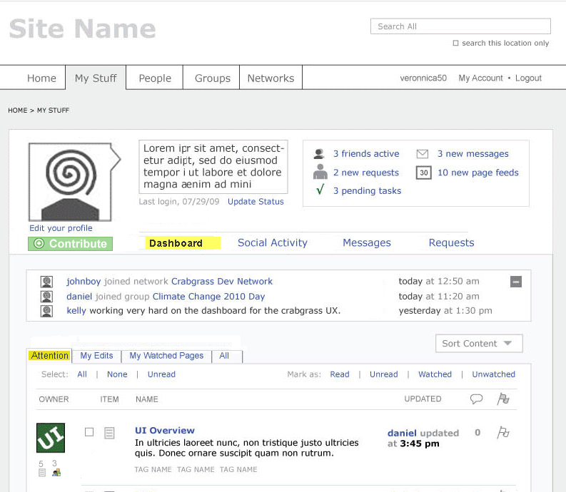
these ideas reflected on the me dashboard coming up.
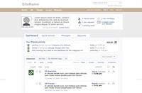
Round 1
We are moving from the blocky feel of the wireframes to a more streamlined design. Early days, but here are some rough starts. Plus the beginnings of cross section design considerations. O shizzzal, it also turns out that facebook is very good at economizing space. i couldnt help but explore this design direction, and with the same UI priorities that we worked on in the wireframes.
facebizal
more streamlined and with mesection in mind
more blocky


|
meghana and i have had a rapid exchange of mockups. moving towards less blocking, more efficient looking. meghana, i uploaded my latest version. not at all satisfying, but you’ll get the idea. see you tomorrow at 11:30.
|
|
|
we also need to think about this holistically otherwise we will have some pretty schitzo design action. we need to keep the me-section frames open / in mind as we design group home. we.riseup.net/assets/13300/me-section-w... |
|
|
Round 2 meghana, thanks!
|
|
|
Wow. Some big changes on the way. I’m just hoping that with these changes, wherever you can write text you can insert hyperlinks. The current layout has a few places where you have to display whole URLs which never looks good (in the “summary” space for example). |
|
|
i updated facebizal sections slightly |
|
|
two comments
|
|
|
elijah – make sure to say what round you are talking about and which specific mock ups. there are new mockups coming down the pipe based on round 1 and 2 – please check in on these later today or tomorrow. Your strongly worded objections are pretty late in the game. these mockups are based on wireframes that have been honed over more then a few weeks. we will put your comments into the pot and stir…. 1. the landing page should be able to support different color themes, so should not have any particular color theme in mind, but allow different areas to be changed.
you should be able to customize the major navigation elements of a group, not just the minor ones.
|
|
|
I think Elijah makes some good points. Some responses below:
|
|


