page design
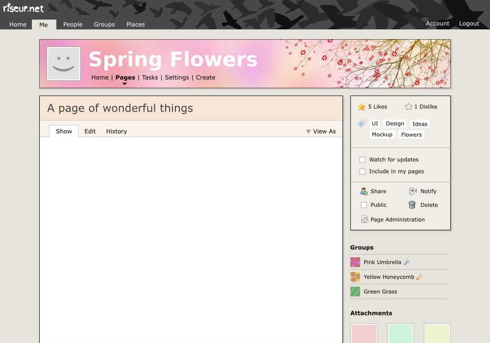
details:
- masthead: the masthead is designed to be small and colorless, but also have some distinctive riseup theme. i don’t want the masthead to clash with a color scheme that might be picked for a particular page. I think of it more like the thin blue masthead that is at the top of blogger.com blogs.
- top navigation menu: the top menus are cut out of the masthead. this provides a simple and clear design. it provides a very strong context: it is obvious that everything on the page directly relates to whatever top level item is selected. the cut out also helps the eye by giving a distinctive shape to current selection, as does the gap between the menu and the banner below. The words are not in all caps, because the eye also is able to read words much better that have distinctive shapes. I have no opinion if the beginning of the menu should be flush with the left edge of the screen or aligned with the banner below.
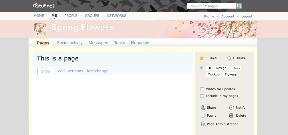
- banner: although we do not have this ability now, it is important to me that we eventually have the ability to strongly theme the banner. that has been my idea with the banner from the very beginning. i think this is really important in order to make it so that people feel like their crabgrass site is their own, to provide important cues as to where you are, and to make the whole site look better. crabgrass actually works with bannerless pages (there is a config item to allow the owner to be optional). this mockup would work also without a banner. the key thing that makes pretty banners something that is feasible and not just a pipe dream is the new invention of firefox personas. There are many thousands of these ‘personas’ for firefox, all licensed under a creative commons license. Personas are the right shape and size, and most of them have a muted left side and a fancy right corner, like the example in this mockup. We could either include a ton of personas with cg (easy), or add some way to navigate the live firefox personas website from within cg (a bit harder). For personas to work, the banner must not be full screen width, although it can vary considerably.
- banner navigation: the banner in this mockup is relatively bigger than other designs and has embedded in it the group/person navigation links. since these are combined in the banner, the space used by the banner+nav is actually the same as in the other mockups. by combining them, we get more space to display the pretty banner and it makes it clear that the navigation is within the context of the group. There is a gap under the banner, which I am not particularly happy about, but it looks much better than without, I think.
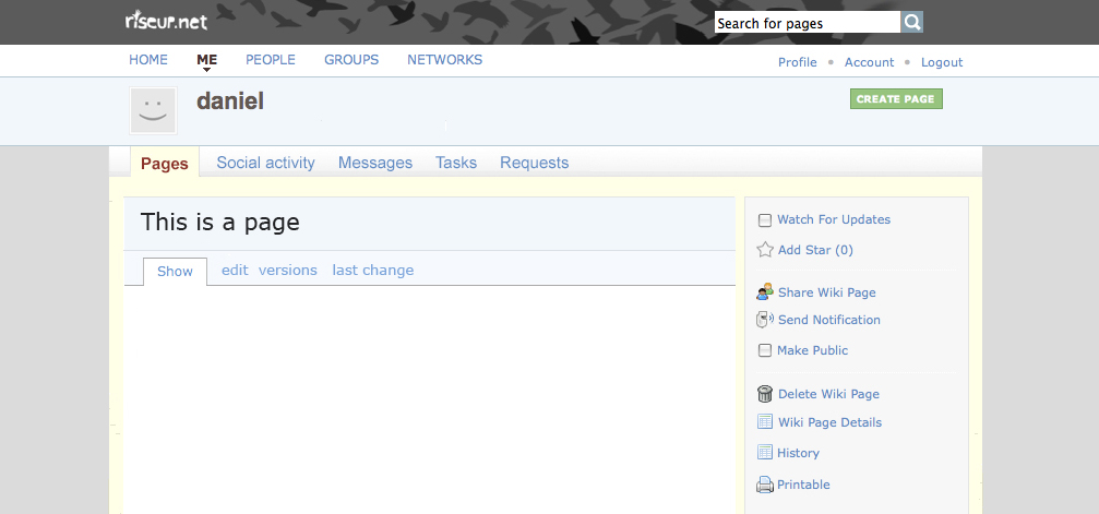
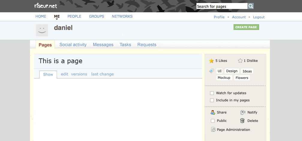
- page content area: I think this area should remain pretty much exactly how it is currently in we.riseup.net. I would make three small changes: (1) allow the color of the title box to change with the banner. This provides some very light weight theming. In this mockup, the titlebox is peach colored, to complement the banner. (2) move ‘history’ link to the info box tabs (show, edit, etc). it makes much more sense here. in the case of wikis, it would need to be combined somehow with the versions tab. (3) move the ‘printable’ button to the infobox, put it on the right hand side and make it part of a dropdown menu labeled ‘view as’ with other options, such as ‘pdf’. I really like the autonomy of the page content area now, and how it all looks clean, and how the comments work. I want to keep this area pretty much how it is on we.riseup.net currently, and to make it stand out from other elements on the screen (like it does now). this allows you to focus your attention on the business at hand when you want to edit or read a page.
- page sidebar: the sidebar in this mockup is similar to the current one, with a few changes. I created box around some items, which helps add another level of visual distinction and clustering.
- page sidebar box: I divided the box into three section:
- the first is popularity and navigation stuff relating to the actual page. This is stuff that should be shown for everyone visiting the page, regardless of permissions. It lets you know how popular the page is, what tags it has, and eventually should list a few pages that are similar to this page. This section could also use a ‘created on’, ‘created by’, and ‘number of page views’ elements, perhaps.
- The second section down is for a particular user to edit their relationship with this page. In addition to the ‘watch’ and ‘include in my pages’ checkboxes, it might be useful to add a link here eventually that lets you ignore a page you are not interested in anymore. currently, we have no way for you to break your ties with a page once you have commented on it or been given access.
- The third section is just a bunch of links to page actions.
- page sidebar background: in addition to the box, the page sidebar also has elements that we want to draw less attention to and that flow down the page on the background level. I think it is important to display the names and the access rights of every person and group. I do not want a list of just icons. It is really important to me that what groups and people are part of this page is something that cannot be easily confused or overlooked, which is likely to happen if we just display the icons.
- page sidebar box: I divided the box into three section:
Overall, this mockup is designed with these ideas in mind: (1) make the navigation context crystal clear at all times (2) cluster and space items to provide visual variety and clarity (3) background and foreground elements to cut down on distraction. It is also important to me that there is no trapped white space, which the other designs have.
The total vertical space used in this mockup is identical to that used in the current ui redesign. However, it looks like there is more space between things, which is exactly the kind of feel that i would argue we want to achieve.
|
It is no secret that I unhappy with the new crabgrass UI and design. I don’t know what requirement went into the mix of coming up with the new UI. For the case of we.riseup.net, however, I would like us to have a discussion specifically about what riseup wants for its site. Other installs of cg can look how they want to look, but we should have control over how we make we.riseup.net look. In the past, people have accused me of creating mockups when I have created wireframes. So, this time, I am going to create an actual mockup. Which means that I am proposing that the final design looks close to the images here. The particular stylistic look of these mockups is inspired from good.is |
|
|
I like this! I love the top nav bar and the birds. Way cool! |
|
|
hmmm, as usual good ideas in here, some i like some i dont. here is the main issue, to have fully customizable crabgrass, meaning fully different templates, like you are laying out here, will require work to make crabgrass really themable, like wordpress is, not just the ability to customize different parts (which we can do now). without that there will always be the issue of how crabgrass looks for different people and how it looks coming out of the box. good fucking god would that make this boy happy. The question then is how to move forward. You have mocked up a page. some of the ideas here could very easily be implemented in 0.5.1.1 template – like the page sidebar, or devin, the masthead (minus the in-laid tabs). Elijah, how would you see getting from here to there – that is allowing we.riseup to be one thing and other instances to be another. That is my main question to you at the moment, not whether or not this layout is better or worse, or which aspects i like and which aspects i don’t like. I have plenty to comment about this, but i will hold for now. I would like to discuss paths forward. What process do you propose? Three options i see
the way forward i would like to see happen is that for 0.6 (the next release) which is due in mid may, we stage this like we did for 0.5, and then implement the changes on we.riseup.net. meanwhile the work to make cg customizable or make a new cross app ui change can go on, and can be implemented when ready. Meanwhile we get invaluable feedback from the active users regarding functional changes as well as UI changes. The main argument i see against this is that we dont want to kill our users with too many drastic UI changes. Fair enough, but
lastly, while i have fielded concerns from folks in riseup, we have also received positive feedback from users of clients sites running 0.5.1 as well as from people looking at the demo. d.s. |
|
|
here are two examples of incremental change that goes some way towards addressing the points that elijah made. The colors are terrible (not my strong point) – but these types changes could be implemented within a week, and also done in a way that siteadmins could tweak various colors – so different instances wouldnt be wed to the color scheme. Again, i am not getting into what i like and what i dont like about elijahs mockup, the point is that changes can be incremental, and perhaps there is a compromise first step that will allow us to go forward with upgrading and using the new work on the w.r.n
And when fancy banner action is in place |
|
|
I think this is a great start towards theming. The strong ideas being:
In regards to Daniel’s comments:
|
|
|
I do not think it is that much work to maintain a separate set of templates. The templates are not supposed to have any code in them. To the extent that they do, this should be factored out anyway. Also, it is not all templates that would need to be modified. I don’t really know what else we can do. I see crabgrass going in a direction that makes me cry a little bit inside. I know a lot of work has gone into it and I know that I have been mostly absent from the discussions. I have also been consistently critical of many of the proposed changes for the past year. Now that many of these changes are close to being rolled out, it makes me feel pretty awful. A minor example is the change to avatar boxes for the page sidebar. For me, this is a political issue, not just an issue of UI. I guess unicef wants something different. Fine. So then we create two different templates. I don’t see any other way to resolve this. It makes me feel better to realize two things: (1) I still care a lot about crabgrass and my mental health is tied to how well crabgrass does (2) I will have at least 50 more years of productive work in me, and I can achieve anything I want in that time if I am patient enough. So, I am in no hurry to roll out a new we.riseup.net that makes me feel bad and shocks the users. For me, it is important to wait until I can be proud of the new we.riseup.net. |
|
|
I think we should introduce some new terminology:
|
|
|
as usual, i think elijah has some great designs, but makes his points quite prickly. i’m not sure what to say. i’d like to make a positive contribution to this discussion, though. i would like to see crabgrass designed more like this before we update we.riseup, and i don’t think that personal theming is important, but i do think that having a stylish layout is. i find the page design we have now on we.riseup much more appealing than the one on the staging server. i tried to get used to the staging version, and i think that i could, but i must confess that i like the way it looks now much more. that said, i think that there is a middle ground solution, and elijah’s spring mockup might be it. my goal would be to make changes as incremental as possible for our current we.riseup users. for me, that means still having networks, groups, committees, and friends visible on landing pages, and having the many changes in menu position as similar as is possible to the way they currently are on we.riseup. when i talked to elijah about the timeline for this, he thought he would have time in the summer to work on implementing his designs, and it would be fine with me to wait until the end of june to update we.riseup. but i know that there are many other crabgrass developers and designers in the mix now, so maybe someone else can take on making 0.5.x look more like we.riseup sooner, and we can get this wonderful site updated faster. |
|
|
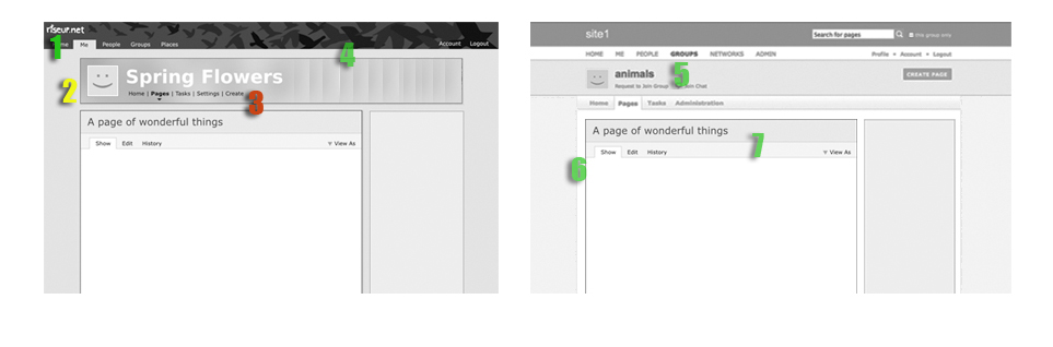
Here is a comparison between 0.5 and spring flowers. As you can see there are differences for sure, but the structural differences, are less then they appear on the surface. The goal for me is to determine what is shared between the two and what would require dev work and what sort of dev work. I’m leaving persona and sidebar changes out of this for a clearer view.
|
|
|
Seeing the 2 designs side-by-side emphasizes the strengths of the ‘Spring Flowers’ design. Elijah, it would be interesting to see how you would resolve your design for the Profile and Group Home pages, which currently support the xlarge (202 px) square avatar. Would you recommend keeping the large avatar for those pages? |
|
|
i talked to elijah this weekend for sometime regarding ways to move As you know, there are general issues with 0.5.0 UI – many of which we However, the two players in this part of the project have been riseup With that in mind, I believe the way forward is this
all the UI changes we have been working on for this release like better unicef can move forward with any UI changes that they would like. Riseup When elijah re-enters the scene he will be working on UI changes as well
|
|
Would you recommend keeping the large avatar for those pages? my objection to the large avatar on those pages is that it reminds me of facebook. i know, not very rational, but there you have it. |
|
|
Just want to say that the competing visions and hopes we’re facing with layout and design and the recent UI changes that we pushed for, are representative of the overall constraint under which we work. We need to find a solid way to develop for all sites and different use cases of crabgrass without imposing too much on each other. Only fundamental changes that are agreed by everyone should be core no? |
|