User Story
1) crabgrass-lite
- user logs into their domain or to groupname.riseup.net (for example)
- they have a very simple crabgrass view that only gives them access to one group. this is called the “crabgrass-lite”
- in the me-section there is no pages feed. to see pages you go the group
- no directory
- bundle logout, profile, account – have them dropdown.
- groupname.domainname.org – like ning you would log into this and you would basically only be within the group, there would be a way a user could move to the more complex, multi-group/network crabgrass view. it would be good if we.riseup.net users could also have the crabgrass-lite version.
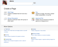
- highlight only discussion, wiki, asset, and rate many poll when you go to create a page, have the rest below these and smaller.
- I like changing Me —> Dashboard. We have had many report backs from users asking about “me”. Its not self explanatory. Also, if we shift to “your world” now we are having you and me in the nav referring to the same person.
2) crabgrass full version
- from the single group mode they can click in the global nav to view the bigger world that your group is a part of. in the mockup belows that is riseup.net
- when the user goes into the bigger world the global nav gains the sitehome, directory links. the single group link changes to “your world”.
- put a “my world” global nav drop down for quick links to friends, groups, and networks.
- combine people, groups, networks into “directory” in global nav
Mockups
No-Masthead Lite Theme
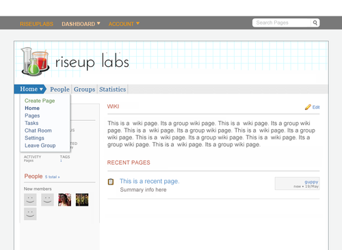
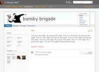
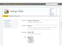
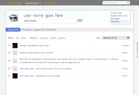
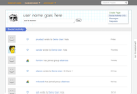
so, here are some more cglite mockups. obviously this is proposing a new theming. i’m sorry to conflate work. but i was really having a hard time working on cglite with the 0.5.3 nav. my work just started morphing. i think the theme i have now is clearer in some ways, but i’ve also been looking at it too much, so maybe its not. either way. the cglite specific ideas can happen with 0.5.3 theming if we want.
cglite specific changes
- ability to login to full version
- no masthead. group banner, within the group section, becomes the branded space.
- dashboard does not have the pages feed. only social activity, messages, and requests
- the global nav is stripped down to dashboard, your group and account.
- search does not have the limit to group option
- profile, account, and login clustered under “account”
- carrots in masthead for clarity.
(i left out the social activity drop down in the banner by mistake. it should be there.)
Navigation Drop down
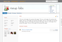
2nd level nav, shown below in the banner, as a drop down of the arrow sign posts. looks very clean, but nav in a drop down and also having the sign post play two roles might not be a good idea.
Navigation in banner
 |
 |
 |
 |
Mockups 0.5.3 Theme Old Mockups
crabgrass-lite
 |
 |
Full version/Basic
This is just normal cg without the me/pages section. For now we will not limit full cg. if i have time i will upload a mockup with me/pages in it and without the “multi-group” button. for now just imagine it.
Changes and issues
changes
- people, groups, networks combined into “directory”: for phase 1 they will resolve to the each section, as they do now.
- “account” in the global nav has profile and logout under it
- “my world” link in global nav has a drop down with your groups / networks / friends
issues
- Basic version: what happens when someone shares a page with you, what happens when someone notifies you of a page, if there is no me section? one solution would be to have the notification show up in messages, and if i share a page with you you get a message that says daniel shared a page with you. you would click on the page an go to the group.
- as per azuls comments, the group page needs tweaking. the mockup as of sept 9th has the group name mentioned 3 times.
create page simplification mockup
For later perhaps
User story for lite – full(basic) – full (multi group)
1) crabgrass-lite
- user logs into their domain or to groupname.riseup.net (for example)
- they have a very simple crabgrass view that only gives them access to one group. this is called the “crabgrass-lite”
- in the me-section there is no pages feed. to see pages you go the group.
2) crabgrass full version – basic view.
- from the single group mode they can click in the global nav to view the bigger world that your group is a part of. in the mockup belows that is riseup.net
- when the user goes into the bigger world the global nav gains the sitehome, directory links. the single group link changes to “your world”.
- in the basic mode the me-section continues to not show the me/pages feed. in the basic mode the user is forced to go to each of their groups to see the page activity within each group
3) crabgrass full version – multi-group view.
- in the me-section, you click on the button that says “multi-group view” and the me/pages tab appears
- the user can now access all their page activity across groups from the me-section. they get the refinements and ability to sort pages that the me-section provides.
- the user no longer has as much reason to go to the group section.
