I’ve been thinking about the frontpage a little and there’s a few things that I think could be improved. For one thing, we want a fast moving frontpage. Also we have some content which is under-used, under-promoted and doesn’t really appear on the frontpage. There’s a way to combine these two things for an improved newsflow: If we include more than articles in the newswire on the frontpage, we’ll speed up the turn around as well as promoting other content types.
I propose to include following content types and moderations statuses in the front page newswire:
| articles | promoted | featured ones are in the features column, we could include the 6th and following features | ||||||||||||||||||||||||
| videos | promoted | featured | ||||||||||||||||||||||||
| tumbles | promoted | featured | ||||||||||||||||||||||||
| links | promoted ones to corp sites should not show up with the other movement reporting and news | featured |
Note: this is a work in progress, feedback would be great, especially if things don’t quite make sense.
Attached are two mock ups what it could look like: one with only regular content and a second one including timeline (or sidebar snippet), main snippet and a new feature that would be awesome: Just like we have to set the site to display a timeline, it would be great if we could set the site to display the latest featured tumble. So when good things are coming in, we can actually display them prominently on the frontpage.
| Regular Frontpage: | Frontpage including special content: |
 |
 |
There’s also some suggestions for renaming of titles:
| from | to |
| promoted newswire | news |
| promoted other media | what the mainstream says |
| posters | we could just drop this and safe some space? really it’s pretty self explanatory |
also thinking if we should shorten sub features to thumbnail and title only, that way we could fit in more or the same amount on less space, bringing the groups up to a more prominent spot.
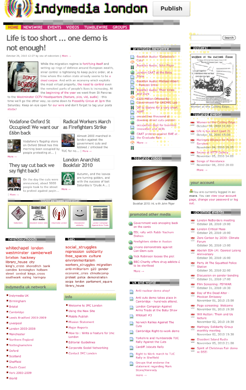
| Could look something like this: | Instead of this: |
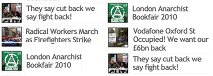 |
 |
Maybe a smaller font, and obviously no repeats.
|
Good suggestions. One reservation – sometimes the featured article titles are not that self-explanatory. Yea, ideally people will then click and read to see if they’re interested. Though at the moment, one can get a fair amount of basic info from coming to the front page only, which is fairly cool. But then again, maybe curiosity means they’ll go deeper into the site? Thinking about other news websites, an intriguing title is enough to lure me in most of the time… Another very very minor thing – which is layout related – is it’d be cool to have things line-up, visually. Or maybe that’s just me and my OCD tendencies coming out. -cp |
|
|
I think the frontpage should be a gate that pulls people deeper into the site. This would mean some work on the other pages, but in order to do this we need some html/css wizards that we don’t currently have. We have the ideas and the ruby geeks are up for it, but don’t have people with the right skillset atm. (The ideas for developing the inside pages are here: wireframes. Obviously adding some large buttons to the featured newswire and other places could be good to pull people in. As for the lining up issue: we can’t really do that, as we can only set the number of items in the wires. Then the actual length (dimension) of the wires is determined by how many one or two line titles we have in there. People are already complaining about the character limit on titles, so I don’t really see a way around that. We could just cut off longer titles, but truncating them wouldn’t help with comprehensibility of the wire. Hope this makes sense, took me a while to get my head around it. |
|
|
Hey mara, very good stuff! I like a lot the idea of promoting tumbles into the front page. Also, a space for a timeline I think is a good idea during mobilisations. And I love the new promoted wire with other types of posts included. Nice stuff. Now, looking at the mock-ups you’ve made, I am trying to imagine the front page with the sub-features shortened to a thumbnail, and I somehow, in my head, I see a front page too crowded with links everywhere. Now, I know that this is a good way to pull people deeper into the site, but on the other hand, I also like the look of the features section of the front page now, mainly because it is the only place that there’s something more then ‘just’ a link. I think this visually works very well. Also, as chickpea mentions, I agree in that sometimes the titles themselves are not very self-explanatory, as well as with the fact that the way they display now they give a bit of basic info … which I think encourage people to click at the more—> link. Also, in the 2nd mock-up, once you have the tumbles and timeline boxes up, plus the snippets, and maybe even an action alert when needed, the front page starts to look very crowded, but yeah, I guess that with the help of a ccs/html wizard this could be solved. Finally, in the mock-up, and under the featured video box, there’s the promoted other media wire only. Does this mean that the movement’s media wire disappears? I mean, are these posts only going to be shown on the new promoted wire? Very exciting ideas and positive work ahead! :-) Stuff to fill some of the next meetings imho. |
|
|
Quick answer: I wasn’t sure about changing the subfeatures, that’s why I didn’t include it in the mock-up. Movement Media: yeah, that would be part of the promoted newswire. I just didn’t want to include links to corp media. Bu anything on movement sites should go there (that’s kinda what I made the table for, but it’s easier to talk about and explain rather than communicate on the web) The crowdedness would need some designer to take a look. I think it’s possible to have a lot of stuff on a website, as long as the layout guides the eyes and kinda contextualises things. Also I’ve asked ekes about getting some feed of the aggregator which excludes the London stuff, so we can have a wire with UK elsewhere news, rather than mir only. |
|
|
That is what Movement Media refers to as a “promoted newswire.” Simply put, |
|